The Most Intellectual Justification for Remote Work — and why we Built a Virtual Design Studio

Go remote! A two-word solution to all of your work-related problems right? OK… not so fast. But there is some truth to this mindset; surely you’ve heard this phrase before. Maybe you’ve said it to a friend or family member in need of a quick mental boost. Because the idea of working remotely is enough to overcome a case of the “Sundays” — you know, the dread you’ve felt from the thought of going into the office on Monday.

To be fair, plenty of people don’t mind facing the day after Sunday (shh, don’t speak its name), but that doesn’t mean they don’t value the option to work remotely. In fact, having options is the secret to creating loyal, happy, and productive team members; it’s good for everyone. It cultivates a sense of flexibility that permeates through the business.

The Iron Triangle of Employment

During his TedxRichland talk titled Remote Working Revolution, Justin Jones introduced three decisions that a person must make prior to accepting a traditional job, using the iron triangle of product development. This design principle states that you can prioritize any (and only) two of the following three results at the expense of the other: quality, time, cost.

Justin’s example, “the iron triangle of employment,” is a spin-off of a product development principle that reflects the three factors influenced by traditional jobs: where you live, where you work, and what work you do. Very rarely does a person find alignment among all three factors.

To his point, remote work empowers a person to choose their location, employer, and type of work, eliminating the need to choose between the three. When you can choose all of the factors, life is good. (Although at DN we always insert a 4th option to this equation too, that people and employers must also know their ‘why’ — but that’s another topic.)

The Iron Triangle of Employment

Richard Branson and David Coplin — Remote Work

Since the creation of Designing North Studios in 2012, the team has delivered many solutions to happy clients all over the country, all without a central brick and mortar office.

Continue reading on Medium…

Add PANTONE Living Coral to Your Workspace — Your Playful Spirit Will Thank You

Have you incorporated PANTONE Living Coral into your workspace? If you haven’t, you’re not ready for 2019. It’s that simple. Why, might you ask? Well, Living Coral is more than just PANTONE’S color of the year;it’s the product of in-depth research collected by color (and psychology) professionals who searched the world (both physically and metaphorically) for relevant feedback and inspiration, even exploring distant cultures for use cases. 

What is PANTONE Living Coral?

As a result, Living Coral is said to provide “vibrancy, warmth, nourishment, buoyancy, and comfort,” all of which contribute to a sociable and lively environment — similar to the look and feel of a coral reef system, inspiration for this pinkish-orangish hue. 

(Ohhh… it all makes sense now.) 

Much like Blue Planet 2 –BBC’s unprecedented documentary on the world’s oceans — PANTONE Living Coral is to be experienced, and the team at Designing North is excited to inject this energy into our own studio. This year especially, we could all use the positivity and warmth this color provides. Good vibes only.

Yes, even you can benefit from “an infusion of modern life,” whether you work from home, a coffee shop, agency, or traditional office. Because keeping up with the times is best done by integrating a social-media-friendly color into the work environment.

Fortunately for you, this color will adjust your mood in the best way possible. Bring on the smile! And feeling of ‘I’m in a good place’ — yup, that’s how you should feel about your workspace.

We’ve laid out the reasons why PANTONE Living Coral exists and is so well liked, but that doesn’t help you incorporate the color into your workspace. For this task we turn to the studio team and Executive Creative Director Lisa Peacock.

We live by the mindset ‘there’s no detail too small,’ and nowhere is this more apparent than in our design studio. Naturally, this served as the team’s source of truth for bringing Living Coral indoors; we think it will inspire you to do the same. Here are some ideas you might not have considered previously, for incorporating PANTONE Living Coral into the workspace:

Living Coral in the Workspace

First, decide how Living Coral can accent your current workspace and provide just the right balance of color. Will it be on the desk? The wall? Or both?

Whichever you choose, why not start with a simple Living Coral notebook— printed with the appearance of a paint chip, of course. Or, there’s this weekly planneroption as well. Both place a splash of Living Coral on your desk at all times and fit within your current workflow.

Canva Calendar Template

Now for the wall… Have you seen this Paint Chip Calendarfrom Paper Source? It pleasantly displays hues of Living Coral as well as other complimentary pantones, and makes the workspace pop. You can also create your own calendar using Canva (it’s free!). Choose a calendar template and add Living Coral anywhere on the page, or overlay a tint on your favorite images. We promise it’s quick and easy and allows for personalization. 

It’s no secret that plants belong on every desk, in every office — including yours. Much like Pantone Living Coral, plants inject life and add a contextual element — why not mix the two. Incorporate this vibrant color into the workspace by adding this coral plant pot to your space. (Just our two cents: it looks best with a green succulent or small cactus.) We can’t help but think of the iconic pink stucco and aloe verde you find in the American Southwest. Pure harmony. 

If planting isn’t your thing, substitute the pot for a vase. This Bright Ceramicist Vase from west elmin coral is a great option. Or this glass option from World Market. These also looks great with a touch of soft green; eucalyptus or fern stems are all you need. Another option would be to purchase flowers in Living Coral, suitable for the desk or any corner of the office. There are so many florals to choose from, including roses, peonies and snapdragons. In fact, Blooms by the Boxhas an entire page of flowers (for Living Coral) to order from. It’s almost too easy!

Incorporating Living Coral into the workspace doesn’t have to be a long-term project; it can be a day-to-day decision. You have enough commitments in life, right?

Health-Aide Rose Kombucha

A good temporary fix is Health-Ade’s new “Bubbly Rose” kombucha. It’s one the the best flavors yet (I know…  that’s subjective) and has impressive packaging to match — oh yes, it’s coral.

Simply arrange the bottle with the planner, notebook and plant — Done. You have yourself a well-curated desktop arrangement. Go ahead, do it for the gram! These “Mocktail” bottles are another creative option for infusing Living Coral into the deskspace. And they represent the light-hearted, is-it-Five O’Clock mindset. And for those who prefer a CBD variety, these sweetgrass sparkling water dropsfrom Dram are a must.

You know where else Living Coral looks great? On white walls. This accounts for the majority of workspaces across the globe. The combination balances the warmth of coral with the cool of white, providing balance for the eyes and mind. But wait.

But wait.

This isn’t just creative banter; it’s us encouraging you to put some art on the walls of your workspace. A quick search online for Living Coral art turned up results, but few compelled a purchase. So we turned to Etsy and found this pleasant piece of geometric Living Coral art. We see the sun surrounded by rolling red rocks (maybe Arizona or Utah), what about you?

Pantone Living Coral in the workspace
Pantone Living Coral accents

Color psychology is real. Very real. It’s a communication tool and so much more: moods and feelings can be conjured up based on a certain color, where it’s seen and how it fits — or doesn’t — with the surrounding environment.

In fact, Pantone’s researchers travel the world just to see color in its natural environment. Some, such as Living Coral, are so special that it’s shared with the public for consumption. And it’s safe to say this year’s choice is welcomed by many. Most importantly, Living Coral is a perfect addition to the workspace. With just the right dosage, it will brighten your day — from the walls to the desk.

If you have ideas on how to incorporate Living Coral in the workspace, we’d love to hear them.

Tag us on InstagramTwitter or LinkedIn; we’ll share with our design friends.

First Orion Website Launch: UX Design & Messaging

Discovery

First Orion was building products with passion. They were on a mission to tackle the large-scale epidemic of scam and robocalls to consumer mobile phones. But you wouldn’t know it from their website or their messaging.

During the discovery process, as we learned more about First Orion, we realized that all of their differentiators were not coming through in their online presence.

First Orion Website Redesign | Designing North Studios

First, they are filled with real data scientists creating the algorithms that allow their specialists to analyze the data around the scam and epidemic of robocalls. Which, let’s face it, is real superhero stuff. And like any good superhero, being authentic about their mission, especially for a company like First Orion, is truly about ‘sharing what’s “under the cape.” And what’s under there is not just the data and the knowledge, it’s a palpable drive coming from their team to protect people. We felt it during discovery; the people at First Orion displayed a sense of passion for protecting us. Just as we communicated a passion to craft a solution for their current problem: an outdated digital presence, lacking a story, lacking a customer journey with these superheroes.

Designing North Studios Cape Design for First Orion

There wasn’t a person at FO that didn’t express a true desire to do the right thing. It was refreshing to see such autonomy around ethical decision making. They could see all the data, all the bad actors trying every second to get through to our phones, unrelenting, and it was so inspiring to unearth this amazing commitment to be part of the change, part of this kind of ‘protection team.’

The Design Challenge

Content is the biggest challenge for every project. But we have techniques to organize process. We introduced something new to our process this time called ‘priority guides’ that allowed the client team to not get distracted with visuals and really focus on the content and message. The design team was then able to mock-up wires with real content vs. your standard latin placeholder. It’s a hard technique, because most people can be very visual — but it forces everyone to read.

In terms of the First Orion voice, it flowed well for us after our interviews in discovery. There is quiet confidence, a humble pride, and a heartfelt knowledge that comes across from everyone. It was important for people to know that First Orion knows their stuff, they are careful with data, but that it’s all wrapped in a good sense of polite Arkansas humor. It makes you what you are: approachable. And this is what the new content communicates.

The ‘Aha! Moment’ — Yes, we had it

The Aha moment was the combination of our initial ‘superhero’ idea for website launch 1.0 combined with the transparency visualization. That everything coming through the phone would be in full color (or transparent) if your mobile carrier chose FO as their protection partner. Hence all the main areas of the website showing full color via the phone, black and white/blue-tint everywhere else. Illustrated well with the home video where a phone is being waved over a crowd of people seeing only color via the phone screen — and every other customer being protected with the FO logo on their phone.

Soon after we felt the superhero emerge for us as a creative team. We drew a cape on one of the data scientists, because we had written that heroics were emerging from their product line. From there, we were inspired to move away from showing real devices with real product shots, and we just sketched. The telecom space is crowded; everyone looked the same. We wanted to introduce simplicity but ensure that FO stood out from the crowd… We were moved by the First Orion mission statement and subsequent tagline (Transparency in Communication) to illustrate transparency and what that really meant. This led to our idea of the phone becoming a trusted source again, where in full color, you could see who is calling and why.

Designing North Studios UX Design for First Orion

A unique truth to this project: it was the client that inspired us most. They are superheroes, but not in a goofy way. Their “powers for good” are understated and authentic — like a sketch or doodle you make on a piece of paper. Because when you’re sketching or doodling, truth emerges. And we think the truth is pretty hip. So ‘hip’ just came naturally — feedback we received directly from First Orion upon launch: “The new website feels decidedly more hip than a traditional corporate website.”

Favorite Design Element

We love the subtlety of the cape. You find it in a few places; it covers (no pun intended) a few themes. It symbolizes that First Orion, carriers, businesses, consumers: we are all superheroes in this fight against mobile scam, robo, and spoof calls. Coming together is what makes us stronger. But it also illustrates that unlike many data companies who may have something to hide. First Orion wants you to see what’s under the cape. This aligns with their mission of Transparency In Communication — so the cape does its job in many aspects.

First Orion and Designing North Studios website Redesign

“We’re a hip, progressive, start-up company with a flair for creativity, said Traci Campbell, Corporate Marketing Manager for First Orion. “We’re packed full of professional and smart people, but we don’t need our voice to be overtly corporate.” The friendly style, tone and language begins to create a cohesive “First Orion persona” across all our digital marketing efforts, including social.” The cape is the perfect symbol for this message. But this benevolent character is non-fictional, and their powers help create super consumers.

The Final Product

It speaks to each audience uniquely now. What First Orion is to a mobile carrier is different for a mobile consumer. We crafted numerous journeys to the right message, the right product, the right information on how to be a part of this ‘superhero league’ in support of First Orion’s quest for complete transparency.

We met them and considered them true heroes in this battle. And believed they were truly fighting for us. So we positioned them as the heroes we knew them to be, succinctly explained why to each of their very important audiences, and hit the launch button so they could share their story everywhere.

Of course, the client always gets the last word: “FirstOrion.com has undergone a complete makeover, thanks to our own Corporate Product Marketing Team and the brilliant folks at Designing North Studios. They have worked countless hours to give a new look and feel to the website, designed in mind to speak to each of our unique audiences. The combined team put together a concept that paints our employees as the superheroes of call transparency, tirelessly crusading for justice against spam, scam, and robocalls and battling for people to trust their phones again.”

First Orion Website Redesign by Designing North Studios

Sharing her feedback on the redesign, Traci Campbell said, “The new site gives First Orion a fresh persona in the marketing world. It also got into the nitty-gritty of what First Orion provides to carriers, businesses, and consumers. This new space will allow us to provide more information to each of our customers in a way that speaks directly to them and lets us showcase our products in a new and exciting way.”

About Designing North Studios:

Designing North Studios is an interactive design studio focused on digital solutions for web, mobile, and branding initiatives. Our mindset: attention to small UX extras makes for big UX impact. A bit different than your average agency, we were started by UX designers and can engage in a project as a team (Hire-A-Team) — or you can rent one of ‘ours’ (Rent-A-Star) for yours. If you have a project you’d like to discuss or are in need of a *designing north star* for your existing team, give us a buzz or shoot us an email.

Subscribing to the Agile Mindset: a Clear Opportunity for UX Designers and Developers to Make Great Products

A collaborative relationship using agile methodology among digital designers and developers can ultimately be the biggest factor separating a good final product from one that is great. Of course, this perspective assumes both teams are authentically agile, and embrace the Agile mindset using Agile strategies — yes, Agile is equal parts culture and lifestyle. All or nothing. Traditionally, using the same word four times in one sentence would be considered excessive; however, in the digital environment, designers and developers must be agile and do Agile, embracing the word as both an adjective and noun.

Adaptability, pace, and continuous improvement are often the words spoken when describing the advantages of using agile methodologies for development teams. And on a similar note, a UX practitioner might be heard describing their process as incremental and iterative with a focus on thoughtful features requiring sprints. In both instances, there’s an understanding that the customer must be heard and the end-user must be happy.

So, although differences between these two departments exist, each having slightly different needs (such as constant communication among developers versus time for research required by designers), a partnership with shared goals is most conducive to fostering the agile environment. Most important, we believe UX designers and developers can occupy the same sandbox in harmony, creating a much more productive environment than if they were separated. Reviewing the thoughts and advice presented by industry experts, we have identified the most important factors to consider when integrating design and development teams in an agile environment. This is how both teams can subscribe to Agile:

Co-design and Co-create

Participatory design, as it is referred to within the design community, describes the act of stakeholders designing with one another rather than in separate silos. An important detail for truly agile teams, this shared or co-design activity serves to meet the needs of end-users and most importantly, guarantees that solutions are usable and rewarding.

However, a nuance of co-design as it relates to cultivating an agile environment, practitioners should bring developers into the design process and developers return the favor for designers. Similar to making smart financial investments, designers can approach co-design (participatory design) with a give-a-little-get-a-lot mentality. By sharing important details, explaining their significance, and proving their value, designers can set the tone for inclusivity on most projects.

Co-creation on the other hand, the act of bringing people together for a mutually inclusive outcome, is critical to the modern agile team of designers and developers. In essence, this concept emphasizes that design and development should happen simultaneously, with both teams sharing responsibilities and working in unison for a more valuable outcome. A transformative experience for agile teams, co-creation motivates project members to be involved in each others work. And that’s the secret sauce. The more developers believe that designers are listening to capabilities of the technology, the more engaged they will be when receiving requirements — the fruit of user research and customer journeys.

As the agile development cycle illustrates, design and development shouldn’t happen in succession. These two teams of practitioners should place equal importance on planning, research, design and development, ultimately allowing them to successfully co-design and co-create — the embodiment of interaction over process.

Flexibility for All

A collaborative relationship between digital designers and developers, one that embraces agility, is dependent on everyone embracing the art of showing flexibility. Unlike waterfall methodology, agile values interaction over process, forgoing strict rules to allow for continuous iteration and change. Of course, some processes still exists in the form of research. Both designers and developers should “have the ability to respond gracefully to change,” says the Norman Nielsen Group.

The truth is, if just one person rejects this mindset the team and therefore company is not truly agile. This is often a common misconception made by both internal and external stakeholders; it’s either all in or not in at all. Therefore, for modern technology organizations or digital design firms where the design and development teams live under one roof or in close proximity, project success is largely determined on everyone’s ability to expect, anticipate, and invite change.

Through the lens of a UX professional designing in a healthy agile environment,

“Flexibility is dictated by how comfortable developers are with UX designers working ahead of sprints, especially on user-research and thoughtful design ideas,”

says Lisa Peacock, Executive Creative Director of Designing North Studios. “Being in-sync doesn’t necessarily mean working at the same pace; teams can still be on the same page when designers gather optimal information and data to effectively report back to DevOps.”

Similarly, flexibility also represents designers’ efforts to respect managed task lists and development timelines, as well as having mindfulness towards how many iterations are too many. Additionally, agile teams outperform the rest when they “win” at the game of trust. Of course, designers must understand that trust is earned not granted.

UX professionals are at the mercy of the user but wouldn’t have it any other way. The user-above-all-else mindset is one that values research, real-world testing, and solutions-crafting to make experiences pleasant and memorable, especially for digital products. Although this mindset is largely driven by creativity, important processes exist to uncover key requirements for the project, and designers should validate these requirements with developers using transparency. Supporting sentiments from the Nielsen Norman Group express that “UX professionals must rigorously validate design ideas, improve them, and communicate that rigor to the rest of the team in an honest and approachable way to gain developers’ trust.”     

The User is the ‘North Star’

Agile teams that seamlessly integrate both UX practitioners and developers wholeheartedly believe in the power of the user. In other words, their work evolves with the end-user at the center, from beginning to end. This inherently adds immense value to the groundwork a UX designer is accountable for: user-research and user-testing.

Many industry professionals fail to recognize that UX design is more scientific theory with well over 20 years of practice behind its title. In fact, the UX community should be looked at as a body of knowledge in its own right that is approached with well tested theory and dedicated practice. From a client’s perspective, it’s not easy to differentiate between all designers while identifying exactly what expertise they need for their project. And often, this is true for developers as well. This explains why a large number of predominantly visual designers (or UI designers) have filled the gap in supply and demand with a quick transition into the UX field. Unlike teams that “get UX,” teams that don’t do agile well will likely fall into this trap and ultimately serve up a biased solution to a real and complex user problem.

A team of UX designers and developers thriving in an agile environment views user behavior as a framework, mindset, and strategy. They measure their work in unison with data to ensure that final products are best for users rather than a reflection of what one person assumed to be the best solution. And like all good things in life, the balanced application of UX knowledge is viewed as a principle rather than input on thriving teams. Any potential gaps between design and development are quickly filled by finding common ground — understanding of the user’s needs. Specifically, the acceptance that thoughtful and considerate design details are paramount to a great final product, and the time it takes to craft these details respects the speed required to remain agile. As a good mother says often, “everything in moderation.” This couldn’t be more true when weighing time constraints versus the need for thoughtful details.

The simple truth is that digital products are most useful when UX and development teams effectively operate with each other, embracing the agile mindset. A key factor to all digital solutions: specialists are needed when building complicated things. More specific to our discussion on thriving agile teams, specialists should understand and embrace each other’s work and most importantly, want to work together for the greater good of the end-user. With the right people in place and the right leadership to guide these people, the critical factors of speed, efficiency, and detail can in fact exist harmoniously. So, as it stands today, agile environments most conducive to long-term success are defined by co-creation, flexibility, and a user-centric approach. If your team is currently in the process of applying agile or wants to understand what techniques should be used, these core factors offer a great starting point for integrating the complex roles among practitioners.


Finding Your Flow Like a Designer With Advice From an Executive Creative Director

What is flow? What does flow mean? And how on earth can flow be experienced? (Outside of the Progressive insurance commercials).

For the longest time, these questions lingered among the team at Designing North Studios as we navigated the sea of creativity and requirements each project demanded. But that was then. Now, with the guidance of our Executive Director, Lisa Peacock, our team has learned how to position our schedules to find our individual flow. And you can do the same: by following our lead!

Whether flow is a new term for you, or you simply haven’t had the time to explore it prior, we have some advice on where to start and how to access it again in the future.

To start, let’s cover the framework we use to understand what flow is, using this ‘pitch’ from Lisa:

I have to be ready to find flow. I don’t do this consciously, but if I analyze my behavior in retrospect – I get visually geared up to focus. So, focus and flow go hand-in-hand, with a need for focus before I can expect to feel “in the zone.

I need to first get control of my environment, this includes that everything around me is visually pleasing – which brings about a calming effect (that includes noise and movement as well) to create an internal organization of thought. Feeling the calm allows me to jump into the storm of flow where my immersion in whatever I’m doing goes unnoticed until I’m done with my work. That’s the funny thing about this concept, I never know I’m inflow until I’m on the other side of it. It’s like you’re asleep, and then you snap out of it! Being interrupted in flow is tantamount to being woken up suddenly in your sleep. Like my cat Dave Mason does at least once a week.

Flow Explained

As it relates to our psychology, flow is a state of deep concentration that causes time to “stand still” or “fly by” — figuratively speaking, of course. As it relates to our studio members, flow is a state of mind where our actions and cognitive thoughts progress with seamless transition, providing incredible satisfaction and enjoyment in what we are doing. And according to psychologist Mihaly Csikszentmihalyi, flow is a finely tuned sense of rhythm, involvement, and anticipation.

Finding flow during a project is a pinnacle moment in identifying what makes youtickas a creative. This sweet spot for concentration allows complete immersion into any activity, although we most often relate it to working. But much like working on your favorite projects, it indicates a correlation between happiness, interest, and performance. For example, if you love the outdoors and dislike confined spaces, flow likely won’t be experienced in an office cubicle (unless of course, your office is filled with puppers, friends, ping pong and catered lunches). So when you try and make sense of this concept, think of flow as a placewhere you go when it’s time to do your best work; be your best self; and connect with your calling. In short, when the opportunity presents itself, go with the flow.

Watch how one artist/athlete explains her perspective on flow:

You can’t force yourself to find flow, but you can:

  1. Clear your mind with a ritual that relaxes your thinking (monitor your routine and identify what works and what doesn’t). (For Lisa it’s a full coffee press and morning emails answered)
  2. Organize your day, every day — alleviate tension from the to-do list (Lisa uses 1 to-do app called Swipes — that goes back years: everything from current client project to-dos to buy paper towels to remodel the master bathroom. The ‘swipe’ to complete the ‘do’ is elation, but the pressure feels minimal.)
  3. Build a wall between distractions (i.e., put the phone away; use headphones and close your email!) (We all know if we don’t hear from Lisa right away, she’s not ignoring us, but rather in flow — which acts as a strong reminder to get there ourselves.)
  4. Identify your ideal setting — where do you work best? What do you need around you to feel at ease? (The overwhelming DN team ideal setting means animal close by, or a window setting that allows for ‘California Dreamin’)
  5. Practice with your attention span — reduce habitual media checking! (We’re on Slack for Teams and rely on each other to share anything really important in our #creative channel — good news being, it’s there when we’re ready to check it.)
  6. Record your moments of flow after the fact — analyze the situation and try replicating it. (During the research for this article, the DN team decided to create a #flow channel in Slack so that we could share what moves us in and out of our creative selves. #stuffworthsharing)

Common Side Effects of Flow

Most critical to a design profession, flow can increase artistic creativity.

When you are “in the moment” with strong focus and good energy the creative brain comes to life. With less thought capacity being consumed by stress and tension, you are left with more creative juices for self-expression and creative production. This is all according to science, of course.

Flow eliminates the suppression of ideas. You are sitting at your desk when a good idea, better yet, a great idea strikes. Your instinct is to tell someone but as you prepare your words doubt creeps in, and you eventually scrap the idea. Unfortunately, this happens often — way too often. And you know why? Because you weren’t in flow. When you are in the zone doing what you enjoy and experiencing satisfying results, doubt, fear, and uncertainty doesn’t stand a chance. In other words, your ideas are free to surface and come to life.

Flow can reveal your calling your ideal workWe have learned that finding flow often occurs during a stimulating or enjoyable activity. Be it work or play, there is enough interest and happiness involved to tune out everything else in the world, leaving room for complete focus. And so, every time flow is experienced, write it down with a description of what you were doing and where; make it a routine, you will likely begin to understand what you should be doing more of in work or life. This step is all about practice and repetition.

Flow positively affects your mood. As simple as it sounds, flow feels really good. Every time you come out of it you want to do it again, wishing that every day could be filled with these moments. When the brain is happy the heart is happy, therefore you are happy.

Flow can increase your performance. From designing a website to running a marathon, flow allows you to be at your best and do your best work. This concept is connected to focus, motivation, and drive; when you are motivated to do something (usually by a perceived reward), you focus on getting it done and are driven to do it well. It’s not just theory, if you learn about what you enjoy doing, you can do more of it, and do it well. But don’t just take our word for it. When you discover your flow, compare your performance on that task to one from a less memorable time; it won’t take long to “connect the dots.”

Flow motivates you to design your life. Designing your life isn’t easy. And deciding how and where to begin can be the hardest part. But finding your flow adds clarity to this process. In creating the life you want to live or the life you dream of living, you need to know what interests you, what you are good at, and what is most important to you — flow can answer all of these questions. Next time you are “in flow,” go with it, and take note of how you got there. These findings will point you in the direction your life needs to go in order to feel more happiness and create your purpose.

Flow makes you a more passionate person. Using artistic creativity, sharing good ideas, doing ideal work, being in a positive mood, achieving higher performance, and designing the life you want, in combination, help to make you a very passionate person. And passion can be applied to everything, not just work. When flow is influencing life in the most positive ways, all other aspects of life align — life is good.

The point is, all of these factors culminate to designing a better you, a you that has more to offer this world. A you that cares for the well-being of a community or team. A you that wants to not only see a brighter future for all, but is also willing to contribute a bit of extra effortto design the best life imaginable. And in return, you will live a life that hovers above the rest. At least that’s how we see it. Would you like to see our vision in action? Please, get in touch.

Good Design is Inclusive, and Inclusive Design is Good for Everyone; These TED Talks Prove it

Life creates many problems for humans; some, you may be familiar with. Fortunately, designers create many solutions for life’s problems. Using the principles of Life Design and a human-centered approach, there are many creatives, technologists, and educators in this world who dedicate their time to thinking differently and creating a “better path forward” — usually for the benefit of others. They are designing north.

As it stands, there are many talented designers and thinkers in this world all working diligently to help us understand how good design can change the world. We recognize them; we thank them; we support them. Now, let’s celebrate them. The following TED Talks discuss the transformative power of good design, leading with examples we can all understand and relate to:

When we Design for Disability, we all Benefit

“I believe that losing my hearing was one of the greatest gifts I’ve ever received,” says Elise Roy. As a disability rights lawyer and design thinker, she knows that being Deaf gives her a unique way of experiencing and reframing the world — a perspective that could solve some of our largest problems. As she says: “When we design for disability first, you often stumble upon solutions that are better than those when we design for the norm.”

We are all Designers

Journalist John Hockenberry tells a personal story inspired by a pair of flashy wheels in a wheelchair-parts catalogue — and how they showed him the value of designing a life of intent. (From The Design Studio session at TED2012, guest-curated by Chee Pearlman and David Rockwell.)

The Art of Designing New Perspectives

Before Daniel Disselkoen studied at the Royal Academy of Art in the Netherlands, he read through his share of textbooks while studying law and philosophy. One day, he realized he didn’t want his own ideas to be tucked away in journals. Today, Daniel is one of the leading interactive artists of his generation. Daniel runs Headmade: a concept studio where he and his team turn thoughts into tangibles. His ongoing fascination in social behaviour and interaction results in playful interventions in the everyday life. Daniel believes curiosity trumps routine.

Simple Hacks for Life With Parkinson’s

Simple solutions are often best, even when dealing with something as complicated as Parkinson’s. In this inspiring talk, Mileha Soneji shares accessible designs that make the everyday tasks of those living with Parkinson’s a bit easier. “Technology is not always it,” she says. “What we need are human-centered solutions.”

Shape-Shifting Tech will Change Work as we Know it

What will the world look like when we move beyond the keyboard and mouse? Interaction designer Sean Follmer is building a future with machines that bring information to life under your fingers as you work with it. In this talk, check out prototypes for a 3D shape-shifting table, a phone that turns into a wristband, a deformable game controller and more that may change the way we live and work.

Design with the Blind in Mind

What would a city designed for the blind be like? Chris Downey is an architect who went suddenly blind in 2008; he contrasts life in his beloved San Francisco before and after — and shows how the thoughtful designs that enhance his life now might actually make everyone’s life better, sighted or not.

Brilliant Designs to Fit More People in Every City

How can we fit more people into cities without overcrowding? Kent Larson shows off folding cars, quick-change apartments and other innovations that could make the city of the future work a lot like a small village of the past.

A Robot That Eats Pollution

Meet the “Row-bot,” a robot that cleans up pollution and generates the electricity needed to power itself by swallowing dirty water. Roboticist Jonathan Rossiter explains how this special swimming machine, which uses a microbial fuel cell to neutralize algal blooms and oil slicks, could be a precursor to biodegradable, autonomous pollution-fighting robots.

When Art Collides with Data

Charts and graphs are the default for data analysis, but some data sets require a little more humanity. What do you call a hairpiece worn by a man? How southern was William Faulkner? Carrie Roy answers these questions and more though sculpture, woodwork, fiber arts, photography, and even virtual reality.

The Beauty of Human Skin in Every Color

Angélica Dass’s photography challenges how we think about skin color and ethnic identity. In this personal talk, hear about the inspiration behind her portrait project, Humanæ, and her pursuit to document humanity’s true colors rather than the untrue white, red, black and yellow associated with race.

As Tim Allen of Microsoft sums up our approach to design, “We should all … understand how each of us is an individual and is unique, but also focus on what is universally important to all of us. That way, we can increase access, reduce friction, create a more emotional connection — in literally whatever you design.” This is inclusive design. Good design.

Life Design With a Trip to Big Sur

Fascinating. Soul-cleansing. Metaphorical. Big Sur is like nowhere else on this Earth. It’s a true playground for those seeking change and a training ground for designing your life.

Big Sur helped open our minds and our hearts to the world, starting with the natural world. It helped us become true listeners. It helped us design our lives. All of the problems that had been causing tension for the past year were being washed away like driftwood heading back to sea. It was this special place that taught us how to design solutions to the problems harassing us as humans. The ones our digital devices reminded us of daily. It shed new meaning on the phrase: “No service, no problem.” This trip was everything we needed to put us back on our tracks. Somehow, it was everything we needed and the only thing we needed all in one.

We are confident the Big-Sur experience is everything you need as well. To see how Big Sur can help you adopt this mindset, click on the image below (McWay Falls) and let the journey begin:

Life Design with a Trip to Big Sur

UX, Positive Change and Togetherness: Murals are Societies Best Tool for Expression

The events of 2017 have positioned 2018 to be a year for recovery, growth, and healing from recent events: political chaos, global humanitarian crises and environmental injustice to name a few. Feeling humanity’s readiness, Designing North Studios is on a mission to find and highlight the small details making a difference in society, starting with the collective effort witnessed from the creation of murals as a form of communication.

Cities across America are in desperate need of more public art — something thought provoking; emotional; relatable or just plain fun. Something to communicate positive vibes and inclusivity rather than negativity and fear. Could murals be the solution? A refreshing user experience for us all? We think so.

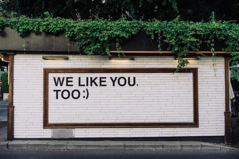
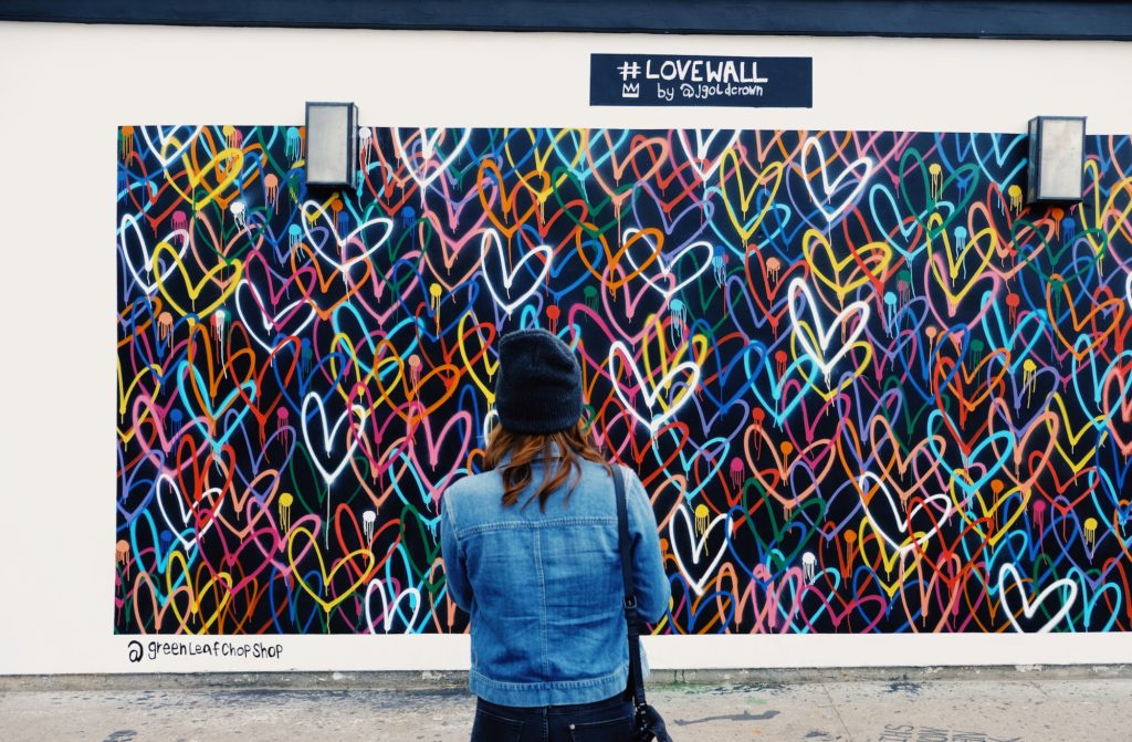
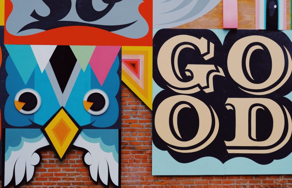
You see, murals are to the public as paintings are to gallery attendees: a visceral experience that requires little more than attention and interest, with the offering of pure enjoyment.

Deceivingly stationary, murals hold the power to larger movements, creating change and cultivating togetherness. Murals are the answer to designing more liveable communities for many important reasons: they are conducive to a person’s and group’s user experience (UX) within public spaces, they motivate positive change without name calling, and build community bonds through peaceful, artistic communication.

Murals Enhance User Experience

Murals of Venice, CA, Designing North Studios

As a member of your own community, you might ask yourself, “what is there to do/see around here.” As a UX designer however, the question might sound more like this: How can I interact with my community in a way that’s enjoyable?

And through the lens of a UX designer (using design thinking), answering this question with a solution that provides equitable impact for both a business and the surrounding public will generate the most impactful outcome. Murals are proving to be the ideal conduit, straddling the border between tangible satisfaction and intangible fulfillment.

Whether it’s measured by local foot traffic, tourism or social media insights, the impact murals have on the user experience (UX) recorded by a person in a public setting is felt throughout many large cities. From San Francisco to Manhattan, urban murals have become an embedded attraction, a reason for people to visit a specific area within a city to see with their own eyes what the hype is about — searching for a genuinely unique experience. From interviewing people on the streets of our local community, the most common reason for visiting a mural is to personally see what the artist has created, digest the artistic message being communicated and somehow capture the moment to share with others — both friends and family.

 The Audubon Mural Project

Most often, discussions around UX are directed towards a digital product, however, the physical world also benefits from good UX design — especially urban environments where many people are interacting with complex systems. Los Angeles is a proof of concept: from Venice to West Hollywood, the city is plastered with influential murals created by amature artists and historical muralists alike. If your asking why, you are thinking like a designer! A two-pronged answer, many of the murals were first painted in the mid 90s for various political, social and humanitarian causes — a way of communicating change at the time. But now, the city is again home to a “mural boom,” a strategic tactic to improve the experience visitors have within evolving neighborhoods.

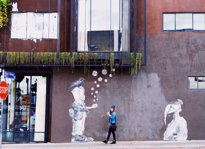
The city of Los Angeles, along with small business owners along Venice’s iconic Abbot Kinney Blvd have made mural viewing a visually rewarding activity, one that is user friendly to visitors on foot exploring the outdoor shopping hub. From corner to corner, local business owners have allowed their exterior walls to be used for large-scale murals, fueling the efficacy of this outdoor retail marketplace. At a time when the greater retail industry is synonymous with “retail-apocalypse,” components of user-centered design (UX in this case) are naturally adding value and reinventing the shopping experience — a concept we believe will define ‘modern retail.”

A recent visit to Abbot Kinney revealed a flow to it all. Almost all of the murals were on walls primed for photography — especially portraits, a.k.a., selfies. And they also ran perpendicular to the main street, giving visitors adequate opportunity to interact and hangout for a few minutes before their next stop. We also noticed that most murals seemed to be strategically located on the exterior walls of highly desirable restaurants, coffee cafes, and shops, a brilliant solution to reduce discomfort over wait times or purchase decisions (customers leave with a positive view of their overall experience). You may disagree, believing these factors to be too small and explained by coincidence, but we simply refer to that as good UX. (If it feels natural and compliments the overall environment, designers did their job.) And as Lisa Peacock, our Executive Creative Director, would say, “Small doesn’t even need to be recognizable to make an impact. That’s its beauty.” When all of the subtle, small details work together, like the murals within a vibrant community, a form of capital is created for that specific region; experiential capital as we call it. And it’s inclusive.

Murals of Venice, CA, Designing North Studios

Murals Facilitate Positive Change

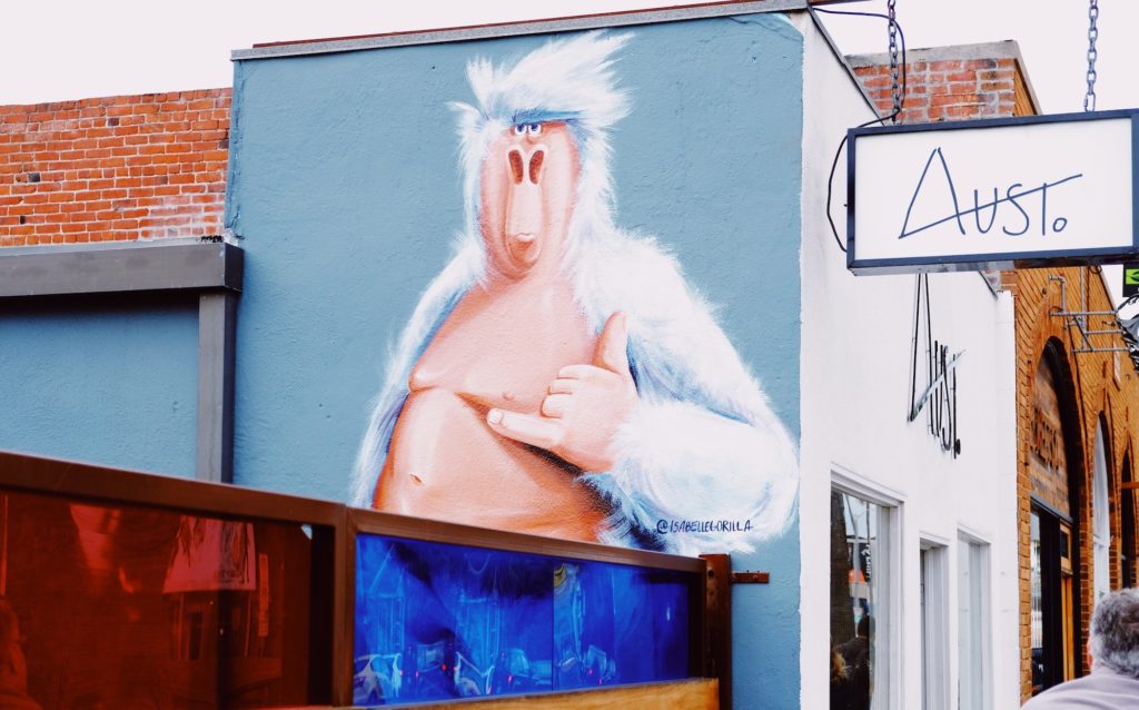
An extension of a good artist, a mural has the power to speak without ever saying a word–the popular “Isabelle Gorilla” murals found throughout Venice, CA, are a great example–one look and you’d swear the Gorilla was telling you to change your lifestyle, maybe even “slow down and chill.” Although they may speak differently to each individual, the unique interpretations often lead to inclusive discussions rather than divisive belief.

Of course, change can come from many sources, but very few of those create desired change purely from spoken words. Often, expression, action, or in the case of murals–artistry is needed. An important detail, murals speak to all humans; race, age and ethnicity are not a factor. This is something Stanford Medicine has been sharing with its community since 2015 when Fair Oaks Health Center (Redwood, CA) revealed a mural in the pediatrics waiting room. A volunteer for the project, Stanford art practice lecturer, Lauren Toomer, MFA, strategically incorporated letters, numbers, shapes, and images of the Redwood City community, as well as three interactive learning panels into the artwork. With the goal of supporting pre-kindergarten-aged children, this mural serves as a tool to educate young children during their visits to the pediatrician–often the only contact they have with professionals of any sort. Part of a larger effort, this mural now aids many children from low-income families who simply don’t have the means to pre-school, setting them up for greater economic potential from a very young age. Now, you don’t need us to remind you of the cumulative benefits on society when all members have access to more schooling and therefore professional development later on in life (higher education and job opportunities, to name a couple). And to think, all of this positive change from the use of a mural…

Just three years later, MayView community Health Center in Mountain View, CA, is also using a mural for positive change within its pediatric care division. Replacing a TV, clinic workers have identified the value murals bring to both the children and the community, addressing knowledge gaps in relationship to other children their age from families with greater means to education and learning. A key component of Stanford’s Pediatric Advocacy Program, murals are creating measurable change for many families in the community.

Similar to the walls of a pediatrician’s office, the urban landscape serves as an artist’s canvas, prime real estate for displaying visual art to convey important messages and change the status quo. A project accomplishing just this, Sea Walls by Pangeaseed Foundation uses public art to spread the message of ocean conservation into the streets. Since 2014, the group has created nearly 300 murals throughout 12 countries, including multiple pieces in San Diego, CA. And with over 200 artists on board, this community isn’t painting in the streets simply to display their talent, they are collaborating to change the way people see the ocean environment; murals are their medium. As Pangeaseed explains, these murals have a dedicated purpose:

While our oceans are the Earth’s life support system, providing 70% of the oxygen we breathe, a sixth of the animal protein people eat, medicines that keep us alive and healthy, and so much more, human impact in the form of overfishing, climate change, development, plastics, and other forms of pollution are taking a toll on the health of our seas. Unfortunately, these critical issues are often complex, multi-faceted and hard to understand for the average citizen. Through public art, Sea Walls has the opportunity to translate facts into visual stories that engage the public in a non-confrontational manner, and increase awareness.   

A lesson for all of humanity, why not let murals be our muse and allow them to communicate sensitive topics to a large audience without the anger-filled media battles? No matter what side of the fence you are on, art is always subjective–an effective method for communicating without insult or attack.

Murals of Venice, CA, Designing North Studios

Murals Create Community Bonds

From Harlem to Portland, murals are much more than artwork, actively driving collaboration and cultivating a narrative for the communities in which they are created. From facilitating coordination among the public, media, local leaders and the artists themselves, a simple creative idea can quickly transform into an organized public event, a process Forest For the Trees does exceptionally well. Curating both local and international artists, this nonprofit puts creators on the center stage. From sketch to unveiling, the entire project displays each artist as an individual but remains cohesive as a city-wide event. That’s the objective according to organizer, Gage Hamilton, “All the artists have their own themes and styles that they work within, and it was really up to each individual and pairing what direction they wanted to take. I just matched them up with property owners that liked their work, and all the property owners were cool enough to keep an open mind.”

Murals have significance in the Portland area, largely due to the bonding influence they provide. As this project displays, the local government doesn’t need to be relied upon for funding; by rallying local businesses and public supporters, community-wide mural events create more inclusiveness than a 4th of July block party. As the organizers had planned, Forest For the Trees wouldn’t have been possible without the help of many locals; because they had a hand in the facilitation, a sense of ownership was felt resulting in accessibility for everyone who wished to join the fun. For humanity, this is a rewarding experience, one that can be replicated from one community to another.    

Designed around a theme, The Audubon Mural Project is the perfect example of how murals can facilitate bonding within a community.

A city not often identified for wildlife viewing, Harlem, NY, now has some of the state’s best “bird watching,” with around 80 completed murals out of the 314 that the National Audubon Society and local gallery,  Gitler &_____ Gallery, wish to complete. Unique significance now resides on Harlem’s urban walls, covering the 314 species of birds labeled as threatened by climate change. You might ask, why Harlem of all places? Well, it happens to be the home of and final resting place of Mr. Audubon himself; a historical fact not recognized by many residents, that was until their home began receiving public art that made headlines across the country.

From Allen’s Hummingbird to a Swallow-Tailed Kite, avian masterpieces are splashed across Harlem neighborhoods, covering everything from aged brick high rises to the security gates of dental and vision offices. And this is all part of the design — when businesses close up, residents and passer-byers have something colorful and awe-inspiring to look at: birds!

Complementary to anyone wishing to view all eighty murals, a project map has been created for self-guided tours around Harlem neighborhoods. Communicating global challenges, this project is attracting accomplished artists from all over, further adding value to the experience of being a local resident, community leader or business owner. When people exit their apartments or visit the gas station they are greeted with lively artforms. It’s something different, something unexpected, yet so rewarding. This is the power of a mural.

Murals of Venice, CA, Designing North Studios

From feelings of unity and togetherness to cultivating thoughts for change, murals hold the power of influence. An answer to designing healthy communities, murals are conducive to a person’s and group’s user experience (UX) within public spaces, they motivate positive change without name calling, and build community bonds through peaceful, artistic communication. We say, let’s create more murals in 2018.

What Is UI Design? Six Articles To Help You Understand

What is UI Design?

Once again, we turn to the Designing North Studio team (only a couple are dedicated UI practitioners) to share their their definition of UI Design in one sentence:

[clickToTweet tweet=”UI design is The translation of UX design into a visual interface.” quote=”The translation of UX design into a visual interface, where the color, composition and placement of various interactive elements reinforce the user experience principles that have been deemed most important for a given interaction.”]

“When function and art move in together before they tell their parents.”

The balance of visual design, layers of presentation, and interactiveness to provide a satisfying look, feel, and experience.

The translation of UX design into a visual interface, where the color, composition and placement of various interactive elements reinforce the user experience principles that have been deemed most important for a given interaction.

[clickToTweet tweet=”Let’s get visual. Here are the basics of UI design:” quote=”UI Design is the creation of graphics, illustrations, and/or use of photographic artwork and typography to enhance the display and layout of a digital product within its various device views.”]

Have you ever heard someone say, “Wow, that website has horrible UI,” or “The UI of this app is the worst”? Similar to our comments on What Is UX Design, if you aren’t around designers all day this acronym is likely meaningless. And there’s nothing wrong with that. But to understand User Interface Design (UI), is to have a greater appreciation for the way designers craft  the look, feel and even responsiveness of a digital product, which all accumulates to interaction.

However, we understand that much like UX (user experience design), UI (user interface) is often interpreted slightly different depending on who you ask.  

At its core, User Interface Design creates the the look, feel, and interactiveness of a digital product — think web experience or app. But this is only the basis for understanding. You see, good UI is a multidimensional approach that enables a product experience to be responsive to a human being. It’s the Xanax of the design world. Remember that short animation that perfectly substituted the need for a thousand words? Or even that website that you navigated as though it was a guided tour. Now, that’s some good UI.

UI articles to help understand design.

Now, let’s paint you a more thorough picture of User Interface Design with these six articles:

1. UI is this, and UX is that:

https://medium.com/blu-mint-digital/ui-design-vs-ux-design-whats-the-difference-af97c2ff052a

2. UI basics, let’s start here:

https://www.usability.gov/what-and-why/user-interface-design.html

3. Good UI gets out of your way to help you complete a task:

http://blog.teamtreehouse.com/10-user-interface-design-fundamentals

4. Four ways color explains good UI

https://www.webdesignerdepot.com/2017/06/4-ways-vibrant-colors-boost-ui-design/

5. UI explained in 60 seconds. Starting now:

https://www.oho.com/blog/explained-60-seconds-ux-ui

6. These big design buzzwords make you sound more experienced — UI is one of them:

https://www.upwork.com/hiring/design/ux-ui-ia-digital-design-terms-explained/

Have a burning UI/UX question? Let’s chat!

Designing North Studios Playlist: Volume 1

“Music is the electrical soil in which the spirit lives, thinks and invents.” — Ludwig van Beethoven

This is affirmation for every designer who stands on a musical foundation to power through the day.

Design and music goes hand in hand. Similar to art and a paint brush. With the majority of our time spent in front of the computer, we need music for many reasons. Music offers an escape to a place of focus; where creativity can be felt, absorbed, and expressed.

Day after day, we pour our heart and soul into our work, in the the design studio, striving to produce impactful results for every body of work that enters our virtual doors.

It’s here where we live, think, and invent with the intent to make the world a slightly more enjoyable place for all.

But this wouldn’t be possible without music. Our feelings, energy levels, and focus all rely on music in one way or another. Without even considering its power, we rely on music to set the mood, each and every day.

And contrary to popular belief, work is in fact a place for sound; a place where turning up the music leads to an atmosphere primed for creation not distraction.

From Stanford to Johns Hopkins, extensive research has been conducted, supporting the positive impact that music has on the learning environment.

A student is to learning as a designer is to creating, and music is the glue that bonds passion, focus, and intelligence to production and results.  

Although our favorites remain intact, we enjoy creating new playlists as we discover tunes that inspire and motivate us while in the design studio. Let us know how we’re doing and feel free to share your favorites along the way.

Designing North Studios Spotify Playlist: Volume 1:

Northern California
studio@designingnorth.com
© 2018 Designing North Studios. The Creative Division of The Carrera Agency. All rights reserved. Privacy | Terms