Bill Passes to Incorporate 27th Letter to Alphabet

Wow. Big news for us designers. After two years of deliberation, the U.S. Congress quietly passed a bill to add a new letter to our Latin alphabet yesterday. The news was buried behind the Trump/Cruz wife mud-slinging and Bernie-Bird-Miracle on page 12 of the New York Times.

The letter, which is most commonly described as a combination of the letters “N” and “G,” will sit between “N” and “O” in the alphabet.

“Academics across the English speaking world have long thought that the NG (pronounced eng) never should have been eliminated when we transferred from the Phoenician alphabet to the current Roman or Latin alphabet,” said former Secretary of Education Arne Duncan. “It endured the same kind of critical debate as the ampersand, but it has emerged triumphant.”

While the single character will replace “NG” creating some content economies, the fiscal costs for government, publishers, and corporations to roll out the change will be extraordinary.

Why is this such big news for designers? Think of every font we use today. The new letter will need to be added to each and every one of them. Think of all of those gorgeous campaigns and websites you’ve worked on – they now all need updating.

Polish up your resume!

#AprilFools


Yup. Mobile. Again.

We really don’t mean to beat a dead horse, but it continues to amaze us when we see successful companies which have still not addressed their unresponsive (read: not mobile-friendly) websites. This recent chart from the insightful folks at Statista underscores the trending well.

decline-of-global-pc-market

PC sales have done nothing but decline since 2011, and are forecasted to eventually stabilize per research from International Data Corporation (IDC). Tablets, phablets, detachable tablets, and phones have all impacted the market substantially. There are, of course, other factors such as the general economy (commodity prices and foreign currency headwinds for example) and perceptions regarding added value or lack thereof of new PCs that affect these trends.

But let’s face it, most of us are hard-pressed to think of a day in which we haven’t used either our mobile phone, tablet, or phablet to access a website.

And there are few things more irritating than landing on an unresponsive website. Your handy hand-held now requires two hands as you try to awkwardly use your fingers to blow-up the micro-text you’re trying to read. Then you have to slide around in an attempt to find a tab in the main navigation to get to your intended destination. A few expletives, and BAM, you’ve abandoned the site in search of greener pastures.

We’re pretty sure that most university marketing programs do not stress a make it hard for the customer to find your product or service philosophy. So why isn’t every company on the planet jumping into website redesigns? Good question.

We think there are four main reasons:


You can't WISH away mobile. [Photo credit: SuperFamous.com]

You can’t WISH away mobile. [Photo credit: SuperFamous.com]

  1. They don’t think there’s a big problem with having an unresponsive website.

We can always point to Google’s demoting of non-mobile friendly websites as the most actionable reason to believe it’s a big deal to have an unresponsive website. And now Google is preparing for what some are calling Mobilegeddon2. In May 2016, Google plans to,“…start rolling out an update to mobile search results that increases the effect of the ranking signal to help our users find even more pages that are relevant and mobile-friendly.” As a design studio that’s deeply involved in creating fantastic and intuitive user interfaces and user experiences, we struggle to digest that a successful company doesn’t view unresponsiveness as a big problem.

2. There’s no money in the budget.

This one we understand. Depending on the size of an organization, the move to a responsive website and/or a mobile app can be a considerable undertaking. We get that. As with most new marketing initiatives, we recommend that you put together a compelling rationale plus ROI that your senior management cannot ignore. Here are few thoughts to bolster your argument.

3. It’s a big undertaking because they need to update the whole website anyway – it’s easier to just keep putting it off.

It’s like dieting. You’ve been adding a couple extra pounds every year, but instead of jumping on it, you’ve let it slide and now you need to do something serious. A few pounds has become an even 10. Your favorite jeans don’t fit. You don’t want to go out. It’s like that with your website, if you haven’t been consistently addressing its upkeep (let’s face it, it’s hard to fit everything in), that killer bod is now, well, rather unsightly.

You have to face the facts. It’s only going to get worse. Mobile is not going away, nor are all those updates and subtle improvements that your website needs. The sooner you get it into a more manageable configuration, the better you are going to feel. Just contacting a design studio to start the conversation will help. So hop on the treadmill and cut the carbs. You’ll feel better once you get started. We promise.

4. Aliens have invaded their bodies with no concept of Earthly digital interactions.

We’re closet nerds. It could happen, right? Plus, it would explain a lot.

What are you thoughts? Are we missing something?

If you’re ready to dive in – or perhaps put a toe in the water, GIVE US A JINGLE.


The Designing North Project: Nancy Jundi

Why is Nancy Jundi designing north*?

So often we think that we have to be heroic to make a real difference in the world. Yet the reality is probably just the opposite. This story of a young woman, Nancy Jundi, taking time out of her day to connect with a little girl is priceless. In a matter of minutes she likely infused a lifetime of confidence in a young stranger. Nancy is an ordinary person who for a moment became heroic in the eyes of a little girl.


Her story, in her own words as she told it on Facebook:

Stopped for coffee this morning at 7 eleven (don’t judge) and when a little girl saw me she hid behind her mother and screamed.

When she started crying I felt really bad and had no idea what I’d done. Her mother bent down to comfort her and asked what happened. The little girl whispered something and then the mother turned to look at me.

“She thinks you’re Wonder Woman,” whispered the mom in broken English. “You’re her favorite…Could you…I’m so sorry…”

“OF COURSE!!!!”

So I bent down and had the sweetest most encouraging conversation with a 4 year old that I ever ever had outside of my own nieces.

“Why aren’t you wearing your uniform?” Sofia asked. “Well, I work with non super heroes for most of the day – even though we do super hero stuff on the computer.”

“So you fight the bad guys on the computer?” she asked.

“Sometimes, yes, but we also build some really cool stuff, too.”

“But when do you wear your boots and tiara? When do you fight crime with your bracelets?” she wondered.

“Lots. Lots and lots. I love my boots – and I’ll tell you a secret, even when you can’t see my tiara, I’m wearing a crown. It’s like my Invisible Jet. Wanna touch it?”

She froze. She was so excited. She touched my head and smiled. She said, “You have hair just like mine!”

So I asked her if she’d like my crown. “I have more, promise, but I want you to have this one.” She was so happy. So, so happy.

She hugged me, her mom thanked me and I was late for work. Because that mattered. And until something in this world tells her differently, she’ll carry herself like she’s wearing that crown.

And hopefully, that crown will help her tell the world to stick it, if and when it ever tells her she’s anything other than worthy.

Oh, God. How I love you. How thankful I am for what you give me in a day.

Go be super heroes, friends.


*Many people in this world “add a little extra” to whatever they do: their career, how they live, the relationships they nurture, or just a random act of kindness – and we consider that *designing north* – designing your life and living it just north of the average bell curve.

Nancy Jundi is designing north. Are you or someone you know? Tell us. We’re looking for the global count.

Words Matter

Understand your target audience before you dive into a website redesign


“Grab my stock! Hey, that’s my stock!” “He dropped his stock!”

When I finally figured out what they were saying through my helmeted ears and their thick Australian accents, I was still confused.

“What were you saying?” I asked the three skiers with whom I was sharing the chair lift.

“My stock. I dropped my stock,” one said as he raised his remaining ski pole and shook it.

“Oh! We call those ski poles here in the states. Just wait after you get off the lift at the top. They’ll send it up with one of the chairs behind us. But…make sure you listen for them to yell ski pole, not stock. Never heard that before,” I said.

We then had a great conversation about the ski odyssey they were on in Utah and the void of skiing opportunities in Australia.

My friends and family had all returned to the cabin, and I was on my last run. As I skied down, I reflected on how important words are. Even though we speak the same language, none of us Americans had a clue what the Australians were hollering.

At Designing North Studios,

we perform a variety of services for our customers. Among other things, we develop websites or website redesigns, we conduct rebranding or new branding initiatives, and we provide content. Our favorite approach is of course to do all three. Why? Because it allows us to take a holistic approach to both design and content. Regardless of how we’re engaged though, we always insist on developing a clear understanding of our end-user before we get started. It’s called discovery.

word-stock-designing-north-studiosWithout discovery, if we were building a website for a multi-national sporting goods company with a strong presence in Australia, we might drone on and on about the merits of a set of featured ski poles. This would tell the end customer that A) the company doesn’t care enough to speak to them using their own local language – their colloquialisms; and B) they may not know what the heck we’re talking about and subsequently abandon the website.

Getting messaging right is a big deal.

Skiing makes for a good example. I’m an intermediate skier with four knee surgeries under my belt I’m basically just happy I can still ski. I don’t want to be on crowded slopes with crazy teen-age snow-boarders, and they probably don’t want to be on the slopes with me either. So I tend to patronize ski resorts that don’t allow snowboarding, that groom the slopes daily, and that limit the number of tickets sold.

The messaging of my target resort is going to be very different from one that is catering to snowboarders and hard-core alpine skiers. They might use words like the “ultimate powder shredding experience”, when I want to hear “peaceful well-groomed slopes.” Yet both are ski resorts.

If you’re about to dive into a new website development initiative or a website redesign or branding update, make sure your project plans allow for thoughtful discovery. Yes, it adds both cost and time to the project. But it saves cost and time on the backend in the way of fewer iterations and revisions. Ensuring that your designers have a clear understanding of your target audience is paramount to your project’s success. Sometimes the slightest nuances make all the difference.

Just imagine how surprised the Aussies would have been if the next skier getting off the lift had produced a paper stock certificate for a share of Deer Valley Resort to them.


Not a subscriber? Jump on board.


Flirty Free Fonts for Valentine’s Day

Being deeply loved by someone gives you strength, while loving someone deeply gives you courage. – Lao Tzu


The Romans did many things well. They built straight roads, they built aqueducts to deliver clean water to their citizens, and they built structures like the Coliseum that have stood the test of centuries. But one of their greatest skills was their ability to borrow Greek mythology and morph it into their own set of gods.

That capricious little side-kick of Saint Valentine, our cherubic Cupid, was borrowed from the Greek god Eros, the god of love. It seems he was rather wily in the Greek world as well – shooting golden arrows to spark passion and leaden arrows to inspire revulsion. What a way to exact revenge. I’ll make you fall in love with her, and then make her find you revolting.

But enough intrigue. This is the season for love. We hope that you find both strength and courage in your relationships and that you might ignite a little flame with these flirty free fonts. Curated by our lovely director of marketing, Dolfin Leung-Melville.

Find them here:


Not a subscriber? Jump on board.


Eight Fabulous Free Fonts for the Holidays

Sleigh bells ring, are you listenin’?

Okay so sleigh bells don’t exactly ring in the Bay Area, but our holiday spirit is alive and well nonetheless. We’ve curated a list of eight fonts that represent the fun, the frivolity, and the tradition of the holiday season. The best part? They’re all free for personal or non-profit use! For commercial use, you’ll need to purchase a license.

Drum roll please… Here are eight fantastic fonts to use in your holiday eNewsletters and greetings.

designing-north-studios-free-holiday-fonts

Find them here:


Subscribing to all our storytelling yet?


Top 10 Reasons You Need a Website Redesign – #YouMightBeAWebneck

Sometimes it’s difficult to know whether or not it’s time for a website redesign. Then again, sometimes it’s obvious. For example, when you’ve decided to take your brick-and-mortar business online and need to launch an eCommerce website – that’s obvious. Let’s face it, it’s a big investment to redesign your website – both internally and externally, and nobody wants to deploy precious marketing budget dollars needlessly. So here is our advice to help you in your decision-making process. If you answer yes to one or more of the items below, it’s probably time to talk to a trusted digital design agency.

You might be a webneck, if:

#1

Your website doesn’t pass Google’s Mobile Friendly test.

This is a very simple concept. It’s pass/fail. As of April 21, 2015, Google began degrading organic search results for non-mobile-friendly websites. If you’re still enjoying strong search results, you’re lucky. Here’s the link to test your website: http://bit.ly/MobileFriendlyTestForGoogle.

#2

Your website is not responsive.

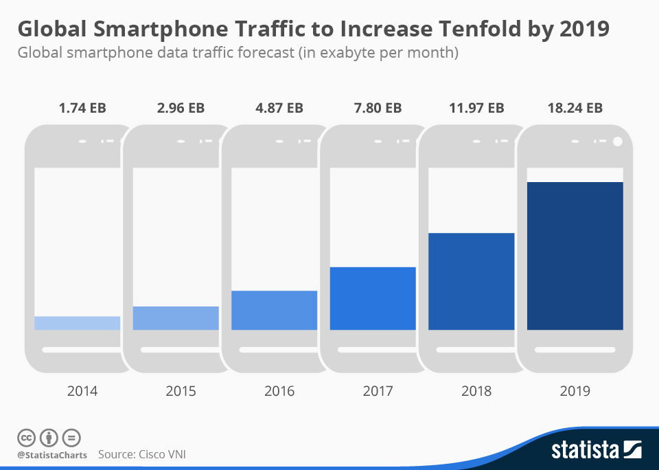
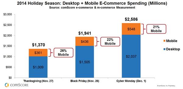
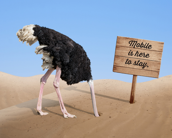
No, that sentence doesn’t mean your website has no pulse and you should rush it to the ER. Although, figuratively, it kind of does. A responsive website is essentially one that can be experienced and look great on whichever platform it is being viewed. That means it looks good and is useable on smartphones and tablets, as well as desktops and laptops. If it’s not responsive, you didn’t pass #1 above either, but we need to underscore this point. Nearly a quarter of all 2014 online sales Black Friday / Cyber Monday weekend were completed on MOBILE. Check out the charts below. Let’s face it, the world is going mobile.

chartoftheday_3227_Global_Smartphone_Traffic_to_Increase_Tenfold_by_2019_n


2014 Holiday Season- M-Commerce-Key-Holiday-Shopping-Days_reference

#3

Your website still has Flash.

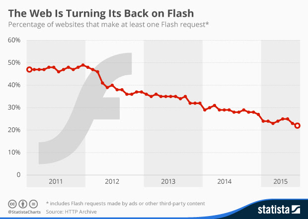
Seriously? Sorry, we don’t mean to be offensive, but have you been living under a rock? If your website utilizes Flash, pick up your phone now. You need a redesign. You are broadcasting to the world that your business does indeed drag its knuckles on the ground. Apple’s Steve Jobs forcefully stated his reasons for not supporting Flash on iPhone and iPads back in April 2010, yet incredibly, over 20% of websites still make a Flash request.

Statista-web-is-turning-its-back-on-flash

#4

Your website takes too long to load.

Sure, those graphics and that video were spectacular when you launched your new site just four years ago, but now no one is waiting around to see them. 47% of users expect a web page to load in two seconds or less, and 40% of users will leave a website if it takes more than three seconds to load {source: Econsultancy}. You work so hard to get eyes to your website, don’t make them leave because you haven’t upgraded it.

#5

Your website’s lost that lovin’ feeling.

And it’s gone, gone, gone. Once your page finally loads (see #4. above), users form an opinion in 0.05 seconds {source: Kinesis Inc.}. According to the NN Group, you have 10 seconds to leave an impression and tell them what they’ll get out of your website and company before they leave. So ask yourself, Does your website’s homepage pack a punch with a sharp, concise message that’s well supported by its graphical design?

#6

Your website is text heavy.

Like it or not (and we at Designing North Studios are book lovers, so…), people don’t take the time to read much text online. If your website has page after page of paragraph after paragraph of text, nobody is reading it. That doesn’t mean you can’t have downloadable white papers or product descriptions, but it probably does mean that it’s time for a website overhaul.

#7

The carpet doesn’t match the drapes.

Regardless of your interpretation of that metaphor, it drives the point home. In this globally competitive landscape, your prospective clients and customers don’t need any surprises. At least not negative surprises. If you fancy your legal practice as the go-to tech law firm, but your website looks like your nerdy nephew pasted it together in 2007, you better believe that when the innovator with the IPO of the decade checks out your site, he’s going to question your tech bona fides.

#8

You’ve expanded globally, but your website is English – only.

If you expect to be a serious global contender, whether in eCommerce or as a service provider or thought-leader, you should consider offering your website in the language of the target home country. This is a big decision by the way. While digital translators have come a long way in the past decade, they are still imperfect. We know. We’ve tested them. Capiche? You’ll need to employ native speakers to assist in the translations, and you’ll need to be committed to translating future updates as well.

#9

Your website hasn’t kept up with your competitors.

If you go online to check out a restaurant, you expect to be able to review its menu. So if you’re running a string of restaurants, and don’t display online menus, don’t expect to accumulate new customers via the Internet. Similarly, if you’re part of the premier orthopedic group in your town, but that practice across the tracks has a website that allows patients to cancel or modify appointments online rather than sitting on hold, as long as they’re not bolting patellae to scapulae, you might get lapped.

#10

Your website adds no value to your customer/clients.

Over two decades ago when I started in this business, it was the Wild West. Nobody was quite sure what worked best. Many businesses just slapped something up on the web to ensure they had a Yellow Pages style presence. Every now and then that still works, but those instances are declining precipitously – think sliding down Everest on a bobsled precipitous. Equally, the websites that are sell, sell, sell are much like watching those insipid infomercials – you want to change the channel as soon as possible. If you’re selling jeans online, are you showing them paired with cute tops and shoes for outfit ideas? Do you have an FAQ section or a blog post about the various denim textures that you sell or a calculator that allows the customer to input their measurements, then spits out a recommended size? If you’re a law firm, does your home page cite a couple of recent cases to illustrate how you would approach a prospective client’s case? Do you offer periodic free tips to your corporate clients that might keep them out of court? Take a good hard look at your website with fresh eyes. Are you helping or just spamming and prattling?

Conclusion

Look, despite the fact that we are embedded in this business, the pace of change is annoying to us too. Just when we can operate a software platform in our sleep, the provider releases an upgrade. We’re not always a first-adopter; sometimes playing a little wait-and-see can be valuable – but eventually we have to bite the proverbial bullet. Plus, all of these upgrades (software, websites, computers, smartphones, etc.) and the concomitant re-training associated with them are expensive. Double sting. That said, what we’ve presented here are not the latest innovations or ephemeral trends. Our Top 10 Reasons You Need a Website Redesign are, in our professional opinion, clearly established indicators that if ignored, may profoundly impact your business in the near future.

Questions? Did we miss one? We would love to hear your thoughts –

Crows and Design Strategy – Cracking the Nut

Crow-BW-walnut-designing-north

What do crows have to do with design strategy? One could easily argue that crows are rarely cast in a positive light. Think of the phrases associated with the ebony fowl: You old crow; Cackling like a bunch of crows; Eat crow; and for us women, the dreaded Crow’s feet. I mean really – we call a flock of them a murder of crows. These guys have a serious PR problem, so why the metaphor?

I live in the country and work from my home office, so much of my thinking is influenced by the outdoors. As I walked my dogs early Halloween morning, I was once again struck by the annual highway located 50 feet above my head. Our property lies about a half-mile (quite literally as the crow flies) from a walnut orchard. Each autumn, the crows mount an industrious effort to harvest said orchard.

Over the years, I’ve come to realize that the tufty endeavor is in fact a highly organized and strategic operation. Beginning at dawn, a squadron of the first airborne descends on the farm. Each pilot grabs a ripe walnut that has dropped to the ground, then begins the long flight to base station. They fly in two lanes on two separate highways. The outbound crows carry their full payload, while the inbound crows have already stored their assets at base station. Free of walnuts, the inbounders cackle encouragement at the burdened outbounders.

Squadron leaders intermittently accompany the outbound crows. They do not carry nuts, but instead coach the neophytes along their flight path. I like to imagine that they are offering suggestions for course adjustment and flight refinement. By late morning, work has ceased save for a few crows on maintenance duty.

Beyond their remarkable coordination, the crows have developed an ingenious method of cracking their walnuts. When we first moved to the sticks, I pitied the crows that accidentally dropped their walnuts on the pavement as I drove down lonely country roads. After another neighbor complained about the walnut shells and crow feces on his tennis court, it occurred to me that none of this was accidental. The crows deliberately drop the walnuts on hard surfaces to crack them. If they don’t break the first time, they shovel them back into their beaks, fly a little higher, and drop their bombs again. It certainly saves some serious headaches from incessantly pounding your beak against the near impervious shells.

crows-walnut-tennis-court-bw-designing-north

Despite their bad rap, we can learn a lot from our feathered friends with respect to good design practice. There’s no question that they have studied the problem of how to efficiently transport their winter food source from Point A to Point B. They’ve developed effective processes for their airborne armada. Each soldier knows his role and the mission of the team. Practical feedback and encouragement is given by team leaders. And finally, through what was likely an iterative process, they arrived at a creative solution for cracking the nut.

As Henry Wadsworth Longfellow once said, Method is more important than strength, when you wish to control your enemies. By dropping golden beads near a snake, a crow once managed to have a passer-by kill the snake for the beads.

While we are not the largest digital design studio in California, like the crows, we do employ proven methods such as discovery and research, iterative processes, creative solutions and innovative approaches through re-imagining experiences to help our clients shrewdly rise above their competition and cleverly crack the nut.

What about you? Had an natural epiphanies lately?

Her Life, Our Future: How Linked Foundation Found Their Way

Why is Dorothy Largay designing north*?

She’s a technophilanthropist on a mission to change the lives of women living in poverty in Latin America.

Don’t let the diminutive figure of former director of worldwide leadership development at Apple, Inc. fool you.

Despite her petite frame and soft voice, Dorothy Largay is nothing but high-density energy. And we are all blessed that she is directing both that intrinsic verve and her financial resources to make the world a better place.

After receiving a ‘windfall’, both she and her husband, former Google Vice President of Engineering Wayne Rosing, decided to focus their talents and treasure on the things that interested them most. For Dorothy, that meant launching sustainable and scalable health initiatives in Latin America, and for Wayne, it meant developing a global network of telescopes to advance astronomy.

Because of Dorothy’s Linked Foundation and its dynamic partners, thousands of women and their families now have access to basic health needs through their rural pharmacies models.

Dorothy treated the foundation like a start-up. It was 24/7 to start, but is now chugging smoothly along, thanks to hard work, a great team, learning from mistakes, and sharing successes.

“My husband and I have a very nice life, but we wanted to keep it simple – uncomplicated. We didn’t want to spend our time managing our ‘things’. That has zero interest to me – too much complexity. We were excited about the potential to make real change in our own lifetimes.”

Read Dorothy’s 10-year Linked Foundation anniversary interview written by Designing North’s Head of Marketing Julie Farrell here.

Check out more on Linked Foundation’s initiatives here.

*Many people in this world “add a little extra” to whatever they do: their career, how they live, the relationships they nurture, or just a random act of kindness — and we consider that *designing north* — designing your life and living it just north of the average bell curve.

Dorothy Largay is designing north. Are you or someone you know? Tell us. We’re looking for the global count.

Northern California
studio@designingnorth.com
© 2018 Designing North Studios. The Creative Division of The Carrera Agency. All rights reserved. Privacy | Terms