Digital Designers and Drug Dealers: We All Need The User

Nobody wants to be called a user. In grade school, that meant you only pretended to be friends with Tina because you really liked Amy. User. In high school, when your mom found Jack’s badly rolled joint in your jeans pocket on a pre-wash inspection, she freaked. Oh my gosh honey, are you a user!? But once you found yourself in the digital design world, the seemingly unsophisticated and often maligned moniker ‘user’ took on a more positive mantle. In fact, it opened the door to thought-provoking conversations about design, experience, and the joy that is felt as people interact with something that is well-designed. More recently, it’s being treated as an undesirable label again, attributed to a form of rather careless behavior on the part of the digital labeler: Oh no, we shan’t call them ‘users’.

Sigh. I think we’re going to have to toughen up. The practice of UX (User Experience) in its classical sense, demands a conceptual context with a blend of human factors and ergonomics that without a doubt, needs a user. Co-founder of the UK-based agency Clearleft, Andy Budd, recently participated in a lengthy and enlightening interview with Digital Arts that thoroughly covered his take on the biggest morphisms in UX; much of which relates back to the term ‘user’ and its unique meaning for the niche specialists who use it as a part of their profession. Andy illuminates the classic UX designer role while educating his audience on the murky waters surrounding title confusion within the field of digital design.

Watch the full interview here: Digital Arts UK | UX in 2016: An in-depth discussion of today’s big issues with Clearleft’s Andy Budd

We can’t all possibly be UX designers can we?

Over the past five or six years an interesting shift has taken place within the digital design market that has resulted in mass confusion among the greater industry. This includes clients of design firms, employees within these firms, as well as new professionals who are seeking to join the industry in their career search. As Andy points out in the interview, this shift in professional title and qualification is simply a result of supply and demand. As demand grew rapidly for classic UX designers, supply couldn’t keep up, leaving prime opportunities on the table for other designers who have similar skill sets. In theory, a niche group suddenly opened its door for others to join the cool kids.

Before we share any further insight from Andy Buddy, let’s quickly cover the core competencies that make a UX designer such a commodity in the first place:

  • Interaction Design
  • Design Research
  • Information Architecture
  • UX Strategy

Many industry professionals fail to recognize that UX design is more scientific theory with well over 20 years of practice behind its title. In fact, the UX community should be looked at as a body of knowledge in its own right that is approached with well tested theory and dedicated practice.

If we go back to Andy’s point on not seeing enough initial supply in order to fulfill the demand for classic UX designers, we can understand why it was fairly easy for other skilled designers from slightly different disciplines to fill the void. From a client’s perspective, it’s not easy to differentiate between all high level designers while identifying exactly what expertise they need for their project. This explains why a large number of predominately visual designers (or UI designers) have filled the gap in supply and demand with a quick transition into the UX field. They may be talented within their area of expertise, but that’s simply not an automatic qualifier for the UX title, and the same goes for all speciality design fields.

UI designers are often experts in:

  • Visual Design
  • Interaction Design
  • Experience Design

In addition they commonly follow the mindset of:

I designed an experience, I then designed a thing, so I must be a UX designer. Andy understands this reasoning but proves that it’s a bit misleading as he explains, “I believe you can’t design an experience. You can only try, and that it is much more of “a layered practice” with lots of practitioners adding to that experience.” We believe the same. You can’t design an experience, but you can design strategic paths for it to unfold. We can see first-hand that this idea of everyone being able to call themselves a UX designer is causing the strategic approach of design to be overlooked and possibly even archived for some unknowing clients. For a large pool of clients who understandably don’t know exactly what kind of ‘U’ or ‘X’ or ‘D’ they should be looking for, they may be finding talented individuals, but might not be finding the best tool for the task at hand.

The simple truth is that you need specialists when you are building complicated things. Andy Buddy said it best, “If everyone is responsible for everything, nobody is responsible for anything.” So lets keep it straight, UX design is not experience design (XD). A classic UX designer taps into the human factors discipline to understand interaction, can analyze your business problem, employs research-based design practices, knows how to structure content, and will strategize your customer journey before any visual designer should even hit the sketch pad. Experience design is broader. It’s what designers want users to feel when they interact with a brand across all its various touch points, beyond digital. It’s the layer of intuition and visualization atop a solid foundation that gets uncovered as the entire design team does its strategic thinking (or discovery). A design team will all be solving the same client problem, but will be doing so from different perspectives and much different lenses. Super key! You wouldn’t use a telephoto zoom lens for a portrait photo shoot unless of course you found out your client was selling the next great acne cream. Then, only your visual designer might insist on real proof and switch up the lens.

No one tool will ever do everything that you need, and the more often companies chase this dream of the multi-acronym designer saving the day, the further down the rabbit hole they will fall. Moving into the future, Andy expresses that designers need to consider themselves as a toolbox. A toolbox full of skills clearly knows what it can do best, but also knows that it may need to collaborate and learn before embarking on complex digital projects.

Designing-North-UX-User-Example

It’s quite interesting to watch the digital design industry burst at the seams with professionals, cringe as the acronyms morph, and sigh as the term ‘user’ gets dropped from many UX conversations. We get it. The subject of UX is a confusing topic and it doesn’t show signs of simplifying anytime soon. Whether the term ‘user’ is considered impersonal, not representative of a project’s defined persona, or even feels a little drug-den-ish or mean, it’s still an integral front-end component to the Experience Designer title if that’s what one is really practicing. In some disciplines, redefining titles to better align with a more familiar subject is appropriate (like, vice-president of people vs. vice president of human resources) but that’s not the case in this design realm. In a way, removing the U from UX would be comparable to asking a chef to make your favorite meal without him inquiring as to the name of your dish, or at least some hints on a food group. Or better yet, it’s like Jack’s joint getting that whirl in the washing machine: Mom didn’t do her usual ‘research‘ and just wanted your jeans to ‘look and feel‘ pretty.

As the industry moves forward, it’s vital that rising design leaders receive broad exposure to all the various lenses and mindsets of UI, UX, XD, IxD, et al. In doing so, they will be better suited to bring the right mix of design minds to the table while trying to create a collaborative environment and strategic approach for client projects. With so many X’s in our world it’s not shocking that the classic discipline of UX has been misrepresented through title confusion and task semantics. Regardless, the interesting evidence in throwing around the UX term so liberally is somewhat indicative that more and more clients and designers are recognizing that digital projects are indeed complex and strategic exercises: touching all aspects of a client’s business ( marketing, sales, customer service, IT, HR, etc.) Digital agencies like us understand that no longer are we in the website design business. We are in the crafting customer journeys business. And like so many of us operating in our own dark den somewhere: we all need the user.

Do you subscribe to Designing North Stories yet?


Inside The Designer’s Studio: Jennifer Hillman-Magnuson

Meet Jennifer Hillman-Magnuson, author, mother and “peanut butter smuggler” who with her family, resides full-time in the beautiful state of Oregon. This wasn’t always the case. As an accomplished writer who began her journey with the likes of Nickelodeon, Jen’s creativity flows in her imaginative writing style and memoirs that are wildly entertaining. Author Jennifer Hillman-Magnuson as DN Podcast Guest

WTF is a “peanut butter smuggler”? I hear you say. Well, fly-by-the-seat-of-her-pants mom, Jennifer Hillman-Magnuson happens to be the author of the hilarious book, “Peanut Butter and Naan: Stories of an American Mom In The Far East”, a memoir that documents the real-life challenge of moving a family of seven from cozy Nashville, Tennessee to Chennai, India. Knowing that her family’s favorite snack might not be readily available in Chennai, Jen packed her bags with enough jars of PB&J to last weeks–a move that TSA likely had some questions about.

The process of documenting her life abroad became a reliable means for Jen to communicate with the family and friends that she left behind in the west. In a place where electricity supply is inadequate at best, the telephone and internet were a thing of luxury. After being persuaded to turn her journals into a permanent record, Jen shared her experience of embracing exotic culture while keeping a piece of Uncle Sam alive for her kids. From rubbing shoulders with Nashville’s music elite to a fully non-rock-and-roll experience in the depths of India, Jen’s memoir is a candid window into what an all-round American mom could expect to find in the far east.

With a reference to the 2014 science fiction action film Lucy, Nigel reveals that movies provide a necessary escapism for the hard working mother and acclaimed author. Even a writer needs an outlet every once-in-a-while. Although verbal story telling provides much of her modern entertainment, Jen’s foundation in journaling laid the groundwork for her imaginative storytelling abilities.

Journaling to create lasting memories is one thing, but writing and eventually publishing an award winning book is quite another. With the success of “Peanut Butter and Naan…” behind her, Jen is excited to reveal her latest book: “Wither – Acute Stories of Shame and Other Embarrassments”  in which she catalogs the sometimes uncomfortable descent of mortified individuals into a fiery pit of face-burning embarrassment. The book pays homage to the brave souls who shared their jaw-dropping stories with the public.

And, as if her world wasn’t busy enough, can you guess what Jen would be if she wasn’t a writer? Here’s a hint: Egon Ronay vs. 007 would be a fitting title.

Happy listening.


Do you subscribe to the Designing North Story yet?


Bright Digital Futures: DNS Interns

As September and school are just around the corner, we were reminded of last summer’s interns. In an effort to provide some meaningful digital experience to up-and-comers, we hired three bright young men to intern at Designing North Studio’s: Zach Furman, Max Peacock, and Matt Sorrentino.

All three had already dabbled in some form of project-based digital design and development for friends and/or for pay. Nigel (head of technology) and I created a practice project replete with a challenging client – I was that challenging client.

Their task was to develop a WordPress blog based on a purchased theme, which would utilize a number of plug-ins and widgets. Nigel introduced them to the Agile software management methodology, then aided them in establishing program timelines with scheduled sprints, as well as arranging for multiple weekly stand-ups, and weekly client meetings.

This week, as summer comes to a close, we checked back in with each of them to determine what they learned whilst at DNS, what they’re doing now, and where they see themselves in the next five years.

Zach Furman

  • What he’s doing now:

    • balloons-standford-zach-furmanZach will be a junior in high school this fall in the Bay Area. He’s already way ahead of the curve with experience in Python, Ruby, JavaScript, MySQL, HTML, CSS, MatLab, and jQuery. He’s been developing websites for an array of local clients for the last couple of years, and is an integral part of the Stanford Student Space Initiative (SSSI) – a student run collective that launches high-altitude balloons. Zach’s role on the team? He’s writing the algorithms for determining the balloon’s optimal altitude over the course of its flight. Imagine what he’ll do when he turns 18.
  • Top take-away from DNS internship:

    • “I already had some coding skills – I’m decent at that – but what I lacked were design skills. Lisa really helped me with making things look good – the way the client wants it.”
    • “I also learned how to deal with clients better. I learned a lot about communication, which has already come in handy in the last year.”
    • Zach said he put in about 70 hours on TreeHouse learning more about working with WordPress during the course of the internship, which he found beneficial as well.
  • Next five years:

    • Zach sees himself attending college after he graduates from high school and majoring in something in the sciences – maybe computer science or aeronautical engineering.

Max Peacock

  • What he’s  doing now:

    • Max will be starting his second year at Cabrillo College in Santa Cruz in a couple of weeks. This summer he’s been working away at a local juice and smoothie shop, but he’s not just buzzing the blender. As a new small business, the shop hired a local high school kid to create its website and branding. After things got rolling, Max offered to dive-in and update the shop’s digital and physical image. He’s redesigned the menus, the window art, and now he’s about to embark on a website redesign.
  • Top take-away from DNS internship:

    • “I learned how to work with themes in WordPress, and how to install plug-ins, but the most challenging bit was learning how to work with clients. Lisa did a good job of being a tough client. We had to learn how to work with her without overstepping our boundaries.”
  • Next five years:

    • Max has one more year at Cabrillo, then he’ll transfer to a four-year college and major in graphic arts and communications. He prefers the creativity of the design side of the digital world to what he sees as the drier tech side. After obtaining his degree, he’d like to work for a big design firm to gain experience – and maybe one day open his own studio. Would he rather work for a big corporation within its design department? “No. I think that would be too limiting creatively and from an experience standpoint too. I think a large design firm would offer more variety in the way of different kinds and sizes of clients from different industries.”

Matt Sorrentino

  • What he’s doing now:

    • Matt has spent the summer working at a country club in New Jersey, sometimes caddying, and sometimes working indoors. He’s also continued to help out a buddy of his who runs a shoe company. Matt designs a variety of graphics for him. In a few weeks, Matt will start his senior year at William Paterson University in New Jersey.
  • Top take-away from DNS internship:

    • “Being in an authentic business environment with a “real” client and dealing with that real client was a big deal for me. We were on a regimented schedule and were working in a team environment. As a matter of fact, I used the experience I gained at Designing North in some of my school presentations this past year.”
    • “Another cool thing was that even though I was in New Jersey, we had no problem communicating as a team or with the client. We were able to accomplish a lot using Google Hang-Outs and email.”
  • Next five years:

    • Matt is finishing his BSA at William Paterson this school year, and is particularly interested in the publishing world. Print or digital? “Either one. I really like both print and digital, and would love to work for either an online or print magazine. I like the creative aspects of having each issue be different from the last, and therefore unconstrained creatively.”


The DNS take-away:

We were privileged to work with these three talented, aspiring guys. Being technically savvy and creatively talented is only half the equation to the successful conclusion of digital product design and development. Our interns learned how to work in a team atmosphere, and how to communicate with, and effectively manage, a client who wasn’t quite sure what she wanted. We are confident that each of these young digital dynamos will accomplish whatever they set their minds to. #BrightFutures


Do you subscribe to Designing North Stories yet?


What We Do at Designing North Studios

Designing North Studios

At DNS, our goal is to always deliver a hover above. To deliver what was asked for, but with that little extra – something just “north” of good. This approach, this mindset traverses our people and our three main service offerings: Digital Design & Development, Brand Strategy, and something we like to call: Rent-a-Star.

Digital Design & Development

Web design has come a long way since ‘Al Gore invented the world wide web a couple decades ago’. Think of it, when was the last time you used the Yellow Pages? For some of you, the answer is never. Now, web design has evolved from “hanging a shingle” to “creating an experience.”   A digital experience that should develop, complement, and pave the way to brand loyalty and ultimately conversion. A website, web or mobile app has to compete for eyeballs. For attention. It must captivate, be experiential, and then convert. Convert from a user, to a participant, a subscriber, a buyer, a champion.

At Designing North Studios, we know this. Whether we are engaged in a pure branding gig, a website redesign, a new digital product idea, developing content, or engaging in strategic initiatives around your product or social media landscape, all roads lead to experience. That it be aligned with your brand promise and values, be purpose driven, memorable, and make it easy for your peeps to return. Again and again. Face it: when any experience is good – people like you. They want to hang out, come back, hear more – they trust you. And so they should. If what you’re selling, saying, pitching, or bitching about is true – it’s only a matter of time before your friends become influencers. So we help you get real about your digital product: what it is, who it’s for, and what will make it successful.

Brand Strategy

The most important part of getting to the heart of of being the brand that you are, and delivering on that promise, is spending time (and money) on the discovery phase. This is when, through listening, questioning, interviewing, brainstorming, (and even sometimes stick drawing), people like us come to understand your organization, and what that currently looks like to an end user, customer, or prospect. The best free advice we can give you: never skip this phase – no matter what firm you select to help you with your next project. Discover who you are currently, and see if that aligns with who you really want to be. And then reflect on all the ways that can get you there: change your product, pivot your service, re-evaulate your audience, re-position your message, or perhaps, stay the course.

We’re here, and would love to start listening.

Rent-a-Star

Sometimes you just need a hand (or at least think that’s all you need). We see this frequently after the start of the New Year. All of that marvelous planning for the upcoming calendar year includes projects that require staff skill sets that you ultimately realized: you don’t have. Oh, and there was nothing in the budget for additional headcount either.

If this sounds too familiar (too real) – we might be able to help. Designing North Studios is an amalgam of designers, developers, and project leaders who have worked either remotely or directly with one another over the years. Most of us, with exception of a few pay-rolled diehards, freelance for DN. But we’re still a family.

That said – our model can be very beneficial to organizations that operate on a human-asset-light basis. If your organization finds itself in need of a designer, developer, or project leader for stints of less than a year, we can likely supply you with a vetted professional. Are our people good? We think so. Every one that’s part of the team first works for DN directly before client work is even an option. We learn a newbie’s skill set and their mindset – and if it fits: they are deemed fit to move on to play with clients. Our reputation is on the line. But we also know that you’re only as strong as your weakest link. We’re not harsh – we just uncover the best in people and nurture it. So if they sit with you for a while, instead of us, they are ready. Our team aligns on work-ethic and soul – producing Designing North Stars – together making each other brighter.

Bootstrap/Material Design vs. Custom: When a Designer Goes Rogue

We periodically receive requests for advice from friends and colleagues. If you’re not knee-deep in design mud on a daily basis, it’s easy to wonder if things are going along the way they ought to be. And it’s equally common to wonder if you’re spending your design dollars wisely. You want to be fair, but not taken advantage of. You want to make sure that nobody is blowing smoke…

Here’s a recent one that we thought might be useful to more than just our friend:

I contracted out a designer for our company to help us design our new Web app experience. We had wireframes in place so I needed someone to bring them to life.  One of the requirements I gave him upfront is that we have a very weak front-end development team and my preference was we built the design off a Bootstrap/Material Design theme.  He didn’t show any resistance to this early on.

As the project progressed, I noticed that he wasn’t using any themes and, instead, was creating his own design.  I called him out on it and he went back and swapped some of the visual components with ones from Bootstrap (e.g., paging control).  I, then, did a full assessment on his comp and found that almost all of it was custom.

I brought this up to him and he started getting defensive saying that I shouldn’t have hired him if I just wanted him to a apply a theme.  So, I’m in a bit of a bind.

What’s your perspective on Bootstrap/Material Design vs custom?  For our company, it’s most important that we move fast (even with weak front-end development) and provide our end users a super simple experience.

Hmm. A few things come to mind here:

The planning, the agreement, the approach.

There are a bunch of Material Design framework themes based on Bootstrap that already exist – did you guys start there? “…build the design off a Bootstrap/Material Design theme.” If you purchased an existing framework, then I don’t know why the designer didn’t follow and work with the purchased theme – seems odd if that was the plan. If you did not purchase a theme, was the agreement clear as to what you meant by “…build the design off a Bootstrap/Material Design theme?” Because Material Design is more than just color and visuals, it also offers tested layout principles to follow (particularly with regard to the interactions around the Android OS) – but the approach to working with Material Design can and should be interpreted/considered/potentially mixed if designing for both Android and iOS.

As for getting defensive around working with a theme, it still takes design talent to work with a theme // but you need some code chops or a good developer partner to actually execute against a canned theme well – it’s not an out-of-the-box exercise.

As for my opinion – both options can be expensive and turn out badly without a good upfront plan. If you get a rock star designer that understands how to design for a developer – then custom is best. If you get an all-in-one designer/developer that finds it easy to work and pull apart a purchased theme, great – but that’s likely a designer-focused person who can hack at the code vs. a developer who can follow a design aesthetic  (good developers hate purchased themes, faster to do stuff from scratch). But if you were just trying to follow the principles of Material Design so as to execute good UX – then the designer and developer should have been working closely from the beginning. And they both should have known to ask for that up-front.

fast=crap // slow=crap // appropriately steady=quality.

Got a question? Shoot us an email.

Creative Inspiration – Something to Chew On

This is an extraordinary time to be a creative person. To survive as an artist in the Middle Ages or during the Renaissance, you needed to have a sponsor, a patron – perhaps a pope, a Medici, or a Holy Roman Emperor. Today, photographers hawk their compositions on any number of stock photography websites; writers can create their own blogs for a fistful of dollars, augmenting their income with freelance posts; and digital designers can create clever website designs as independent contractors. A creative type can effectively create his or her own marketplace.

DN-Lightbulb-photopack-217_1024Yet the strain to satisfy the insatiable beasts that are content marketing and competitive creativity can sometimes be overwhelming. The Information Age is just that: an age that is exploding with information. At times the glut of information bombarding one’s senses either drives the creative person into an entirely catatonic state or catapults him or her into a state of utter pandemonium – numb or crazed – take your pick. Either way, creative output is essentially paralyzed.

All of us sometimes become trapped in creative morass, so we thought we would share some of our favorite ways to break free and get into the creative zone.

We’d love to hear what yours are too.

Chris Mohler – Creative Director

  • Taking a long drive
  • Blasting music
  • Taking a walk on the beach

Andra Gheorghe – Designer

  • Anticipating an upcoming vacation frees my creative spirit + a Nespresso coffee with milk and sugar

Paul Gergely – Product Designer

  • I’m inspired when I’m around people who are great at their craft (doesn’t have to be designers or people in tech – just people who are great at what they do)
  • Early mornings at the office or my local coffee place – just getting some place where there are few distractions – where I can “get lost in my head”

Dolfin Leung-Melville – Marketing Director

  • Browsing through photos/designs/layouts/from print or online materials for inspiration
  • Searching with keywords online
  • Riffling through a stack of magazines to see what jumps out at me
  • Clearing my head with long walks with my dogs

Madalin Slaniceanu – Designer

  • Listening to music and chilling out

V:shal Kanwar – Creative Director

  • Ambient sound drives my creative energy – the right music can help emote the right visuals for a particular project, and the wrong background humming (static sounds, buzzing, people having annoying conversations) can really throw off my chances for finding that moment of design epiphany.

Julie Farrell – Head of Marketing

  • Nature first and foremost – long walks in the sticks or long bike rides through wine country where I live
  • Reading, learning, traveling – sounds corny, but learning or experiencing something that’s tangential to what I’m doing at work often shines a new perspective on a creative topic/problem

Me – Lisa Peacock – Managing and Executive Creative Director

  • Doing anything away from my computer: showering, gardening, motorcycle riding, cleaning house, working out, decorating the house
  • Riffing about a specific creative goal itself with other smart people
  • Sitting quietly alone with something that has moved past a blank canvas
How about you? What gets your creative juices flowing? Tell us!

Walking the talk – Design comps – A hover above

Small triumphs

Our industry is no different than any other. Some weeks are more of a grind, littered with meetings and deadlines. Others are punctuated with small or large triumphs that energize the team, the project, the day, the week.

This last week proved to be the latter. Our tagline at Designing North Studios is, “It’s not a location. It’s a mindset.” We aim to consistently deliver north of expectations – a hover above what’s expected. This week, after working around the clock, quite literally around the world, we presented design comps on a very large project (still cloaked in secrecy).

Exceeding expectations

Instead of delivering the minimum number of contractually obligated design comps, our design team provided twice that. They were on a roll, and let their creative juices and our discovery findings be their guide. Because we are responsible for providing content, we were also able to include key messaging that led to a more authentic initial experience for the client. Hence, the client was able to grasp true manifestations of the end product in a variety of styles and formats.

The client had provided good direction in the form of inspirational websites, but in the end, the winning design took the benchmark websites to another level. The client was able to see what they had initially imagined, and then, although they liked those concepts, they were able to confidently eliminate them as a design direction. They weren’t wondering, “What if?”

A good  kind of unusual

The selected design direction featured key elements of the inspirational websites, but cleverly incorporated the client’s branding guideline components in an unexpected way. Or as the client said, “…in an unusual way – the good kind of unusual.” Our designer had provided three variations on his particular theme, so the client was able to pick and choose the favored blocks for moving forward. We concluded the design comp review (all done on GoToMeeting from coast-to-coast) with great enthusiasm and excitement for the next stages of the project.

The seminal lesson here was that the extra effort was not at all wasted. By seeing several concepts of what they thought they wanted side-by-side with a more innovative approach, the decision process was unambiguous. Thus, the overall project can proceed with greater confidence, and likely with less iteration.

More soon!


Not a subscriber? Jump on board.


The Age of Mobile – Downton and Design

The month of January is always rife with expert predictions about trends in the New Year. Some are outlandish, some are wishful thinking, and some are on target.

One area that we believe is on target is the continuing march of mobile supremacy over its desktop relatives. If you’re a fan of Downton Abbey, you might compare this transformation to the devolution of Britain’s aristocracy following the Great War.

With the superb vision of hindsight, we are amused at the desperate grasping of the Dowager Countess Violet Crawley and Sir Michael Reresby of Dryden Park (Season 6 Episode 3) to the old ways. They both believe that if somehow they can maintain the status quo just a bit longer, these nagging fads (fewer servants, women without escorts, the lower classes seeking improved circumstances) will soon fade.

Sometimes, we wonder if these ostrich thoughts are running through the buried heads of those who are not concerned about their non-responsive websites. Do they think that mobile phones, phablets, and tablets are silly trends that will soon fall out of vogue?

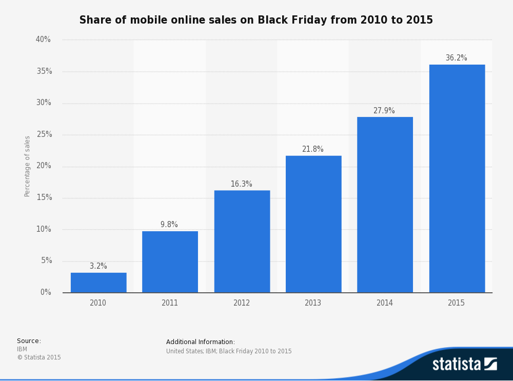
Like Countess Cora Crawley last Sunday, we’ve done our homework. Take a look at the share of mobile online sales on Black Friday in 2015. A full one-third of online sales were executed on mobile. And look at the trend – talk about a march. Those stair-steps remind us of another January activity – New Year’s resolutions and working out.

statistic_id247195_black-friday_-percentage-of-mobile-sales-2010-2015

So if you don’t have an eCommerce website, are you off the hook? Nope. Let’s not forget that mobile passed desktop in Internet usage in 2015. Oh, and that Google will potentially penalize you for not having a mobile friendly site. No big deal unless you want prospective clients/customers to find you when they are searching in your industry.

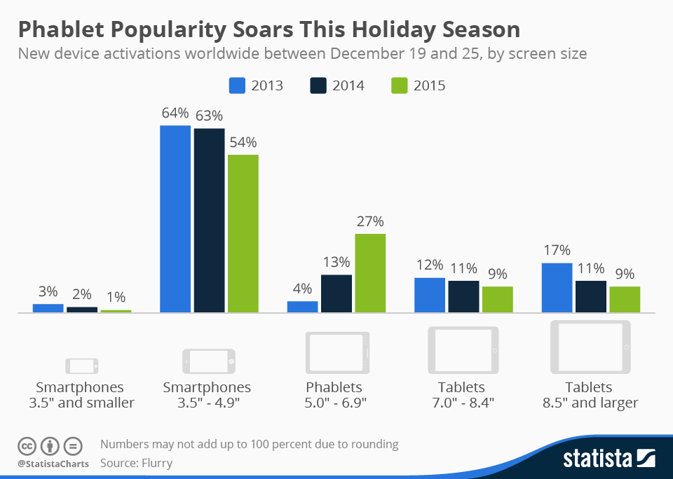
Take a look at new device activations during the holiday season. This chart might take a moment to digest. But here’s the big bite: People like their smartphones and bigger smartphones (phablets), more than tablets. How’s your website looking on your cell phone?

chartoftheday_4184_holiday_season_device_activations_n

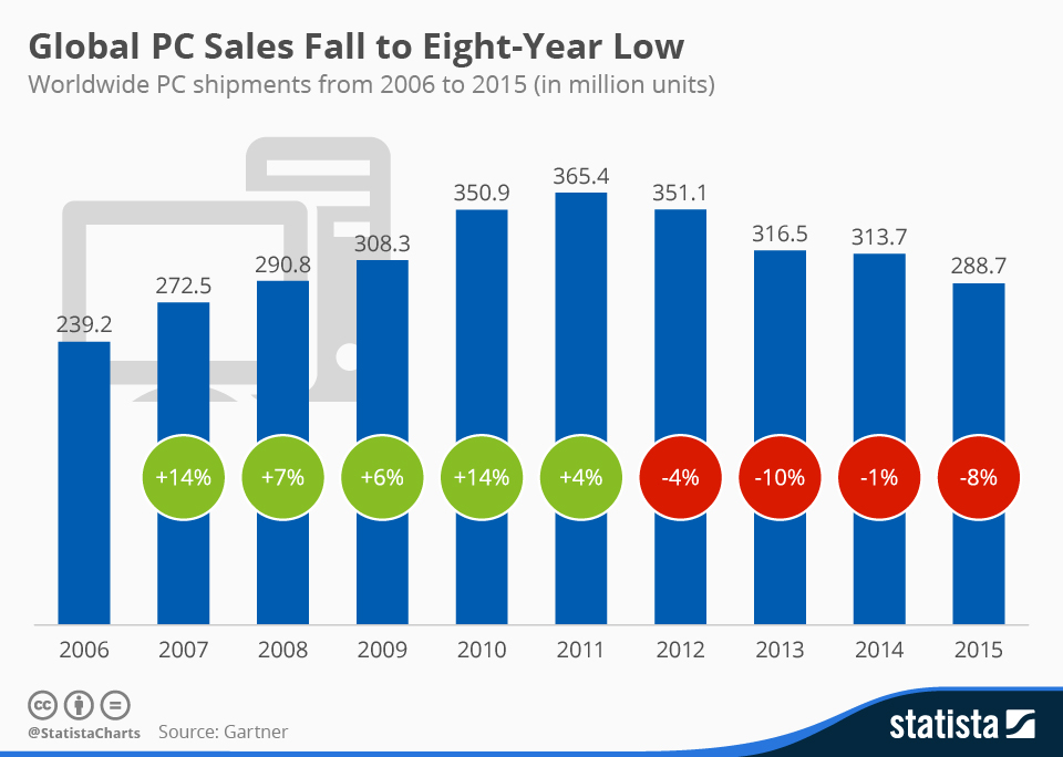
If you’re having trouble letting go of your valet or lady’s maid, we have one last chart for you. While we don’t believe that people are abandoning PCs, the last three years have not been particularly kind to the big lugs. The strength of the U.S. dollar may not have helped overseas sales, but analysts see structural changes on the horizon leading to fewer people using PCs.

chartoftheday_4231_global_pc_shipments_n

Look, we know it’s tough. Mrs. Patmore is still struggling with her new refrigerator. But it’s time to get on the Branson, Lady Mary, and Lady Edith rail car. Let’s talk about getting your website ready to embrace modern times.

My, How Design Has Changed


That sounds a bit like a grandma or a too-doting-an-aunt remark. But now and then I’m overwhelmed with conflicting feelings about the current state of digital design. When I started some two decades ago, it was a holistic, all-consuming affair. I studied media arts & graphic design at the University of Arizona, and web design & usability at UCLA when they were embryonic topics. I led Ernst & Young’s bicoastal design team for its Center for Technology Enablement group when email was just beginning to replace the interoffice memo.

Sure I’ve evolved. I no longer write HTML from scratch. We employ BaseCamp, Asana, Pre.Vue, Slack, and Skype to communicate and manage projects instead of the hand-built HTML project sites I used to craft. I rarely sit in person with a hefty laptop to present design concepts or wires to our clients – we meet virtually with Google Hangout, GoToMeeting, Join.me, or BlueJeans.

The scheduled photo shoots with a lighting guy, a stylist, and an assistant to nab the right shot for brand, web, and print pieces has morphed into the hunting, decision, and purchasing process from sites like Stocksy, CreativeMarket, VisualHeirarchy, et al. Designers can combine hi-resolution photography with well-designed themes, PSD smart objects, and helpful vector layout kits (not to mention Sketch). Laboring for hours over code to produce clickable user experiences is over – InVision, Solidify, and Axure have deftly allowed our team to provide UX prototypes for our clients that already look real. This ensures a collaborative, iterative design process that’s both quick and cost-effective.

As a firm, we still insist that clients do not skimp on brand development. But the basement competition allows you to flash a five-dollar bill on Fiverr or a couple hundred bucks on 99 designs – presenting a logo as a *brand* to the unwitting. Even websites can be quickly produced by the layman with SquareSpace, Wix, and the forthcoming phenomenon of The Grid.

And yet, as much as it sometimes feels as if a once respectable vocation has turned into a used-car business, I must say, I relish the change. Now small businesses that could not have afforded design studio contracts can have a relatively professional looking digital presence and take advantage of our increasingly digital economy. For these smaller clients, design studios might now be able to play a more strategic role, offering direction, consultation, and best practices.

In a sense, this evolution has sculpted the brand identity of our virtual team at Designing North Studios. We’ve been able to aggregate a team of stars who have the deep knowledge to both consult and implement. The digital revolution has permitted us to bring so many stars together because we’re not shackled to a single zip code. And due to the extraordinary volume of noise in the digital landscape, having a team who can make a business audible above the cacophony does add value. We can take our years of experience in listening, researching, strategizing, and finally designing to re-imagine user experiences and create strong brand identities that are intrinsically tied to clear business goals.

I guess it’s okay that I’m no longer slogging through HTML in every nook and cranny of our projects. It doesn’t make me less of a designer. In fact, it allows me to focus more deeply on the creative elements that add that hover above – that provide authentic differentiation. In the end, it’s great design if it successfully accomplishes what your business set out to do. Period.

Thanks for the therapy session. I’m cool now.

Note: I still love and prefer meeting clients in person whenever it works for them!

/Lisa

How about you?  What do you miss? Do you agree that the evolution is a net positive?
 

Not a subscriber? Jump on board.


Top 10 Things to Consider Before You Hire a Digital Design Agency, or…

(The 10 Things Your Best Friend would Tell You if She Owned a Design Agency)

You know the drill.  When you have a big decision to make that’s outside your knowledge wheelhouse, you check-in with a trusted friend for advice.

You twist your knee playing tennis, so you call your old college pal the orthopedic surgeon for advice.

“I’ll make a few calls and get you a couple of names. Make sure you insist on an MRI. And take your old x-rays in – explain your past trauma to that knee – still can’t believe you fell off that table sophomore year. Ask about insurance coverage – a lot of the best surgeons are independent now, and you don’t want any surprises. Your doc should have a go-to physical therapy team – it’s one thing to have a successful surgery, but what happens afterwards is equally important.”

So you’ve decided it’s time for a new website. When you type in your website address on your iPhone, it loads at a glacial pace and the text is microscopic. You’re ticked because you just spent $75K building a new one four years ago. Of course you’ve had two other iPhones since then –  Why does this stuff keep changing so fast?!

No, it’s not fair, but the digital landscape is changing at an exponential pace and you have to keep up if you want to remain competitive and frankly, relevant.

As managing director of a Bay Area digital design firm, here is the advice I give to my best friends when they call me:

  1. DEFINE YOUR GOALS – CLARITY IS QUEEN. As with all strategic planning, understanding your clarity of purpose is paramount. If it’s not clear why you’re taking on this project, you certainly are not going to be able to adequately convey your vision to a design team. If you don’t? No one will be happy in the end. You think you need a new website? Ask yourself and your internal team why. “Because this one stinks” is insufficient data. Why does it stink? “It takes too many steps for someone to place an order.” “It’s terrible on mobile.” “It makes us look old-school – our digital image doesn’t match our edgy physical image.” “Our competition is doing 25% more eCommerce business than we are.” “It’s just not who we are anymore.” Now we’re getting somewhere.
  2. DO THEY CONDUCT RESEARCH? Your prospective design firm should insist on interviewing current customers, partners, employees, and target customers/clients. They need to understand your culture from the good, the bad, and the ugly. Digesting how others perceive what you do well and what you do poorly is key to a successful project. If your prospective agency isn’t asking for clarity and doing a deep-dive in discovery, you’ve picked the wrong pony.
  3. ENSURE IT’S RESPONSIVE. Without going totally geeky on you, put simply:: responsive web design means your website will be experienced and look great on all three of the major digital platforms: desktop, tablet, smartphone. I cannot stress the importance of this enough. Industry data shows smartphone access of the Internet is skyrocketing [add charts here]. Google announced that they’re now penalizing websites that are not ‘mobile friendly’ in search rankings (see #8 below). Friends don’t let friends build non-responsive websites.
  4. ESTABLISH A SUSTAINING BUDGET. You’ll need to write compelling content via blog posts and/or new product descriptions. You’ll want your social channels pointing to your flossy new site. You’ll want to keep it fresh with new photos and new hire bios. You’ll need to have your provider update to the latest platform, plug-in, and widget versions, as well as periodically back-up your site.
  5. ASSESS YOUR IN-HOUSE TALENT. Do you have internal personnel who can adequately address the needs of your on-going web support? If not, will you hire someone, or does the digital agency your considering offer such services?
  6. DO YOU LIKE THESE PEOPLE? Developing a new website or app takes time and substantial communication. And more than likely, you will have some form of relationship with your digital design agency after the product launches. Do you like the people presenting the proposal? Do you trust them? If you’ve got that crummy feeling inside as you walk or login to another meeting with them, think twice before hiring them. This can be fun, you know.
  7. PICK AN INTERNAL POINT PERSON. Make someone responsible for this project. If you’re the owner/founder or president/CEO, you’re probably going to get distracted. Select a highly organized person whom you trust, and let them run with it. Make sure they’re giving you regular updates, and make sure that you give them your undistracted attention. The reason a project misses deadlines is usually due to A) The client taking too long to review work-in-progress (WIP); B) The client not spending enough time in their own discovery stage to clearly define goals and requirements, resulting in a circuitous path to the finish line; C) The true decision-maker is only partially engaged, and when it comes down to final revisions, decides he/she wants fundamental changes.
  8. INSIST ON ANALYTICS BEING INSTALLED AND TRANSFERRED TO YOU. You know the old adage, “If you’re not measuring, you’re just practicing.” None of us have time or money to waste. For perhaps the first time in history, your marketing dollars can be accurately measured against performance.  You need to know what’s working and what isn’t. Google Analytics is free, and will go a long way to help you understand where your web traffic is coming from and which of your pages are performing and which aren’t. Make sure your developer has included analytics in the proposal, as well as submitting your new website to the top search engines (Google, Bing, Yahoo). The agency should set-up a Google webmaster account for you and hand over the keys to someone in your organization. Alternatively, you could hire them to provide you with monthly reports.
  9. INQUIRE AND LEARN ABOUT SEO. If you build it, they won’t necessarily come. SEO stands for search engine optimization. When you type in a search phrase on your computer or mobile device, the search engine (e.g. Google) looks at what you’ve typed, and using a highly sophisticated set of algorithms, serves you the websites links it believes best fits your search criteria. You want your new website optimized for SEO so that people find you when they type in phrases that match the products or services that your company provides. If your prospective digital design agency doesn’t address this topic with you, it’s a signal that they do not have your best interests in mind.
  10. ASK FOR A TEST PLAN. Your digital design agency should be making faux purchases through your eCommerce, complete with credit cards. They need to test the new site’s functionality on desktops, tablets, smartphones, browsers (e.g. Chrome, Firefox, Explorer, Safari) and operating systems (iOS, Android, Windows, OS X, etc.).  What are your expectations for how many versions back they’ll test for?
  11. CHECK REFERENCES. Okay – I had to add just one more. After all, you are hiring people. Call a couple of their recent clients and see what the agency was like to work with. I asked the CEO of a billion dollar company recently how he liked working with a particular high-flying ad agency. On a scale of 1 to 10 he gave the creative product a 9. He gave his personal contact a 2. Was months of consternation worth it? We all have our own thresholds.  What are yours?

CONCLUSION. Jumping in bed with a digital design agency takes some reflection. Be armed with knowledge going into the relationship, and clarify roles – you’ll have a much more successful marriage as a result.

How about you – had any good or bad experiences lately?  Which of our Top 10 is the most important to you?

Northern California
studio@designingnorth.com
© 2018 Designing North Studios. The Creative Division of The Carrera Agency. All rights reserved. Privacy | Terms