The Education Versus Work Experience Dilemma: It’s up for a redesign

Can you really know what you like or dislike if you haven’t experienced ‘it’?

We like to think we can, and often, we convince ourselves that we have the answers for questions to what we ‘should’ be or ‘want’ to be doing for our careers. But when this vision is finally realized, the expectation of excitement and fulfillment is nowhere to be found.  

There’s a good explanation for this feeling or lack thereof: the importance of the ‘it’ too often is overlooked; stripped of its magic as we are conditioned (by the education system) to use research and personality tests as the “governing body” over our professional, and subsequently, personal success in life.

Whether it’s our own fault for simply being human — using our brains to over think our situation — or it’s at the hands of an outdated education system (many institutions are designing innovative solutions to this problem), the education versus work experience conundrum isn’t any easier to solve today than it was ten years ago, and this isn’t a problem we can shrug off.

A better way to learn?

In a conversation with our Executive Creative Director at Designing North Studios, Lisa Peacock, she reminded me of important conversations already happening throughout the higher-education arena, some of which are also being discussed within design fields.

One such conversation, as she explained,“How do we transform learning? Not just so young students don’t waste personal time when they set off on a pre-determined path, but also so that we can educate more people (beyond a residential experience) in the right way (experientially, via distance, collaborative learning, etc) to also solve problems that are becoming increasingly more and more complex as we evolve: the planet, our political system, racism, poverty, war, etc… If higher education doesn’t figure it out (leaving many capable minds for solving such problems behind) there will be no personal time loss to worry about — Life on this planet will be lost.”

Public or private, a university is a business; I get it; I have been a “customer” myself, and am a “customer” this very moment. Yet, the majority of the professors I have come to know well don’t teach for earning potential — they do it for the reward of working with students and serving as SMEs (subject matter experts) in their field. And to this day (seven years later) they continue to develop forward-thinking programs based on producing ‘experienced’ graduates; they are taking the education process one step further than previous generation educators, or better yet, pioneering new methods for students to overcome the challenges of adapting to what life ‘really’ looks like after school.

Should they really have to take matters into their own hands? Sure, to some extent it’s their job, but I see the corporation and executive board sharing in this responsibility with professors — adequate budget and technology tools should come with the gig. Still, when discussing the idea of introducing integrated learning programs based on real-world working demands, the common response is doubt induced by small budgets and staff.   

What’s even more interesting, these professors I observe aren’t working on projects to help students determine what they are good at, and what they find most interesting about their field of study. Instead, they are asking students to physically enter the real world (business arenas across the globe, often in a virtual presence) and identify opportunities that aren’t being met or can be improved upon. From here, skills of interest can be developed into a toolkit that transcends many fields.Furthermore, they are sending their students down a “road of discovery,” where the destination provides clarity on what they ‘actually’ want to do in contrast with what they ‘believed’ they wanted to do. What a concept!

WHAT IF learning on the job was more closely connected with time in school rather than in the workforce; an internship consumed 4-5 years (across multiple disciplines) rather than just one summer. This could provide students with the time needed to make more polished decisions without being coerced into a curriculum based on traditional constraints associated with school: time, money, grades, job outlook etc…

The frustration felt by professors who fixate on a single-specialization approach must be challenging. Given today’s disruption-prone workforce, I imagine they often reconnect with past students who don’t report back with stories of success, positivity, and progression. We can’t all receive a trophy like our beloved parents once promised, but that doesn’t discredit the time and hard work educators dedicate to producing successful graduates. It doesn’t have to be this way, we can design a more successful system geared around realistic preparation.

Visualizing a model for success

Now more than ever — with the millennial generation placing greater emphasis on soul-searching — the model for a ‘successful graduate,’ ready to tackle what life has coming, must be made more clear and beneficial to the many young learners chasing their dreams… or so they think.

We must also not forget the old model — law school was a great example. It used to be common for big firms to recruit graduates from fancy programs and offer irresistible salaries while billing them out to clients. This lasted until clients realized they were paying top dollar for untrained lawyers; the model had to change thereafter, once the big firms began losing business to smaller ones who provided more qualified resources.

I believe current learning models can be shaped by making slight tweaks to experiential learning. It’s no different than the first five years in the workforce, except you get paid to try new things rather than pay to learn about what you might later want to try, and if that doesn’t work out, well too bad, pay off your loans, go back, and learn about something else you might want to try. Shouldn’t students at least pay to actively try the many/few subjects that interest them, checking some off as they go while also uncovering skills that might otherwise remain buried by the pressure of discontent and fear? This is undoubtedly what the current model breeds — just ask five random people what they do for a living, and follow that up with asking what they would rather be doing for a living. I’m confident the two answers will be in misalignment.

I call it the “pick it and stick with it” approach. It’s not working. It hasn’t worked for decades.

The constraints of time and competition are leveraged to corral pre-professionals into “choosing” their path forward in society. Again, as a current paying customer (grad-student), I see experiential learning across multiple fields to discover what makes us “tick” as a superior approach to strategic selection based on what’s realistic and in alignment with personality, grades, background, and let’s not forget, affordability — queue the phone call to dad, ring-ring-ring: “hello. “ Hi dad, I think I want to go to med school… research says I would make a great doctor.”  
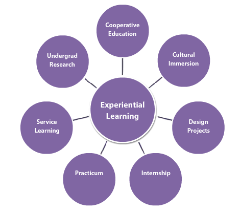
Experiential Learning Designingnorth.com

Experiential learning is the process of learning through experience, and is more specifically defined as “learning through reflection on doing. — Purdue University

I’m confident an institution-wide shift in mindset — with processes following behind — towards embracing discovery among students’ interests and imaginations will lead to a more effective population of young professionals entering the workforce. Speaking from what I learned along my journey, I met more people who were constantly searching for what could be, or what’s next. Very few people were excited with the present, and I attribute this to a fear of failure, a side effect to specialization too early in one’s career. Once you accept that you only fit into one small nook of the workforce, it’s easy to close yourself off from the plethora of knowledge and opportunity out there.  

There’s no good reason why working and living can’t go hand-in-hand… in harmony. But hope is on the way: shiny-bright lights are beaming down through the clouds with the help of the modern-education leaders who agree with my perspective on experiencing to learn rather than learning to experience. In fact, one in particular has curated a group of professionals from a similar educational/professional background to mentor his upcoming senior class: we will be guiding them through the transition phase of student to workforce-team member, and sharing the ‘experiences’ we recorded during our journey while equipping them with the tools and knowledge we wished we had just five or six years ago — I like to call this “paying it forward,” or “sending the elevator back down.”

There has to be more to the work experience than this.

This is a thought that has been repeated far too many times in my young career. And I’m not alone on this island. In fact, the majority of my previous coworkers and current friends share this perspective, they too are spending more time ‘searching’ rather than living. But it doesn’t have to be this way.

You see, we’ve come to agree on one thing: without experiencing something you don’t know with certainty whether or not it’s a good fit. And this mindset works both ways: there are plenty of undiscovered interests and talents in this world that are hidden simply due to lack of exposure. This theory resembles the way most kids are raised in the U.S. : parents enlist them in as many sports leagues as possible, allowing them to discover where they belong, and what they can derive happiness.

When I talk with fellow peers who, like me, are living out the last years of their twenties (I know, it’s terrifying), we frequently joke about getting ‘older’ and entering the age of no return: 30 — Yikes! Mentioning this is usually followed with a deep sigh.

It’s not the hesitation of tacking on an additional year to my age that scares me, but rather the concept of time running out before I gather enough experiences to identify my ‘it’ — ideal form of professional contribution or body of defining work. I have learned  about what I really don’t like and definitely don’t want to do. Looking back, I recognize missed opportunity that proved to be too “risky” at the time.

Have an open mind; allow new ways of thinking to influence the direction of your life, you will be happier person for it.

The post-college years should be a time of exploration and discovery in the professional world. Before family or a mortgage, you should feel justified in experimenting with career paths. But be prepared to fail, start over, and fail again — failure is a sign that you are actively designing. It’s OK to run into challenges right out of the gate — remember, it’s a marathon not a sprint.

At the current rate of change among companies, you will likely need to be good at many things to maintain a healthy career.

Current systems do in fact facilitate failure, and for some reason this is still viewed with negativity. Rather than manage success rates, it would be more productive to prepare professionals for what comes next: the getting back up and try something different part.

This is what you learn in your late twenty to early thirties (if you’re being honest with yourself). It’s the ‘I wasn’t expecting this part of life’ when the shortcomings of the education industry become transparent. So much is learned and achieved when the big-life plan fizzles out before it “booms,” but of course, you don’t know or understand this upon leaving the comfy confines of school; how could you?

The lessons learned during this stage of life (it really is just a phase many people experience in their lifetime) prove that you don’t know enough to pursue just one path. But for some reason society finds justification in criticizing those who don’t specialize in a single field of professional practice. This is the difference between learning in school and working in the real world: you don’t know all of the available opportunities until you are ‘in’ each unique work setting where stones can physically be turned over, and new doors opened.

For example, when I was in business school I didn’t know that I could enter the freelance economy if I choosed; I didn’t know that I could work on multiple projects at once as a consultant; I didn’t know that my education in marketing was just a foundation for a plethora of career tracks — I would still need to determine what the heck I was interested in (in the workforce), let alone good at and qualified for. And this caused significant tension — how could I become qualified for something I was advised to specialize in as a “best option,” not due to a deep interest, but rather a need to ‘simply’ pick something. And to think, I was paying to learn about a single subject I wasn’t confident I would enjoy… 100k should buy you a bit more experience, and a bit less book time — I think my fellow constituents would agree.

The truth is, you can be whatever you want to be in life, and that includes professionally; age doesn’t dictate what you can or can’t become. And figuring out what you want to be doesn’t always happen while in school; it may not even begin until entering the workforce — you just don’t know enough about the subjects you know nothing about. The elusive idea that we can excel at multiple things and build professional equity through a multidisciplinary approach is slowly becoming understood, especially as technology innovation powers full steam ahead and companies need their “rock stars” to manage numerous challenges at once.

As more and more industries transform in response to increased technology and competition, education institutions have an opportunity to follow their lead, while empowering professors to finally redesign the user experience associated with learning at a university. With this shift, learning would encompass more than subject matter, and would include the behavioral and psychological tools needed to make an impact in the workforce without regard to where you end up once the training is complete.

We are all fledglings at some point in life, but maybe a little more time in the nest would do us good.

These experiences will further train young professionals how to envision their true self, not just rely on their everyday self for answers and guidance. More importantly, they will empower students to seek multiple areas of interest, and develop a mindset that embraces transferable skills. The ultimate goal for education leaders will not be to graduate the most skilled engineers or marketing coordinators, it will be to shape problem solvers who are comfortable in many environments, and can alter their understanding of broad concepts to further absorb new knowledge. It’s this idea that will help shed more light on building transferable skills for the workplace while also exercising the human ability for rapid learning.

These are the changes we can make to fix the current education and work experience conundrum — it’s the firmware update this system has been waiting for, and it’s just in time for the arrival of smart machines. I’m not asking for a reinvention, I just want to see it designed better than before, to a level where it supports idea sharing, new ways of thinking, and most importantly, a greater value in oneself. One day, employers won’t need to evaluate education versus work experience to determine if a candidate is ‘ready’ for the gig. Can you see a similar future?
SaveSave

What Is UI Design? Six Articles To Help You Understand

What is UI Design?

Once again, we turn to the Designing North Studio team (only a couple are dedicated UI practitioners) to share their their definition of UI Design in one sentence:

[clickToTweet tweet=”UI design is The translation of UX design into a visual interface.” quote=”The translation of UX design into a visual interface, where the color, composition and placement of various interactive elements reinforce the user experience principles that have been deemed most important for a given interaction.”]

“When function and art move in together before they tell their parents.”

The balance of visual design, layers of presentation, and interactiveness to provide a satisfying look, feel, and experience.

The translation of UX design into a visual interface, where the color, composition and placement of various interactive elements reinforce the user experience principles that have been deemed most important for a given interaction.

[clickToTweet tweet=”Let’s get visual. Here are the basics of UI design:” quote=”UI Design is the creation of graphics, illustrations, and/or use of photographic artwork and typography to enhance the display and layout of a digital product within its various device views.”]

Have you ever heard someone say, “Wow, that website has horrible UI,” or “The UI of this app is the worst”? Similar to our comments on What Is UX Design, if you aren’t around designers all day this acronym is likely meaningless. And there’s nothing wrong with that. But to understand User Interface Design (UI), is to have a greater appreciation for the way designers craft  the look, feel and even responsiveness of a digital product, which all accumulates to interaction.

However, we understand that much like UX (user experience design), UI (user interface) is often interpreted slightly different depending on who you ask.  

At its core, User Interface Design creates the the look, feel, and interactiveness of a digital product — think web experience or app. But this is only the basis for understanding. You see, good UI is a multidimensional approach that enables a product experience to be responsive to a human being. It’s the Xanax of the design world. Remember that short animation that perfectly substituted the need for a thousand words? Or even that website that you navigated as though it was a guided tour. Now, that’s some good UI.

UI articles to help understand design.

Now, let’s paint you a more thorough picture of User Interface Design with these six articles:

1. UI is this, and UX is that:

https://medium.com/blu-mint-digital/ui-design-vs-ux-design-whats-the-difference-af97c2ff052a

2. UI basics, let’s start here:

https://www.usability.gov/what-and-why/user-interface-design.html

3. Good UI gets out of your way to help you complete a task:

http://blog.teamtreehouse.com/10-user-interface-design-fundamentals

4. Four ways color explains good UI

https://www.webdesignerdepot.com/2017/06/4-ways-vibrant-colors-boost-ui-design/

5. UI explained in 60 seconds. Starting now:

https://www.oho.com/blog/explained-60-seconds-ux-ui

6. These big design buzzwords make you sound more experienced — UI is one of them:

https://www.upwork.com/hiring/design/ux-ui-ia-digital-design-terms-explained/

Have a burning UI/UX question? Let’s chat!

Designing North Studios Playlist: Volume 1

“Music is the electrical soil in which the spirit lives, thinks and invents.” — Ludwig van Beethoven

This is affirmation for every designer who stands on a musical foundation to power through the day.

Design and music goes hand in hand. Similar to art and a paint brush. With the majority of our time spent in front of the computer, we need music for many reasons. Music offers an escape to a place of focus; where creativity can be felt, absorbed, and expressed.

Day after day, we pour our heart and soul into our work, in the the design studio, striving to produce impactful results for every body of work that enters our virtual doors.

It’s here where we live, think, and invent with the intent to make the world a slightly more enjoyable place for all.

But this wouldn’t be possible without music. Our feelings, energy levels, and focus all rely on music in one way or another. Without even considering its power, we rely on music to set the mood, each and every day.

And contrary to popular belief, work is in fact a place for sound; a place where turning up the music leads to an atmosphere primed for creation not distraction.

From Stanford to Johns Hopkins, extensive research has been conducted, supporting the positive impact that music has on the learning environment.

A student is to learning as a designer is to creating, and music is the glue that bonds passion, focus, and intelligence to production and results.  

Although our favorites remain intact, we enjoy creating new playlists as we discover tunes that inspire and motivate us while in the design studio. Let us know how we’re doing and feel free to share your favorites along the way.

Designing North Studios Spotify Playlist: Volume 1:

Horse On The Loose: A Designer-Sister Duo Passionate About Equestrian

What do you get when you cross an illustrator and a graphic designer that both share a passion for all things horses? Horse on the loose, of course!

Horse on the loose is a collaboration between a sister duo who were looking for a way to share their love for everything equestrian with the world. Sister Andra happens to be a member of the Designing North team as well; we are very proud!

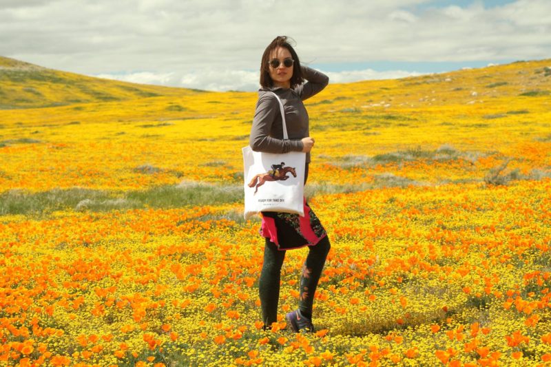
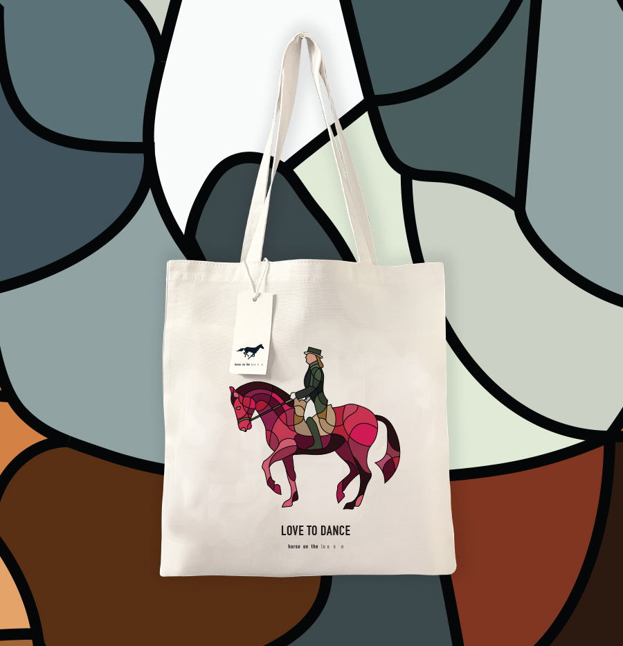
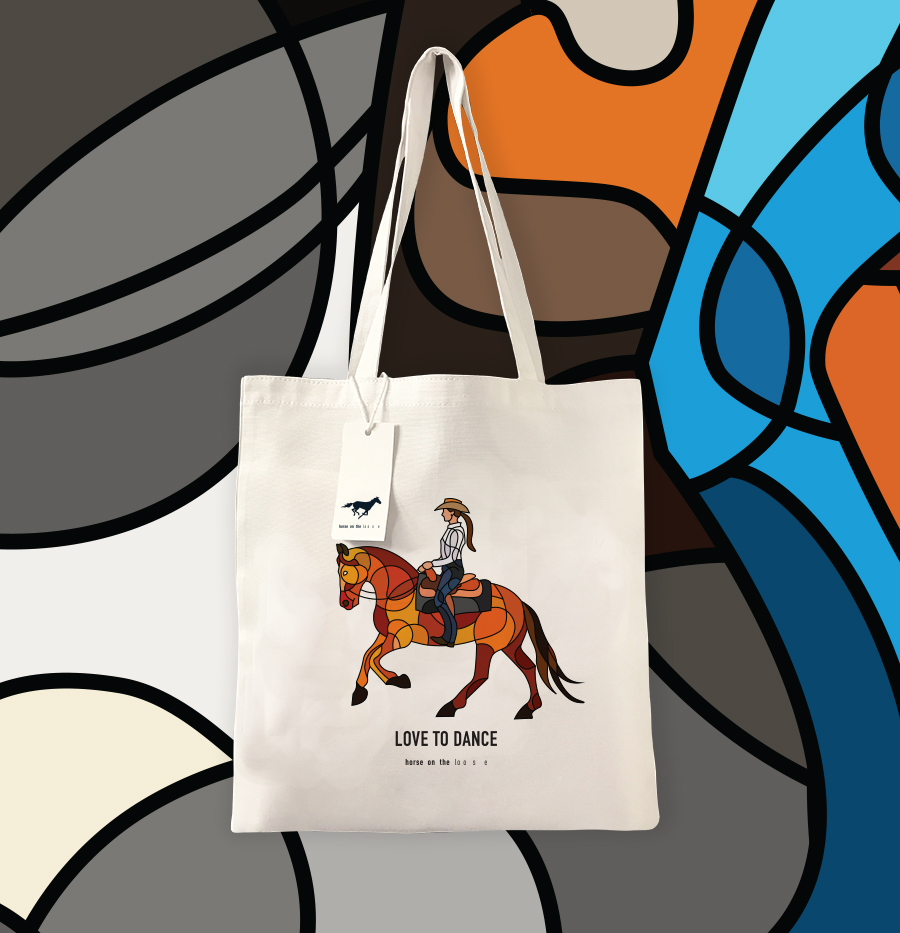
From shopping, to work and travel they envisioned a product that could be seen by others and instantly recognized by the larger equestrian community. Naturally they landed on the trusty tote; a bag for all purposes. But not just any tote. These bags are custom printed in Los Angeles, CA with unique illustrations representing dressage, jumping, and southwestern equestrian culture.

 Of course, there’s always more to the story than meets the eye. To go beyond the vibrant colors and flawless horse silhouettes, we asked Andra for her inspiration behind Horse on the loose, and the details that led to its launch.

Horse on the loose Story

“My sister Roxana and I started Horse on the loose at the end of last year. I live in Los Angeles, California and she lives in Transylvania, which is in the northern part of Romania. The two of us share a passion for horses and all riding disciplines. I’ve been taking dressage and jumping lessons for more than 9 years; incorporating this style into our designs was a natural progression for me.”

Horse on the loose tote bag

“I currently ride at an eventing barn called Goldspirit Farm in Los Angeles, CA. My sister has also been riding for two years now in Cluj-Napoca, Northwestern Romania. Although we are over 6,300 miles apart, we often spend holidays together and love to go horseback riding wherever our travels take us.”

“Besides having a passion for horses, we are both artists by trade. I am a graphic designer and and my sister is a painter and illustrator. Since my earliest memories, we have been drawing horses for fun, and to this day it’s still our favorite subject. With such a great distance between us, it’s comforting to know that my sister and I share the same passions and enjoy talking about art and horses whenever possible. But Horse on the loose is so much more. From two different continents, we are building a brand based on a shared interest and are able to display our talents in the process; I wouldn’t trade it for anything.”

Inspiration for the Designs

The inspiration for the designs originated more from a graphic design approach, rather than illustrative. The horses are very clean, edgy and stylish; we want people to recognize the designs without leaving too much room for interpretation. However, the designs cater to riders in the various disciplines, leaving room for a little personalization. These riders are a more sophisticated audience, seeking something unique that speaks to them.

“I’ve been to quite a few tack stores throughout the years and never found a tote bag that “spoke” to me. Most were either too generic looking and childish, or super high end and overpriced. I guess I simply wanted to produce a product that is affordable yet still looks great for everyday use. Secretly, I am my ideal customer — I’m an artist after all. “

Horse on the loose tote bag design

With the recent ban on single-use plastic bags, totes are more than a trend at the moment and you can take them everywhere, including the barn! But these bags give riders the opportunity to show off their hobby to the outside world as well.

How did you end up with these unique designs? And where can enthusiasts find them?

Funny enough, I was working on a wall graphic for an equestrian event management company in San Diego. I presented them with various looks, amongst them was something similar to the style we ended up using on the bags. They didn’t choose that look (my favorite of course), so I decided to use it for myself.

Horse on the loose tote bags for equestrian

Besides selling the bags through our online store, we are sending a few to some equestrian shows across the country as competition prizes.

In the future I hope to expand the line to feature more horse-riding disciplines such as racing and polo. Maybe we can put the designs on other merchandise; only time will tell! Until then, I hope you enjoy the bag designs and please share them with other horse-loving friends.

Are you an illustrator, graphic designer, or enthusiast for all things equestrian? If so, Horse on the loose would love your support!


Digital Design In Motion: Designing North Studios

It’s not a location, it’s a mindset.  

This is the brand tagline for Designing North Studios, our digital design and development studio based in the Bay Area. It’s meaning runs deep in the veins of the studio, and serves as the guiding light for every team member that walks through its doors — we like to call them Designing North Stars.

Designing North Studios is the product of many years of hard work and planning by Managing Director, Lisa Peacock. From the name, to the logo and color palette, and most importantly the mindset, Lisa’s vision always included motion in some way or another — it just took a few years for this vision to be brought to life:

“I’ve always envisioned that the Designing North logo would move. It’s not super easy to recognize that the DN from DESIGNING NORTH flips and glides together with our Yummo Font forming the combined ‘DN’ mark in our DN badge.”

The joining of the Designing North logo and motion marks a pivotal moment in the studio’s existence. It takes dedication, commitment, and most importantly, really good people to make a design studio “tick,” and that’s exactly what we do.

It’s all about designing a community that lives north of expectations.

Using Motion In Branding

Although motion and branding isn’t a new art form, augmented experiences are becoming an important part of our daily lives — across all screens. With more eyes on mobile, people want to experience a brand, not read about it.

As digital devices pervade all aspects of the human experience, motion design is an interesting and informative way to share the big idea or story; our story.

The Designing North interstitial display, designed by the talented Nick Alexander – expresses that marriage of the D, and then the N falling sideways, to form the mark.

Motion Design Inspiration

As the Executive Creative Director, Lisa Peacock envisioned every movement that takes place in the interstitial. It all has meaning, as it adds life to the Designing North name:

“It was important to give recognition to the use of the STAR in the logo badge. Even though a simple symbol, used by many – I always knew that the people I was looking for to work at Designing North Studios, would be my Designing North Stars. I had no one at first, but I knew they would come. And they did. So it serves both a tactical purpose of displaying the ‘mark’ inspiration, and it illustrates the aspirational side of the designing north mindset: we know the stars are out there, swirling around somewhere, and eventually we hope they land here and work with us at Designing North. But even more broadly: we know there are those out there, swirling around, ‘designing north’ wherever they are, and wherever they land. And we salute that mindset most of all.”

California’s ‘Super-Bloom’ 2017: User Experience Design Madness

California’s ‘super-bloom’ leads to a ‘super-boom’ of tourism, traffic, and confusion.

Wildflowers are popping up all over the map in Southern California — a place largely known for mars-like droughts — is turning once desolate landscapes into a colorful array of white, yellow, orange, and purple — the ideal contrast for your Instagram feed or Facebook wall. And as we have learned time and time again, when all media streams descend on a single subject, reality is quickly distorted; reflecting individual imagination and creativity in a method that portrays a universal reality.

We all want to experience the same feeling of excitement as the next person — missing out might trigger anxiety. It’s commonly referred to as FOMO (fear of missing out), and represents the California wildflower ‘super-bloom’ very well. In order to keep our dreams in sight we latch onto pictures, videos, and written words from strangers who have been where we have not. Sounds harmless, right? Unfortunately, it’s quite the opposite; something the town of Anza Borrego recently learned.

The LA Times reported: JoAnn Maiter, a part-time employee of the Borrego Springs Chamber of Commerce, said she couldn’t remember how many phone calls she’d answered. Dozens and dozens.

“We’re swamped. You can’t even get into our visitor’s center right now,” she said, adding that nearly 300 people had already signed into the visitor’s log by noon on Friday. “They’re coming from everywhere — absolutely everywhere: Canada, Minnesota, Chicago.”

From a user experience perspective, you can’t design a guaranteed outcome, you can only design for an experience — which may or may not lead to the desired outcome. Even with all of the user research in the world there will always be situational factors that a designer simply can’t control — unless artificial intelligence has something up it’s sleeve.

External forces such as social media, rarely follow this thought process and often distort reality to a level that we can’t recover from — the ‘Super-Bloom’ is a prime example.

Impact of Media on Perception

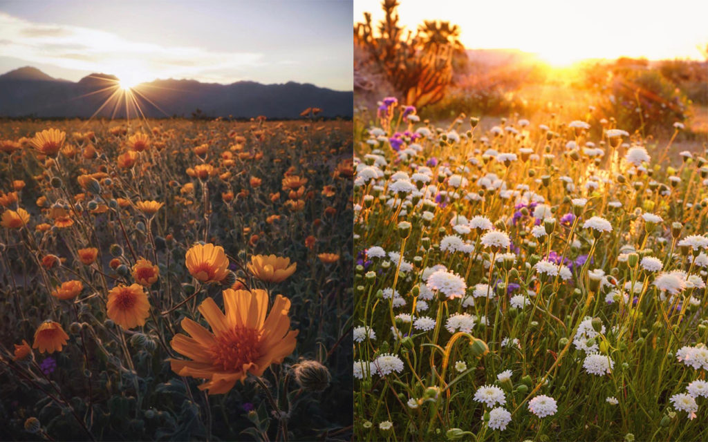
A well respected photographer uses his highly trained eye, creative vision, and advanced equipment to capture a brilliant image of the desert bloom. As most experienced photographers do, he then uses post-processing skills to perfect the image and shares it with her thousands of eager followers; with a well written message of inspiration and eternal wanderlust. It’s a dream-worthy scenario and nearly every human on the planet wants to experience this feeling personally. And this is the expectation they have, all the way up to the moment they finally do — “the moment of truth.”

As was the case for many visitors, the ‘super-bloom’ introduced a reality that wasn’t entirely true to the stunning imagery and influential media viewed online — an all-too-common scenario in this “digital age”. Just like a moment in time, every human can’t experience the exact same event the way another person did previously. 

Anza Borrego Wildflowers

Instagram photos by professional photographer Scott Kranz

From a user experience perspective, I am able to understand why a highly anticipated natural phenomenon has turned into a complete headache for thousands of people. A quick comparison of expectation versus reality reveals two different scenarios; we all want the one that aligns with our media viewing experience. But not everyone will experience the event in the same manner; under the same conditions.

The first 500 visitors to the region likely had a great time; roads were clear, the sun was still rising, services were accessible, and fellow adventure seekers weren’t breathing down their throats. By the time ten thousand people flooded the park, reality took a turn for the worst.

Importance of Understanding User Behavior

When talking about the field of UX, understanding ‘user’ behavior through and through is a fundamental rule. Unfortunately, most professional industries — outside of the digital design or human factors realm — forget to rehearse their use cases, often leading to more harm than good.

Read more on the differences between UX, XD and other practices around UCD.

In predictable fashion, the governing bodies that control this impacted region, have been promoting the “super-bloom” for months — picking up the intensity over the past few weeks — as they prepared for this abundance of excitement in their own backyard. Shortly after, the media took hold and the conversation snowballed from there — fake news!

Because our studio practices the user-centered approach, I quickly recognized a parallel between the work of a UX designer and the experience that these state parks and media outlets were hoping to deliver. More importantly, I concluded that the managing bodies of these parks didn’t do their research on the possible user groups that might ascend and make up most of their visitors. As you might expect, the resulting experience was best described with frustration and disappointment — and that’s putting it politely.

Whether they were in communication or not, the media and state park services did a fantastic job promoting this natural phenomenon; you might even believe that it was a planned event from the look of coordinated PR efforts. In this case, it’s not what they did, but rather what they didn’t do that made the experience memorable.

Whether it was the severe underestimation of potential attendance or lack of education leading up to the event, the disconnect between visitors (users for all intended purpose) and the parks themselves was too great to recover from. From a user’s perspective, this is where the disconnect made the most impact:

I was promised once-in-a-decade-flowers yet I was never educated on what a super-bloom entails; how it looks and how it’s different from my garden at home — a bed of roses is far more spectacular than a patch of dandelion. Given the rarity of this phenomenon, it’s safe to assume that the majority of visitors didn’t have detailed knowledge on what exactly they were going to see; Leaving this experience up to my imagination was a risky approach to rely on.

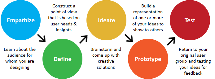
Apply Design Thinking

Prior to the weekend, visitor estimates were casually tossed around. Whether a backup plan was strategized or not, it was evident that the actual attendance to the region was far greater than expected. The lack of parking — yet alone physical space — direction, and transportation resources caused a once relaxing environment to quickly become stressful and borderline dangerous.

Design thinking example

Hosting a large number of visitors — similar to a sporting event — called for an increase in staff or personnel to at least assist visitors during their travel, yet alone manage their experiences while visiting. This region in particular required off-road access to view some of the most appealing landscape. With no prior education or experience in off-roading, hordes of visitors took to the trails without proper equipment or professional direction; conflict ensued for many, positioning select groups against each other. Have you ever seen a Hyundai Sonata attempt a water crossing? We hadn’t either until this trip.

With consideration for the needs, wants, and limitations of visitors, the ‘Super-Bloom’ experience could have been something special. And had I not been working shoulder-to-shoulder with a team of UCD practitioners, reminding me daily how design should solve problems, I’d still be confused and frustrated from the tension felt during the experience. Understanding the gaps, missed communication, and lack of research helps to alleviate the disappointment I felt (kinda). Who knows, in the next decade we might just see designers in charge of the solutions to the problems we identified — wouldn’t that be smart. The events of the 2017 California ‘Super-Bloom’ are a reminder that design thinkers are needed everywhere; in every company and perhaps most especially when it comes to serving the people experiencing government services.

Design thinking can transform. Let us show you how that paired with a UCD approach can open the door to new possibilities.

By Any Other Name a Rose

They say that April showers bring May flowers, but in California these days it tends to be aqueducts or aquifers making buds bloom. Rain or no rain, the extraordinary show of Mother Nature in springtime is a feast for the senses.

What on Earth (pun intended) does this have to do with digital marketing and the realm of social media? This time of year is all about life. Of living things. And believe or not, this is precisely the metaphor you should use when thinking of your digital marketing strategy.

I’ve consulted with a number of businesses, nearly all of which have had the erroneous conception that once the new website/Facebook Page/Instagram Profile/YELP Profile/Pinterest Page/YouTube Channel/etc. has been launched, they can let out a collective sigh of relief and scratch those items off their to-do lists…and their budgets. Misleading ads promise instant website traffic and fans…the if we build it, they will come marketing strategy. People are lured into the dream that launch is synonymous with instant traffic and commercial success. I’m afraid I’m here to pop that bubble. This misconception is a little like planting a rose bush not being entirely sure that this particular variety will even thrive in this climate, then sitting back and waiting for the glorious blooms to appear…no soil prep, no fertilizer, no water, no pruning.

Like planting a rose bush in your garden, your digital presence must be well thought out and nurtured.

So how do we get our green thumb on?

Establish Goals.

Think of this as the time you spend turning over the earth before planting, researching the best soil amendments and fertilizers, and ensuring that even if that gorgeous rose in the photograph is the one you want, you won’t choose it if it can’t survive in your climatic zone.

If you’re thinking about diving in with a new website, or a massive overhaul (from that site your nephew built for you in the 90’s), you’ll need to ask yourself some questions:

Turning Over the Soil or Why am I Doing This?

  • If your answer is to look modern and relevant, that’s okay. I mean let’s face it, if you went to Apple’s website and it was slow and clunky with teeny tiny Times Roman fonts and oodles of text with a few gritty graphics, you might think twice about buying an iPhone.
  • Ease-of-use is also a good reason for an upgrade – the digital world has changed dramatically in the last five years. When was the last time you wanted a product SO badly that you actually had the patience to put-up with a slow, unresponsive website all the way to completion of the sale?
  • To start selling products online: Great! If you’re currently a bricks-and-mortar outfit and want to expand to selling your goods and services online, let’s go. But – if you currently have no or limited digital presence, or very limited bricks-and-mortar presence, or no presence at all, you need to understand that you will need time to build your brand, and therefore your sales. Just as that rose rootstock must grow, sprout leaves, produce buds, and finally bloom, so too must your digital presence move through its growth stages.
  • To establish oneself as a thought leader: Perhaps you’re a consultant who wants a website to gather new clients, or a non-profit seeking new donors. A new or updated website might be a great way to help people find you. Bear in mind that to establish yourself as a leader, you’ll need to prove it…or better yet have others prove it through testimonials and/or links to your superlative content.

Amendments and Fertilizers or Determining the Best Channels for Me

  • People get really excited about various social media platforms. As with fertilizers and soil amendments, you don’t necessarily want to throw all of them at your rose bush. Typically, you want your social channels to drive some kind of conversion. I say typically because some are better at driving conversions, and some are better at creating brand awareness, so don’t lose sight of your goals here. For example, I recently had a client who was very excited about SmugMug – she loved its layout and ease of use. They’ve made some recent upgrades that make it a lovely platform for displaying photos of your products, but unlike Pinterest, it doesn’t allow for a direct link on the photo back to the product page on your website. In addition, Pinterest has far more users, and its demographic is hugely canted to women in the client’s age range. If you have limited time and budget resources, why expend efforts on both platforms?

The Right Climatic Zone or Consider Time and Budgetary Constraints

  • Remember you need to think of your digital presence as a living organism requiring careful tending. Google’s search algorithm thinks this same way. It’s looking for websites that have fresh content. And like a spectacular bloom, it’s also looking for sites that people are oohing and aahing about. The more people who are clicking through from Facebook to your page featuring that fabulous blog post you just wrote, or from YouTube to your website because they couldn’t believe how cool your product looked/worked in action, the greater authority and relevance Google will give you in organic searches.
    • Don’t think for a minute that people will gravitate to your website without you feeding it.
    • Select social channels that will help you achieve your answer to Turning Over the Soil or Why am I Doing This above.
    • As you develop your overall digital plan, write a first draft digital marketing calendar…think of it as your gardening strategy…water daily, fertilize monthly, clip weekly…
      • What kind of content and themes are you going to promote at given times of the year?
      • What human and monetary resources will you need to bring these goals to fruition?
        • Are they available to you? If not, either negotiate for more staff/hours/dollars, or rework your plan.
    • Figure out the best feeding time or Aim at Consistency – perhaps you dedicate a day’s posts to education about your industry, another day’s posts to freaky facts about your business, another day to something funny. People tend to engage when you’re engaging them by educating them, making them laugh, or making them cry.
    • Don’t over water – actual selling or call-to-action posts should be about 1 in 7 (different experts have different opinions on this, so experiment with your fans). An overwatered rose looks sickly and dies…just about the way you feel when someone is constantly badgering you to buy or do something. Earn their trust and friendship first.

Prune Dead Heads

  • Don’t be afraid to trim something that’s not working or that’s run its course.
  • If you thought that Instagram was going to be the greatest thing since sliced bread for getting your widget out there, but have since found that despite your best efforts no one really cares about ball-bearings in Instagram’s key demographic of 15-24, scrap it and focus your efforts on channels where your prospective buyer’s hang-out. Effective digital marketing is an iterative process.

Clearly, these are just a few tips to stimulate your thinking when developing your digital marketing strategy. The key take-away is that like a beautiful rose, those coveted websites and admirable social presences are the result of careful planning, tending, and care.

Good Luck and Happy Gardening!

Julie Farrell is a reformed engineer and head of marketing & social at Designing North Studios. Intensely curious, she’s worked with lasers and missiles, bungee-jumped in New Zealand, crawled under Egypt’s pyramids, and been lifted in an elephant’s trunk. She dreams of one day writing a great American novel. Connect with Julie on Twitter or LinkedIn.
 

Not a subscriber? Jump on board.


Creative Inspiration – Something to Chew On

This is an extraordinary time to be a creative person. To survive as an artist in the Middle Ages or during the Renaissance, you needed to have a sponsor, a patron – perhaps a pope, a Medici, or a Holy Roman Emperor. Today, photographers hawk their compositions on any number of stock photography websites; writers can create their own blogs for a fistful of dollars, augmenting their income with freelance posts; and digital designers can create clever website designs as independent contractors. A creative type can effectively create his or her own marketplace.

DN-Lightbulb-photopack-217_1024Yet the strain to satisfy the insatiable beasts that are content marketing and competitive creativity can sometimes be overwhelming. The Information Age is just that: an age that is exploding with information. At times the glut of information bombarding one’s senses either drives the creative person into an entirely catatonic state or catapults him or her into a state of utter pandemonium – numb or crazed – take your pick. Either way, creative output is essentially paralyzed.

All of us sometimes become trapped in creative morass, so we thought we would share some of our favorite ways to break free and get into the creative zone.

We’d love to hear what yours are too.

Chris Mohler – Creative Director

  • Taking a long drive
  • Blasting music
  • Taking a walk on the beach

Andra Gheorghe – Designer

  • Anticipating an upcoming vacation frees my creative spirit + a Nespresso coffee with milk and sugar

Paul Gergely – Product Designer

  • I’m inspired when I’m around people who are great at their craft (doesn’t have to be designers or people in tech – just people who are great at what they do)
  • Early mornings at the office or my local coffee place – just getting some place where there are few distractions – where I can “get lost in my head”

Dolfin Leung-Melville – Marketing Director

  • Browsing through photos/designs/layouts/from print or online materials for inspiration
  • Searching with keywords online
  • Riffling through a stack of magazines to see what jumps out at me
  • Clearing my head with long walks with my dogs

Madalin Slaniceanu – Designer

  • Listening to music and chilling out

V:shal Kanwar – Creative Director

  • Ambient sound drives my creative energy – the right music can help emote the right visuals for a particular project, and the wrong background humming (static sounds, buzzing, people having annoying conversations) can really throw off my chances for finding that moment of design epiphany.

Julie Farrell – Head of Marketing

  • Nature first and foremost – long walks in the sticks or long bike rides through wine country where I live
  • Reading, learning, traveling – sounds corny, but learning or experiencing something that’s tangential to what I’m doing at work often shines a new perspective on a creative topic/problem

Me – Lisa Peacock – Managing and Executive Creative Director

  • Doing anything away from my computer: showering, gardening, motorcycle riding, cleaning house, working out, decorating the house
  • Riffing about a specific creative goal itself with other smart people
  • Sitting quietly alone with something that has moved past a blank canvas
How about you? What gets your creative juices flowing? Tell us!

Top 10 Social Media Monitoring Tools Social Pros Are Using Today

One day you’re in, the next day you’re out.

Heidi Klum may have been talking about fashion when she coined that phrase, but at the rate of today’s ever-changing social media landscape she could have been talking about social media monitoring tools.

More often than not the hot young analytics system of today suddenly becomes the old prehistoric system of yesterday in what feels like the blink of the eye (or at the very least the stroke of the pen signing the very costly contract).

So what are the tools real-world social media gurus are using right this minute?

I recently posed that question to my social media colleagues at Stanford, who are using these tools on a daily basis to measure impressions, engagement, sentiment and much more.

Here are the top 10 tools (paid, free and native) our social pros are using across campus:

Paid

Radian6:
Radian6 is a great tool for aggregating data, tracking sentiment, demographics, topic trends, intent, and more. This is my go-to tool when I need to tag specific posts or do a keyword search within my search string.

Union Metrics:
When I need to run a quick report on how a hashtag campaign is doing-I start with this. Great for determining top tweets and influencers. Also one of the few good tools currently providing data on Instagram accounts/hashtags.

Bitly:
Bitly provides audience insights and measurements through custom URLs. Great way to follow the reach of content you’ve pushed out on multiple platforms and the vanity url’s really boost the branding in your tweets.

SocialFlow:
This is helpful in understanding click data. Through a special algorithm, they help you release posts when timing, relevance and audience are optimized.

Crowdbooster:
In addition to tracking engagement in real-time, Crowdbooster also uses the data to offer recommendations on how to respond to the posts.

Free

Hootsuite:
Hootsuite is an easy listening tool, which allows you to manage your platforms from one single dashboard. Even better; you can schedule your content for the times when you need to step away (because even social media extraordinaires need breaks).

Google Analytics:
Google Analytics helps you measure the conversions as a result of the referrals from each network. It also tracks the share buttons on your website helping you measure what’s being shared and where.

Native

Facebook:
Facebook provides great metrics for you to measure your own page’s activity, reach and followers. It also provides basic stats to help understand who your audience is.

Twitter:
I’m loving Twitter’s new free analytics, which highlight your account’s top tweet & mention for the month, and also tracks your account’s follower growth, impressions and monthly activity.

LinkedIn:
LinkedIn company page analytics do a great job of measuring impressions and clicks per post. In addition, they offer several options in breaking down your follower demographics (e.g. seniority, industry, function, etc.) and I particularly appreciate how they also can compare your page to other like-minded pages.

It’s important to note, that most of us on average only use about 3-5 of these tools. So before you starting worrying over which tools you should use, my suggestion would be to first define the top KPI’s you care about in social, and find the tool which best helps you measure those.

But of course don’t wait too long, as our favorite model Ms. Klum so eloquently reminded us above; social media monitoring tools, like fashion, change quickly.

Alex Murray is the Assistant Director of Digital and Social Media at Stanford Law School; navigating the murky waters of all things social one tweet, post, video at a time. In her spare time you’ll find her drinking good wine, doing important pizza research in SF and during niners seasons-glued to her iPhone as she manages her multiple fantasy football teams. Connect with her on Twitter @Social_Alex or on Linkedin.

Northern California
studio@designingnorth.com
© 2018 Designing North Studios. The Creative Division of The Carrera Agency. All rights reserved. Privacy | Terms