Digital Design In Motion: Designing North Studios

It’s not a location, it’s a mindset.  

This is the brand tagline for Designing North Studios, our digital design and development studio based in the Bay Area. It’s meaning runs deep in the veins of the studio, and serves as the guiding light for every team member that walks through its doors — we like to call them Designing North Stars.

Designing North Studios is the product of many years of hard work and planning by Managing Director, Lisa Peacock. From the name, to the logo and color palette, and most importantly the mindset, Lisa’s vision always included motion in some way or another — it just took a few years for this vision to be brought to life:

“I’ve always envisioned that the Designing North logo would move. It’s not super easy to recognize that the DN from DESIGNING NORTH flips and glides together with our Yummo Font forming the combined ‘DN’ mark in our DN badge.”

The joining of the Designing North logo and motion marks a pivotal moment in the studio’s existence. It takes dedication, commitment, and most importantly, really good people to make a design studio “tick,” and that’s exactly what we do.

It’s all about designing a community that lives north of expectations.

Using Motion In Branding

Although motion and branding isn’t a new art form, augmented experiences are becoming an important part of our daily lives — across all screens. With more eyes on mobile, people want to experience a brand, not read about it.

As digital devices pervade all aspects of the human experience, motion design is an interesting and informative way to share the big idea or story; our story.

The Designing North interstitial display, designed by the talented Nick Alexander – expresses that marriage of the D, and then the N falling sideways, to form the mark.

Motion Design Inspiration

As the Executive Creative Director, Lisa Peacock envisioned every movement that takes place in the interstitial. It all has meaning, as it adds life to the Designing North name:

“It was important to give recognition to the use of the STAR in the logo badge. Even though a simple symbol, used by many – I always knew that the people I was looking for to work at Designing North Studios, would be my Designing North Stars. I had no one at first, but I knew they would come. And they did. So it serves both a tactical purpose of displaying the ‘mark’ inspiration, and it illustrates the aspirational side of the designing north mindset: we know the stars are out there, swirling around somewhere, and eventually we hope they land here and work with us at Designing North. But even more broadly: we know there are those out there, swirling around, ‘designing north’ wherever they are, and wherever they land. And we salute that mindset most of all.”

Preserving A Fishery With A Mindset Above Average

With the lobster fishery closed for the season, it was now up to locals to design a community for conservation.

It all began with a young man dressed in flashy swim trunks, sprinting up the beach towards me as I sat in the sand, photographing nearby surfers. I have always considered the beach to be my second home; the ocean is a very important part of my life, and I have always been a strong believer that I must be active in protecting the things closest to me. This explains why I was alarmed by this lone runner; it’s not like running on the beach is odd, but for some reason this instance felt different. And boy was I right.

In this moment, I was completely committed to this stretch of beach, as a participant in its beauty and steward for its existence, which allowed me to recognize that this was no ordinary young man out for some exercise.

Living near the coast for so many years has conditioned me to care deeply for it. It’s no longer a choice but rather a natural thought I have or action I take to keep this environment free of conflict. Most often, a donation to a local marine conservation groups does the trick; facilitating a greater impact than I can physically provide. But on this day no such monetary exchange was required.

By the time the runner had stopped he was already waving his hands in the air, almost as if he was trying to flag down someone in the surf — fairly uncommon behavior unless jumping jacks are involved — they were not. I then thought, “is someone in trouble; should I offer help?” The wild arm waving lasted only minutes before a single diver popped his head above the surface like a seal scanning the shoreline.

I spent my childhood on this very coastline, free diving and spearfishing with friends. Yet, scanning through all of those memories I couldn’t recall an instance when I had tried to communicate with someone on the beach, at least forty yards away. Again this situation proved to be different. The two young men appeared to be in-sync with one another; whatever they were up to was intended to be disguised from everyone around them.

Like magnets, the pair continuously moved closer to one another until the young man on the shore was knee deep in the water. Again the diver showed odd behavior in remaining on his stomach when he could clearly stand. At this point myself and a fellow group of four beach-goers were standing, intensely focused on this pairs activity. This beach in particular had a modern tower for state park employees and ranger, yet nobody was home at the time. Coincidence? More like a stroke of luck for these two.

Out of nowhere, two plastic bags were abruptly yanked from a backpack and double-bagged in perfect fashion. Either this guy was a supermarket attendant in his profession or had plenty of experience doing whatever it was he had planned next. Seconds later the diver presented at least two large Spiny Lobster — attempting to hold them below the surface, out of sight from us onlookers.

Pacific Spiny Lobster

My instinct urged me to confront the young men head on, but my lack of legal knowledge restrained this response. Instead I pulled out my phone and visited wildlife.ca.gov to verify the exact dates of California’s lobster season. The results read: March 16, 2017. Additional text stated that each count of illegal capture could carry a fine of $1,000 and possible jail time — no wonder these two were acting with such deceitful intent. The day’s activities suddenly fell into perspective.

With the sight of lobster antenna crawling through an opening in the bags, beach-goers began approaching the pair with smiles of intrigue and curiosity. Clearly this attention, although harmless to their mission, was unwanted. With the obvious risk of being spotted by the park rangers the lobster catch was stuffed into a backpack and thrown over the man’s shoulder; followed by a mad dash back down the beach towards the parking lot.

Witnessing this blatant disrespect for not only the law, but also a place I cherish, was more than enough to incite my involvement. As I searched for the park ranger — he had passed by me only twenty minutes prior — I made contact with the only group who was noticeably disturbed by the brazen heist of a highly regulated marine asset. They too were ready to take action, with the mindset that we all share a responsibility in protecting our local environment.

Our physical presence on the beach, just outside the state park tower, served as the flare needed to direct officials to our cause . What began as individual efforts soon progressed to a group cause fueled by a desire to act beyond expectations — providing a voice to the environment that we call home. This wasn’t a new scenario for the on-duty rangers. In fact, as soon as they heard of our account they assembled their search crew within seconds with eyes already over the beach exit; it was time to let them get to work on foot and by air.

As I returned to my car I couldn’t help but fixate on what had transpired; thinking about everything else that could have been done to stop the day’s unfortunate loss, the moment they trespassed on our coastal environment. I asked myself, if it were an elephant being slaughtered, or a bear being trapped, would everyone have paid attention — am I missing some unidentified threshold for tolerance? In a time when poaching and wildlife crime is considered a global crisis, there’s no room to turn a blind eye, not even for a pair of irresponsible teenagers who seemed to fit their surroundings well.

As frustration eased, I wrapped my head around a lesson to walk away with, and share with you:

Not one person HAD to pay attention to these people as they commit their crime — but a few of us were compelled to do so. We went beyond what anyone would have expected us to — the ‘designing north’ mindset. This mindset is in you too, in ways you may have already discovered or will eventually find.

Although I may never know whether or not my actions served as a voice for the voiceless, I am certain that they brightened the day for the law-enforcing professionals I collaborated with. The feeling of camaraderie and sense of pride that I would want, if I were in their shoes, is exactly what this experience provided.

Healthy marine life, healthy marine ecosystem, and a happy coastal community; it just takes a few good people to make a world of a difference. And why not be one of the few. Many people go beyond what is expected of them: in their career, how they live, the relationships they nurture, or through just a simple random act of kindness – we call it   ‘designing north’.

Do you know someone that is ‘designing north’? Maybe it’s you? Tell us. We’re looking for the global count.

California’s ‘Super-Bloom’ 2017: User Experience Design Madness

California’s ‘super-bloom’ leads to a ‘super-boom’ of tourism, traffic, and confusion.

Wildflowers are popping up all over the map in Southern California — a place largely known for mars-like droughts — is turning once desolate landscapes into a colorful array of white, yellow, orange, and purple — the ideal contrast for your Instagram feed or Facebook wall. And as we have learned time and time again, when all media streams descend on a single subject, reality is quickly distorted; reflecting individual imagination and creativity in a method that portrays a universal reality.

We all want to experience the same feeling of excitement as the next person — missing out might trigger anxiety. It’s commonly referred to as FOMO (fear of missing out), and represents the California wildflower ‘super-bloom’ very well. In order to keep our dreams in sight we latch onto pictures, videos, and written words from strangers who have been where we have not. Sounds harmless, right? Unfortunately, it’s quite the opposite; something the town of Anza Borrego recently learned.

The LA Times reported: JoAnn Maiter, a part-time employee of the Borrego Springs Chamber of Commerce, said she couldn’t remember how many phone calls she’d answered. Dozens and dozens.

“We’re swamped. You can’t even get into our visitor’s center right now,” she said, adding that nearly 300 people had already signed into the visitor’s log by noon on Friday. “They’re coming from everywhere — absolutely everywhere: Canada, Minnesota, Chicago.”

From a user experience perspective, you can’t design a guaranteed outcome, you can only design for an experience — which may or may not lead to the desired outcome. Even with all of the user research in the world there will always be situational factors that a designer simply can’t control — unless artificial intelligence has something up it’s sleeve.

External forces such as social media, rarely follow this thought process and often distort reality to a level that we can’t recover from — the ‘Super-Bloom’ is a prime example.

Impact of Media on Perception

A well respected photographer uses his highly trained eye, creative vision, and advanced equipment to capture a brilliant image of the desert bloom. As most experienced photographers do, he then uses post-processing skills to perfect the image and shares it with her thousands of eager followers; with a well written message of inspiration and eternal wanderlust. It’s a dream-worthy scenario and nearly every human on the planet wants to experience this feeling personally. And this is the expectation they have, all the way up to the moment they finally do — “the moment of truth.”

As was the case for many visitors, the ‘super-bloom’ introduced a reality that wasn’t entirely true to the stunning imagery and influential media viewed online — an all-too-common scenario in this “digital age”. Just like a moment in time, every human can’t experience the exact same event the way another person did previously. 

Anza Borrego Wildflowers

Instagram photos by professional photographer Scott Kranz

From a user experience perspective, I am able to understand why a highly anticipated natural phenomenon has turned into a complete headache for thousands of people. A quick comparison of expectation versus reality reveals two different scenarios; we all want the one that aligns with our media viewing experience. But not everyone will experience the event in the same manner; under the same conditions.

The first 500 visitors to the region likely had a great time; roads were clear, the sun was still rising, services were accessible, and fellow adventure seekers weren’t breathing down their throats. By the time ten thousand people flooded the park, reality took a turn for the worst.

Importance of Understanding User Behavior

When talking about the field of UX, understanding ‘user’ behavior through and through is a fundamental rule. Unfortunately, most professional industries — outside of the digital design or human factors realm — forget to rehearse their use cases, often leading to more harm than good.

Read more on the differences between UX, XD and other practices around UCD.

In predictable fashion, the governing bodies that control this impacted region, have been promoting the “super-bloom” for months — picking up the intensity over the past few weeks — as they prepared for this abundance of excitement in their own backyard. Shortly after, the media took hold and the conversation snowballed from there — fake news!

Because our studio practices the user-centered approach, I quickly recognized a parallel between the work of a UX designer and the experience that these state parks and media outlets were hoping to deliver. More importantly, I concluded that the managing bodies of these parks didn’t do their research on the possible user groups that might ascend and make up most of their visitors. As you might expect, the resulting experience was best described with frustration and disappointment — and that’s putting it politely.

Whether they were in communication or not, the media and state park services did a fantastic job promoting this natural phenomenon; you might even believe that it was a planned event from the look of coordinated PR efforts. In this case, it’s not what they did, but rather what they didn’t do that made the experience memorable.

Whether it was the severe underestimation of potential attendance or lack of education leading up to the event, the disconnect between visitors (users for all intended purpose) and the parks themselves was too great to recover from. From a user’s perspective, this is where the disconnect made the most impact:

I was promised once-in-a-decade-flowers yet I was never educated on what a super-bloom entails; how it looks and how it’s different from my garden at home — a bed of roses is far more spectacular than a patch of dandelion. Given the rarity of this phenomenon, it’s safe to assume that the majority of visitors didn’t have detailed knowledge on what exactly they were going to see; Leaving this experience up to my imagination was a risky approach to rely on.

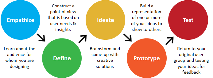
Apply Design Thinking

Prior to the weekend, visitor estimates were casually tossed around. Whether a backup plan was strategized or not, it was evident that the actual attendance to the region was far greater than expected. The lack of parking — yet alone physical space — direction, and transportation resources caused a once relaxing environment to quickly become stressful and borderline dangerous.

Design thinking example

Hosting a large number of visitors — similar to a sporting event — called for an increase in staff or personnel to at least assist visitors during their travel, yet alone manage their experiences while visiting. This region in particular required off-road access to view some of the most appealing landscape. With no prior education or experience in off-roading, hordes of visitors took to the trails without proper equipment or professional direction; conflict ensued for many, positioning select groups against each other. Have you ever seen a Hyundai Sonata attempt a water crossing? We hadn’t either until this trip.

With consideration for the needs, wants, and limitations of visitors, the ‘Super-Bloom’ experience could have been something special. And had I not been working shoulder-to-shoulder with a team of UCD practitioners, reminding me daily how design should solve problems, I’d still be confused and frustrated from the tension felt during the experience. Understanding the gaps, missed communication, and lack of research helps to alleviate the disappointment I felt (kinda). Who knows, in the next decade we might just see designers in charge of the solutions to the problems we identified — wouldn’t that be smart. The events of the 2017 California ‘Super-Bloom’ are a reminder that design thinkers are needed everywhere; in every company and perhaps most especially when it comes to serving the people experiencing government services.

Design thinking can transform. Let us show you how that paired with a UCD approach can open the door to new possibilities.

Digital Designers and Drug Dealers: We All Need The User

Nobody wants to be called a user. In grade school, that meant you only pretended to be friends with Tina because you really liked Amy. User. In high school, when your mom found Jack’s badly rolled joint in your jeans pocket on a pre-wash inspection, she freaked. Oh my gosh honey, are you a user!? But once you found yourself in the digital design world, the seemingly unsophisticated and often maligned moniker ‘user’ took on a more positive mantle. In fact, it opened the door to thought-provoking conversations about design, experience, and the joy that is felt as people interact with something that is well-designed. More recently, it’s being treated as an undesirable label again, attributed to a form of rather careless behavior on the part of the digital labeler: Oh no, we shan’t call them ‘users’.

Sigh. I think we’re going to have to toughen up. The practice of UX (User Experience) in its classical sense, demands a conceptual context with a blend of human factors and ergonomics that without a doubt, needs a user. Co-founder of the UK-based agency Clearleft, Andy Budd, recently participated in a lengthy and enlightening interview with Digital Arts that thoroughly covered his take on the biggest morphisms in UX; much of which relates back to the term ‘user’ and its unique meaning for the niche specialists who use it as a part of their profession. Andy illuminates the classic UX designer role while educating his audience on the murky waters surrounding title confusion within the field of digital design.

Watch the full interview here: Digital Arts UK | UX in 2016: An in-depth discussion of today’s big issues with Clearleft’s Andy Budd

We can’t all possibly be UX designers can we?

Over the past five or six years an interesting shift has taken place within the digital design market that has resulted in mass confusion among the greater industry. This includes clients of design firms, employees within these firms, as well as new professionals who are seeking to join the industry in their career search. As Andy points out in the interview, this shift in professional title and qualification is simply a result of supply and demand. As demand grew rapidly for classic UX designers, supply couldn’t keep up, leaving prime opportunities on the table for other designers who have similar skill sets. In theory, a niche group suddenly opened its door for others to join the cool kids.

Before we share any further insight from Andy Buddy, let’s quickly cover the core competencies that make a UX designer such a commodity in the first place:

  • Interaction Design
  • Design Research
  • Information Architecture
  • UX Strategy

Many industry professionals fail to recognize that UX design is more scientific theory with well over 20 years of practice behind its title. In fact, the UX community should be looked at as a body of knowledge in its own right that is approached with well tested theory and dedicated practice.

If we go back to Andy’s point on not seeing enough initial supply in order to fulfill the demand for classic UX designers, we can understand why it was fairly easy for other skilled designers from slightly different disciplines to fill the void. From a client’s perspective, it’s not easy to differentiate between all high level designers while identifying exactly what expertise they need for their project. This explains why a large number of predominately visual designers (or UI designers) have filled the gap in supply and demand with a quick transition into the UX field. They may be talented within their area of expertise, but that’s simply not an automatic qualifier for the UX title, and the same goes for all speciality design fields.

UI designers are often experts in:

  • Visual Design
  • Interaction Design
  • Experience Design

In addition they commonly follow the mindset of:

I designed an experience, I then designed a thing, so I must be a UX designer. Andy understands this reasoning but proves that it’s a bit misleading as he explains, “I believe you can’t design an experience. You can only try, and that it is much more of “a layered practice” with lots of practitioners adding to that experience.” We believe the same. You can’t design an experience, but you can design strategic paths for it to unfold. We can see first-hand that this idea of everyone being able to call themselves a UX designer is causing the strategic approach of design to be overlooked and possibly even archived for some unknowing clients. For a large pool of clients who understandably don’t know exactly what kind of ‘U’ or ‘X’ or ‘D’ they should be looking for, they may be finding talented individuals, but might not be finding the best tool for the task at hand.

The simple truth is that you need specialists when you are building complicated things. Andy Buddy said it best, “If everyone is responsible for everything, nobody is responsible for anything.” So lets keep it straight, UX design is not experience design (XD). A classic UX designer taps into the human factors discipline to understand interaction, can analyze your business problem, employs research-based design practices, knows how to structure content, and will strategize your customer journey before any visual designer should even hit the sketch pad. Experience design is broader. It’s what designers want users to feel when they interact with a brand across all its various touch points, beyond digital. It’s the layer of intuition and visualization atop a solid foundation that gets uncovered as the entire design team does its strategic thinking (or discovery). A design team will all be solving the same client problem, but will be doing so from different perspectives and much different lenses. Super key! You wouldn’t use a telephoto zoom lens for a portrait photo shoot unless of course you found out your client was selling the next great acne cream. Then, only your visual designer might insist on real proof and switch up the lens.

No one tool will ever do everything that you need, and the more often companies chase this dream of the multi-acronym designer saving the day, the further down the rabbit hole they will fall. Moving into the future, Andy expresses that designers need to consider themselves as a toolbox. A toolbox full of skills clearly knows what it can do best, but also knows that it may need to collaborate and learn before embarking on complex digital projects.

Designing-North-UX-User-Example

It’s quite interesting to watch the digital design industry burst at the seams with professionals, cringe as the acronyms morph, and sigh as the term ‘user’ gets dropped from many UX conversations. We get it. The subject of UX is a confusing topic and it doesn’t show signs of simplifying anytime soon. Whether the term ‘user’ is considered impersonal, not representative of a project’s defined persona, or even feels a little drug-den-ish or mean, it’s still an integral front-end component to the Experience Designer title if that’s what one is really practicing. In some disciplines, redefining titles to better align with a more familiar subject is appropriate (like, vice-president of people vs. vice president of human resources) but that’s not the case in this design realm. In a way, removing the U from UX would be comparable to asking a chef to make your favorite meal without him inquiring as to the name of your dish, or at least some hints on a food group. Or better yet, it’s like Jack’s joint getting that whirl in the washing machine: Mom didn’t do her usual ‘research‘ and just wanted your jeans to ‘look and feel‘ pretty.

As the industry moves forward, it’s vital that rising design leaders receive broad exposure to all the various lenses and mindsets of UI, UX, XD, IxD, et al. In doing so, they will be better suited to bring the right mix of design minds to the table while trying to create a collaborative environment and strategic approach for client projects. With so many X’s in our world it’s not shocking that the classic discipline of UX has been misrepresented through title confusion and task semantics. Regardless, the interesting evidence in throwing around the UX term so liberally is somewhat indicative that more and more clients and designers are recognizing that digital projects are indeed complex and strategic exercises: touching all aspects of a client’s business ( marketing, sales, customer service, IT, HR, etc.) Digital agencies like us understand that no longer are we in the website design business. We are in the crafting customer journeys business. And like so many of us operating in our own dark den somewhere: we all need the user.


Do you subscribe to Designing North Stories yet?


5 Tips for Managing the Digital Product Design and Development Process

Everybody knows that the three most important words in real estate are location, location, location. But did you know that the three most important words in managing digital product design & development are communication, communication, communication?

No, this is not a new Geico ad. We recently interviewed Designing North Studios’ Managing Director and Executive Creative Director Lisa Peacock  and Head of Technology Nigel Peacock about how best to navigate the sometimes stormy seas of digital design and development. The interview was timely, as we just completed a retrospective on a major digital product design (yet to be unveiled to the public) – a process we undertake religiously after every big digital endeavor.

What tools or processes are most critical to the successful execution of a digital development project?

Nigel:

If the decision is solely ours, then we employ the Agile development methodology, which has consistently worked well for us. Depending on the Nigel_Peacock-colorclient’s preference, we can employ offshoots of Agile such as Scrum, Kanban or even Extreme programming.  That doesn’t mean that we can’t adapt to other more traditional processes, however, such as Waterfall or Critical Path Method (there’s one for the teenagers). That said, we often find ourselves working in a hybrid environment to accommodate a particular client’s internal processes. Whatever the preferred methodology, we do insist that a decision is made early on in the engagement usually during the discovery process which ensures that we get everyone on the same page thus completing stage one of “communication, communication, communication.”

Lisa:

Yes, and I think that the daily stand-ups are probably the most beneficial or critical element of that process. Every team member who is deployed on the project is part of the daily stand-up, and is expected to report on what they’re working on that day, what’s next on their task list, and any blockers or impediments that might cause them to not complete their task.

Nigel:

I would add  that it’s imperative that those meetings are kept to the brief three-point agenda that Lisa mentioned. In fact the meeting leader, the “Scrum master,” has a responsibility to keep the stand-ups organized to the point of being regimented and steer each contribution to a 5-10 minute slot at the same time every day.  Longer discussions can be saved for the “Meet After” or “Huddle.”  Working with a virtual team means that we don’t have the luxury of “water cooler” discussions, so tools like Slack and Basecamp are vital additions to our project arsenal, and allow us to continue conversations outside of the stand ups. Or we can just say “Hi’ to make sure we keep the team socialized and the energy levels up.

You’ve both managed countless digital projects over the course of your collective careers. What are the biggest potential pitfalls to be wary of – the perennial hang-ups?

Lisa:
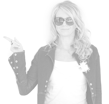
designing-north-studios-lisa-peacock-pointingTwo Things: Business Requirements and Business Rules. Not keeping requirements top of mind throughout the project, and not documenting the product’s business rules effectively so that they are not lost in the hand-off between Design and Tech is critical. Establishing requirements up front, which is part of an Agile process or any project process for that matter, is the easy part. But it takes strong leadership to continuously circle back and hold both the requirements and subsequent business rules up against decisions points as the team progresses through a project.

Nigel:

Yes, and steady tracking of the requirements and designs makes it easier to eliminate disagreements as they arise. When you encounter a conflict between a proposed UX solution from the designers and a technical solution from the developers, we’ll grab the applicable business set to help inform a direction. I would also add that guiding the customer toward defining the MVP (Minimum Viable Product) is paramount to any product launch success. It’s super easy to get excited as the product begins to take shape and keep adding more and more bells and whistles until you eventually have a difficult time reaching the finish line. Keeping a backlog of great ideas, with a quick prioritization indicator for add ons later is critical to keeping the creative thinking logged. It also helps to remind clients that you can eventually get everything you want, but not all at once. This is where Agile, used properly, can be a real asset.

Speaking of settling conflicts, how do you solve conflicts that aren’t necessarily settled by a review of the business rules?

Nigel:

branding-design-gallery01Even the most well documented, evolved business rules can still be open to interpretation when the development rubber meets the road. It’s really important to have members of the design, development, and analysis teams joined at the hip from the project inception to deployment.  Rather than constrain enthusiasm or creativity, we tend to let ideas flow freely, then before committing to them, we’ll have the Tech team make sure that designers aren’t writing checks that can’t be cashed.

Lisa:

Hey now, expertise comes at a cost my friend. Ha! No, this is true. Creativity can jeopardize scope. A good creative director will spot it when its happening. I would also add that the designers can often help to rein-in the tech team too when their solution is more elegant than might be needed for a particular requirement or business rule. Again, daily stand-ups can give tech a better understanding from the design and business teams as to what the customer not only wants but really needs. Then assumptions aren’t made along the way that can cost everybody extra time and money.

You touched on time and money and that translates to budget. What tools do you use for scheduling and for tracking budget?

Nigel:

Typically we use Microsoft Project for the project schedule and Google Docs to communicate high level planning.  Depending on the customer preference we will use a variety of development planning tools, but most often focus on Microsoft Team Foundation Server (TFS) or JIRA for sprint planning.

Lisa:

In terms of tracking project budget, we’re a Harvest shop. Everyone works to a detailed time sheet that’s approved every week. Harvest reports make it easy to see exactly where you are, and forecast burn rate which is especially helpful when talent is working on more than one project at a time. Specifically, for tracking design deliverables, we like Trello, and find it to be an effective way to assign tasks, see what’s coming up next, what’s in-review with the client, and finally fill-up the complete column once a deliverable has been handed-off to tech.

What happens when a designer or a developer just isn’t getting it?

Nigel:

You know, that’s honestly one of the best parts of our business model. We’re a blend of freelancers who have worked together on a variety of projects. When we select our team, it’s after Lisa and I have a good feel for the type of client we’re dealing with, the type of project we’re tackling, and the methodology that’s going to work best for the client. We handpick the team from there. We’re not saddled with having to use anyone “on the bench” just because they’re filling seats at an office.

Lisa:

And look, despite that flexibility, we still need to have the fortitude to acknowledge when we’ve got the wrong person for a particular task. We recently had a very talented designer who came out of the chute with the client’s favorite overall design for a digital product, but whose follow-up design comps kept missing the mark. Rather than beating our head against the wall, we just made the change; swapped out one talent for another talent more suited to the pace and ‘feel’ for the product brand direction. It worked out great, in no time, we were back on track. It was the right move.

Nigel:

Again, our business model gives us a lot of flexibility. We usually shoot for the Extreme Programming model in that we assemble a team dynamic which comprises a mix of business experience, technical talent, innovators, and leaders but most importantly a team that works together, understands each other, and just gets off on producing quality products.

Any final thoughts or advice?

Nigel:

No process is perfect. We see digital product design & development as an iterative process always. We’re continually improving and refining how we tackle new projects. But without question, effective communication between team members and between DN and the client, is paramount. And actually, a true strategy we believe in.

Lisa:

I agree with Nigel, and would add that having people who are generally happy, energetic, and who come to the table with the DN mindset we’re always looking for in our stars, is what I strive for. We put together teams filled with people who enjoy what they do. It makes life much easier during crunch time. You can have the best full stack developer on the planet, but if everyone hates working with him, it can make for a rough project. Respect for one another and collaboration are key.

Nigel:

And I think that when team members have a common goal and a mutual respect for one another, it also eases the process. When everyone has a solid understanding of the scope of the project and has respect for each other’s abilities, it goes a long way. 

Top 5 tips for effectively managing a digital product design & development project:

_______________

1. Communicate, Communicate, Communicate.

Conduct daily stand-ups. Every team member knows what he or she is working on that day and that week. Blockers are addressed and mitigated.

_______________

2. Revisit requirements & business rules.

They’re established during discovery with the client and are revisited frequently – Scope creep kills the project, erodes motivation, and makes planning a pain in the ass.

_______________

3. Establish an MVP.

Make sure the project plan has a clear definition of the MVP and successfully execute that first. Refer to the “wouldn’t it be great” list later, and don’t let that distract anyone.

_______________

4. Assemble the right team.

And don’t be afraid to make changes when needed. One wrong apple makes the whole tree look like it needs water.

_______________

5. Iterate.

No process is perfect, so keep striving to refine your processes with each new project. Wisdom comes by learning something every single day.

_______________

Ready to get started on a new digital product or redesign?

GIVE US A HOLLER

_______________


Subscribing to all our storytelling yet?


What We Do at Designing North Studios

Designing North Studios

At DNS, our goal is to always deliver a hover above. To deliver what was asked for, but with that little extra – something just “north” of good. This approach, this mindset traverses our people and our three main service offerings: Digital Design & Development, Brand Strategy, and something we like to call: Rent-a-Star.

Digital Design & Development

Web design has come a long way since ‘Al Gore invented the world wide web a couple decades ago’. Think of it, when was the last time you used the Yellow Pages? For some of you, the answer is never. Now, web design has evolved from “hanging a shingle” to “creating an experience.”   A digital experience that should develop, complement, and pave the way to brand loyalty and ultimately conversion. A website, web or mobile app has to compete for eyeballs. For attention. It must captivate, be experiential, and then convert. Convert from a user, to a participant, a subscriber, a buyer, a champion.

At Designing North Studios, we know this. Whether we are engaged in a pure branding gig, a website redesign, a new digital product idea, developing content, or engaging in strategic initiatives around your product or social media landscape, all roads lead to experience. That it be aligned with your brand promise and values, be purpose driven, memorable, and make it easy for your peeps to return. Again and again. Face it: when any experience is good – people like you. They want to hang out, come back, hear more – they trust you. And so they should. If what you’re selling, saying, pitching, or bitching about is true – it’s only a matter of time before your friends become influencers. So we help you get real about your digital product: what it is, who it’s for, and what will make it successful.

Brand Strategy

The most important part of getting to the heart of of being the brand that you are, and delivering on that promise, is spending time (and money) on the discovery phase. This is when, through listening, questioning, interviewing, brainstorming, (and even sometimes stick drawing), people like us come to understand your organization, and what that currently looks like to an end user, customer, or prospect. The best free advice we can give you: never skip this phase – no matter what firm you select to help you with your next project. Discover who you are currently, and see if that aligns with who you really want to be. And then reflect on all the ways that can get you there: change your product, pivot your service, re-evaulate your audience, re-position your message, or perhaps, stay the course.

We’re here, and would love to start listening.

Rent-a-Star

Sometimes you just need a hand (or at least think that’s all you need). We see this frequently after the start of the New Year. All of that marvelous planning for the upcoming calendar year includes projects that require staff skill sets that you ultimately realized: you don’t have. Oh, and there was nothing in the budget for additional headcount either.

If this sounds too familiar (too real) – we might be able to help. Designing North Studios is an amalgam of designers, developers, and project leaders who have worked either remotely or directly with one another over the years. Most of us, with exception of a few pay-rolled diehards, freelance for DN. But we’re still a family.

That said – our model can be very beneficial to organizations that operate on a human-asset-light basis. If your organization finds itself in need of a designer, developer, or project leader for stints of less than a year, we can likely supply you with a vetted professional. Are our people good? We think so. Every one that’s part of the team first works for DN directly before client work is even an option. We learn a newbie’s skill set and their mindset – and if it fits: they are deemed fit to move on to play with clients. Our reputation is on the line. But we also know that you’re only as strong as your weakest link. We’re not harsh – we just uncover the best in people and nurture it. So if they sit with you for a while, instead of us, they are ready. Our team aligns on work-ethic and soul – producing Designing North Stars – together making each other brighter.

Bootstrap/Material Design vs. Custom: When a Designer Goes Rogue

We periodically receive requests for advice from friends and colleagues. If you’re not knee-deep in design mud on a daily basis, it’s easy to wonder if things are going along the way they ought to be. And it’s equally common to wonder if you’re spending your design dollars wisely. You want to be fair, but not taken advantage of. You want to make sure that nobody is blowing smoke…

Here’s a recent one that we thought might be useful to more than just our friend:

I contracted out a designer for our company to help us design our new Web app experience. We had wireframes in place so I needed someone to bring them to life.  One of the requirements I gave him upfront is that we have a very weak front-end development team and my preference was we built the design off a Bootstrap/Material Design theme.  He didn’t show any resistance to this early on.

As the project progressed, I noticed that he wasn’t using any themes and, instead, was creating his own design.  I called him out on it and he went back and swapped some of the visual components with ones from Bootstrap (e.g., paging control).  I, then, did a full assessment on his comp and found that almost all of it was custom.

I brought this up to him and he started getting defensive saying that I shouldn’t have hired him if I just wanted him to a apply a theme.  So, I’m in a bit of a bind.

What’s your perspective on Bootstrap/Material Design vs custom?  For our company, it’s most important that we move fast (even with weak front-end development) and provide our end users a super simple experience.

Hmm. A few things come to mind here:

The planning, the agreement, the approach.

There are a bunch of Material Design framework themes based on Bootstrap that already exist – did you guys start there? “…build the design off a Bootstrap/Material Design theme.” If you purchased an existing framework, then I don’t know why the designer didn’t follow and work with the purchased theme – seems odd if that was the plan. If you did not purchase a theme, was the agreement clear as to what you meant by “…build the design off a Bootstrap/Material Design theme?” Because Material Design is more than just color and visuals, it also offers tested layout principles to follow (particularly with regard to the interactions around the Android OS) – but the approach to working with Material Design can and should be interpreted/considered/potentially mixed if designing for both Android and iOS.

As for getting defensive around working with a theme, it still takes design talent to work with a theme // but you need some code chops or a good developer partner to actually execute against a canned theme well – it’s not an out-of-the-box exercise.

As for my opinion – both options can be expensive and turn out badly without a good upfront plan. If you get a rock star designer that understands how to design for a developer – then custom is best. If you get an all-in-one designer/developer that finds it easy to work and pull apart a purchased theme, great – but that’s likely a designer-focused person who can hack at the code vs. a developer who can follow a design aesthetic  (good developers hate purchased themes, faster to do stuff from scratch). But if you were just trying to follow the principles of Material Design so as to execute good UX – then the designer and developer should have been working closely from the beginning. And they both should have known to ask for that up-front.

fast=crap // slow=crap // appropriately steady=quality.

Got a question? Shoot us an email.

Sunday on the Sofa – Good UX and Bad UX

Like any red-blooded, country-loving, digitally-engaged American couple, my husband and I spent last Sunday morning shopping online. He for some bike rack attachments for a road trip, and I for new sheets to replace our frayed sets.

This is a rather pathetic first-world problem, but we are selling our home, so I didn’t want to invest in a whole new design/style for our bedding – just in case our new digs have a different vibe.  After hearing an annoying satellite radio ad over and over again for Boll and Branch sheets, I thought I’d check them out.

I found the whole user experience remarkably easy and intuitive. I was greeted with a $30 off-my-first-purchase-coupon-offer, which I quickly dismissed after determining that my satellite radio coupon code would give me a better deal. The website’s photos were big, bold, and beautiful, and visually answered nearly all my questions. Option selections such as size and color were in big print and simple to navigate – a bonus for my deteriorating middle-aged vision. The checkout process was a walk in the park. No hassles, no long processing waits while you’re wondering if you actually pressed a button or not, no repeat entries – clear bold calls-to-action (CTAs) so you know exactly what to do next.

Meanwhile, as I was delighted with my quick and facile purchase, my husband was grumbling loudly at the other end of the sofa.

“Jule, you gotta check this out,” he said.

I gathered my robe, and slid my coffee over to his end.

“I mean look at this! It is so irritating!” I knew where this was going.

“I know exactly what I want to look at, but they’re making me enter all this junk first. Okay, so now I’ve done that, and I have no idea if what I’m seeing matches what I need now. I want it for my truck, but they’re modeling the rack on a car.”

good-ui-not-equal-good-ux-designing-north-studiosHe was exasperated. The company was Yakima, one I hold near and dear to my heart due to a native allegiance to the Northwest. We have spent thousands of dollars on Yakima equipment – from Rocket Boxes to ski racks to bike racks for just about every motor vehicle imaginable. Suffice to say, we’re fans. I’d almost go so far as to say to we’re influencers in the parlance of Malcolm Gladwell. But here’s the deal, my husband was so frustrated with the user experience, that he abandoned the purchase. He figured out a way to make due with what we had. If you go to the website, it looks beautiful. The user interface or UI, is modern and appealing. It’s the user experience that was miserable.

So there we were. A once blissful couple wiling away our morning with our laptops, Meet the Press, and our credit cards burning in our hands – both intent on a purchase. And due to user experience (UX), the too frequently ignored brethren of UI, one purchase was gleefully made, and one purchase was angrily abandoned.

If you’re building a new digital product or updating an existing website, make sure the firm you’re working with knows the difference between UI and UX. Designing North Studios’ Managing Director Lisa Peacock likes to say, “UX should inform the UI. We’ve all been to art school – we know we can make it look good, but can we make it useable.” That’s the problem your firm needs to be able to solve.

Think of the money, time, and effort you expend on finally getting BUYERS to your website. Not just looky-loos, but BUYERS. Don’t blow it once you’ve got them there. UX is not optional. Our weekend foray resulted in one happy customer, (who will be a return customer), and one temporarily lost customer. Had we not already been avid fans of Yakima’s products, we wouldn’t consider trying again. Fortunately, the coffee was good, the PJs were cozy, and Meet the Press was entertaining. Not even crummy UX could spoil our Sunday on the sofa.

Yup. Mobile. Again.

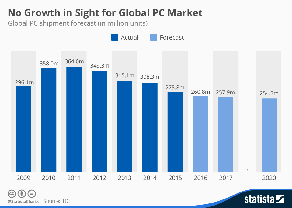
We really don’t mean to beat a dead horse, but it continues to amaze us when we see successful companies which have still not addressed their unresponsive (read: not mobile-friendly) websites. This recent chart from the insightful folks at Statista underscores the trending well.

decline-of-global-pc-market

PC sales have done nothing but decline since 2011, and are forecasted to eventually stabilize per research from International Data Corporation (IDC). Tablets, phablets, detachable tablets, and phones have all impacted the market substantially. There are, of course, other factors such as the general economy (commodity prices and foreign currency headwinds for example) and perceptions regarding added value or lack thereof of new PCs that affect these trends.

But let’s face it, most of us are hard-pressed to think of a day in which we haven’t used either our mobile phone, tablet, or phablet to access a website.

And there are few things more irritating than landing on an unresponsive website. Your handy hand-held now requires two hands as you try to awkwardly use your fingers to blow-up the micro-text you’re trying to read. Then you have to slide around in an attempt to find a tab in the main navigation to get to your intended destination. A few expletives, and BAM, you’ve abandoned the site in search of greener pastures.

We’re pretty sure that most university marketing programs do not stress a make it hard for the customer to find your product or service philosophy. So why isn’t every company on the planet jumping into website redesigns? Good question.

We think there are four main reasons:


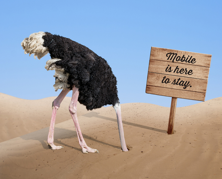
You can't WISH away mobile. [Photo credit: SuperFamous.com]

You can’t WISH away mobile. [Photo credit: SuperFamous.com]

  1. They don’t think there’s a big problem with having an unresponsive website.

We can always point to Google’s demoting of non-mobile friendly websites as the most actionable reason to believe it’s a big deal to have an unresponsive website. And now Google is preparing for what some are calling Mobilegeddon2. In May 2016, Google plans to,“…start rolling out an update to mobile search results that increases the effect of the ranking signal to help our users find even more pages that are relevant and mobile-friendly.” As a design studio that’s deeply involved in creating fantastic and intuitive user interfaces and user experiences, we struggle to digest that a successful company doesn’t view unresponsiveness as a big problem.

2. There’s no money in the budget.

This one we understand. Depending on the size of an organization, the move to a responsive website and/or a mobile app can be a considerable undertaking. We get that. As with most new marketing initiatives, we recommend that you put together a compelling rationale plus ROI that your senior management cannot ignore. Here are few thoughts to bolster your argument.

3. It’s a big undertaking because they need to update the whole website anyway – it’s easier to just keep putting it off.

It’s like dieting. You’ve been adding a couple extra pounds every year, but instead of jumping on it, you’ve let it slide and now you need to do something serious. A few pounds has become an even 10. Your favorite jeans don’t fit. You don’t want to go out. It’s like that with your website, if you haven’t been consistently addressing its upkeep (let’s face it, it’s hard to fit everything in), that killer bod is now, well, rather unsightly.

You have to face the facts. It’s only going to get worse. Mobile is not going away, nor are all those updates and subtle improvements that your website needs. The sooner you get it into a more manageable configuration, the better you are going to feel. Just contacting a design studio to start the conversation will help. So hop on the treadmill and cut the carbs. You’ll feel better once you get started. We promise.

4. Aliens have invaded their bodies with no concept of Earthly digital interactions.

We’re closet nerds. It could happen, right? Plus, it would explain a lot.

What are you thoughts? Are we missing something?

If you’re ready to dive in – or perhaps put a toe in the water, GIVE US A JINGLE.


6 Smart Sites/Apps That Might Make Holiday Shopping More of a Breeze

The holiday shopping season is upon us (yippie! no?), and the team at Designing North Studios has compiled a short but helpful list of sites and apps that have a UX that might just make things easier. From helping you navigate the mall parking lot, to finding the perfect gift, we’ve got you covered.

Fancy

Fancy.com offers a beautiful UI, with the killer combo of intuitive search functions, painless checkout, and stellar product photography. Offering very unique merchandise – from clothing and accessories, to things for your furry friends, food, cars, travel and destinations, this site curiously has it all at your fingertips. Fancy also allows you to “chip in” with friends and family on a gift for someone, where everyone pledges an amount. Crowdshopping, I guess.

Fab

Another great and well-known one-stop shopping experience is Fab.com. With a rotating, easy to search, more modern catalog of gifts and its super smart checkout experience, you can find something crazy for everyone on your list. The site’s product photos, easy to read product details and reviews remove the guesswork from your gift buying, while free shipping and returns (and white space) make it a great overall shopping experience. Yes, it’s Fab.

Warby Parker

Looking for something for the fashionista on your list? Try Warby Parker eyeware at warbyparker.com. The clean UI makes browsing glasses and sunglasses frames pretty neat. The experience takes the guesswork out of the equation. By uploading an image of the person you are buying for, you can virtually try a pair of glasses on them using a simple set of tools to reposition, scale, and angle frames and arms until they fit that person’s face! (What? yep.) Once you have the positioning just right, the site remembers the settings, so you can try pair after pair and find the right look. For you’re friend. (long pause) Or For you. (Stop shopping for you!)

Tadd Car Finder

If online shopping isn’t your thing (like, you’re an alien), and you’re hitting the malls instead, this free app for iPhone and Android is hilarious and helpful (both good mall emotions). Tadd Car Finder will actually help you find your car in the parking lot. This handy and easy to use app uses map annotations and notes to help you remember where you parked, and the exact location of your car, in detail. Note to self: How did I ever get home without this app?

Giftster

Giftster is an app for iPhone and Android and a website that can be thought of as an online gift-registry that is not store-specific. By signing into one group account, you, and those in your group, add things they want along with gift preferences (sizes, interests, etc.). The platform links with sites like Amazon, Target and other stores through your web browser – allowing you to add items to your list with a simple click and drag. It also allows you to mark a gift as reserved or purchased, avoiding duplicate gifts.  Instantly, you have all the information you need at your fingertips to get your holiday shopping crossed out done. Kinda like that old folded up Christmas list you carried as a kid, gave to your mom who then mailed to the North Pole. Kinda.

Wish

Need to drop a few (or many) hints about what you really want this holiday season? Check out wish.com (also available for iPhone or Android). The straightforward design and UX of the site and the app allow you to shop, collect and share products you are wishing for with friends and family. It’s like Pinterest for wishers vs. pinners. There’s a lot of ‘wishing’ going on here at the studio. Back to work people!

So what kind of shopping experience do you look for during the mad holiday dash? Quick? Kind? Beautiful? Simple? One-click? Mind reading? We’re kinda curious this season. Good luck out there.

Chris Mohler is a Creative Director at Designing North Studios. She loves the holidays, her cats, and has nasty case of insomnia at the moment.

Northern California
studio@designingnorth.com
© 2018 Designing North Studios. The Creative Division of The Carrera Agency. All rights reserved. Privacy | Terms