
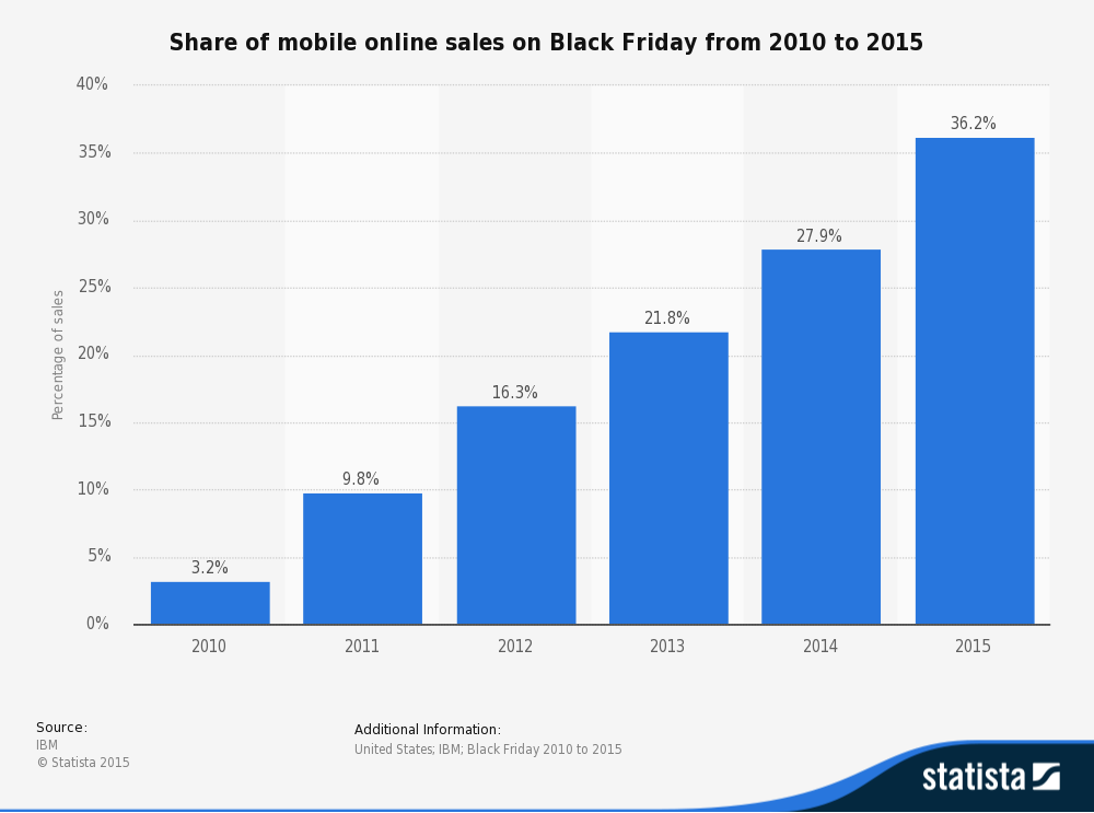
We really don’t mean to beat a dead horse, but it continues to amaze us when we see successful companies which have still not addressed their unresponsive (read: not mobile-friendly) websites. This recent chart from the insightful folks at Statista underscores the trending well.
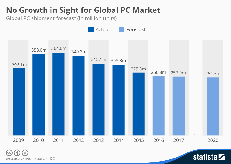
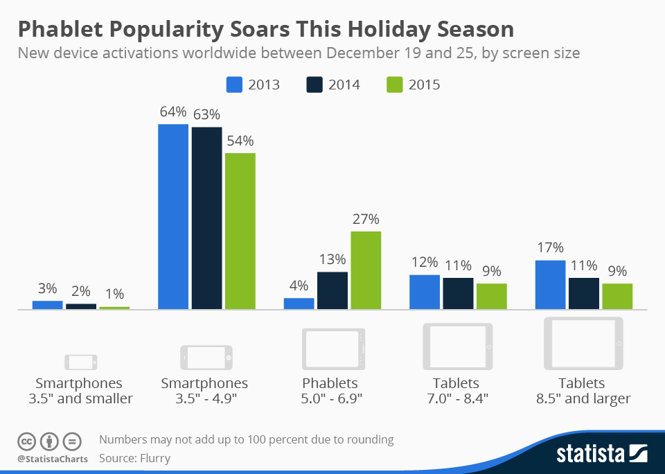
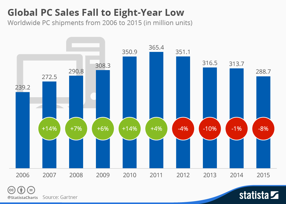
PC sales have done nothing but decline since 2011, and are forecasted to eventually stabilize per research from International Data Corporation (IDC). Tablets, phablets, detachable tablets, and phones have all impacted the market substantially. There are, of course, other factors such as the general economy (commodity prices and foreign currency headwinds for example) and perceptions regarding added value or lack thereof of new PCs that affect these trends.
But let’s face it, most of us are hard-pressed to think of a day in which we haven’t used either our mobile phone, tablet, or phablet to access a website.
And there are few things more irritating than landing on an unresponsive website. Your handy hand-held now requires two hands as you try to awkwardly use your fingers to blow-up the micro-text you’re trying to read. Then you have to slide around in an attempt to find a tab in the main navigation to get to your intended destination. A few expletives, and BAM, you’ve abandoned the site in search of greener pastures.
We’re pretty sure that most university marketing programs do not stress a make it hard for the customer to find your product or service philosophy. So why isn’t every company on the planet jumping into website redesigns? Good question.
We think there are four main reasons:
![You can't WISH away mobile. [Photo credit: SuperFamous.com]](http://45.33.55.47/wp-content/uploads/2016/03/Dandelion.jpg)
You can’t WISH away mobile. [Photo credit: SuperFamous.com]
-
They don’t think there’s a big problem with having an unresponsive website.
We can always point to Google’s demoting of non-mobile friendly websites as the most actionable reason to believe it’s a big deal to have an unresponsive website. And now Google is preparing for what some are calling Mobilegeddon2. In May 2016, Google plans to,“…start rolling out an update to mobile search results that increases the effect of the ranking signal to help our users find even more pages that are relevant and mobile-friendly.” As a design studio that’s deeply involved in creating fantastic and intuitive user interfaces and user experiences, we struggle to digest that a successful company doesn’t view unresponsiveness as a big problem.
2. There’s no money in the budget.
This one we understand. Depending on the size of an organization, the move to a responsive website and/or a mobile app can be a considerable undertaking. We get that. As with most new marketing initiatives, we recommend that you put together a compelling rationale plus ROI that your senior management cannot ignore. Here are few thoughts to bolster your argument.
3. It’s a big undertaking because they need to update the whole website anyway – it’s easier to just keep putting it off.
It’s like dieting. You’ve been adding a couple extra pounds every year, but instead of jumping on it, you’ve let it slide and now you need to do something serious. A few pounds has become an even 10. Your favorite jeans don’t fit. You don’t want to go out. It’s like that with your website, if you haven’t been consistently addressing its upkeep (let’s face it, it’s hard to fit everything in), that killer bod is now, well, rather unsightly.
You have to face the facts. It’s only going to get worse. Mobile is not going away, nor are all those updates and subtle improvements that your website needs. The sooner you get it into a more manageable configuration, the better you are going to feel. Just contacting a design studio to start the conversation will help. So hop on the treadmill and cut the carbs. You’ll feel better once you get started. We promise.
4. Aliens have invaded their bodies with no concept of Earthly digital interactions.
We’re closet nerds. It could happen, right? Plus, it would explain a lot.
What are you thoughts? Are we missing something?
If you’re ready to dive in – or perhaps put a toe in the water, GIVE US A JINGLE.