Crafting a New Reality for Education and Career Decisions: Lead With UX

The take-away feeling an end user records from an experience in a digital environment reigns supreme. With almost any product or service accessible via wifi and a connected device, user behavior is most accurately analyzed with patterns of interaction between people and technology devices. In fact, many people spend a significant portion of their day “glued” to mobile screens (for the average consumer, that’s 5 hours per day), scanning social accounts, browsing trends, visualizing their ideal self and inevitably measuring digital self-worth.

Equally important, people search for answers to difficult life-questions using digital experiences as validation. And they are convinced by their findings, certain their devices (and someone else’s experience) confirm reality. Whether this is good or bad, it supports the idea that people can arrive at sensible conclusions upon interacting with well-designed digital touchpoints — websites, web apps, and mobile apps.

With this understanding of the digital world, we believe the described experiences increasingly influence the way a person thinks about the following four questions:

Who do you want to be in life?

What do you want to do?

What makes you happy?

What is your passion?

Referring to younger generations (ahem… millennials and gen z), people commonly learn about their “authentic” desires through research conducted on a smartphone, often dreaming vicariously over project photos or videos shared by someone with a “purposeful” occupation/existence. Ultimately, these experiences influence the discovery phase for both students and young working adults:

What do you want to study?

What school do you want to attend?

What career path do you want to pursue?

What company do you want to work for?

John Richardson, an adjunct professor at the University of Ottawa and head of English at Ashbury College reiterates that “Technology is less intentional and more intuitive for 32% of the population, and their social skills are morphing into a hybrid of technology and face-to-face contact” — therefore, solutions must be designed to reflect these nuances.

Most importantly, if digital thresholds have become the gateway for self-discovery, we (as journey crafters) want to further examine this same process in order to support young people in making better (well-informed) choices about their education and career. We repeatedly talk about the rising costs of attending universities and how difficult it is to correlate a degree with success — or passion with career prosperity — in the real world. And it’s time we further examine the many options already being touted as the future of learning, the ones that have been available for years and may simply be in need of experienced and strategic UX designers to better craft their purpose and impact for developing generations.

Believe in the User and Their Experience

It’s time we embrace the inherent superficial value of digital and social media as a life-advice tool — our pixel reality — that empowers people to believe in themselves, explore new opportunities, and provide constant reinforcement through it’s craftily designed feedback loop: claps, likes, shares, comments, or “You have to see this!”

While watching the ‘Astrology’ episode of the Netflix series, Explained, scientists and current astrologists presented data supporting the idea that something doesn’t need to be real in order to have real effects — sorta like social media. It’s called the placebo effect, and it states: The belief in something can be enough for it to work.”

In fact, further research proves that many people admittedly know they are taking “the fake pill” (or accepting an absence of the real thing) yet still record a positive effect.

Feel better faster with the reassuring words from the doc; a bit of wishful thinking, don’t you think? Not quite. A new study conducted by Stanford University revealed the true power of believing in a positive outcome: healing. The study, published by Alia Crum, assistant professor of psychology at Stanford University’s School of Humanities and Sciences, hints at the use of the placebo effect beyond pills. Healthcare providers, in this case, significantly reduced healing times of allergic reaction patients using encouraging words about recovery times.

As you can see, if the effect (and affect) is in our minds, and belief is enough to inspire realness, companies should be more willing to support UX designers and more importantly, the UX process. UX practitioners craft journeys that empower people to be moved: students to personalize their education, workers to develop their professional path. All according to what people want, feel, and most importantly, believe.

Academics, careers and finances; these are key factors every student should consider before making one of the most important decisions of their lives: what college to attend and what career to pursue. But how does a developing adult gather the key information required to make sound choices on such weighted subjects? e believe personalized digital experiences can have a profound impact on a person’s choices, leading to greater feelings of success and ultimately happiness.

‘Money’s Build Your Own Rankings’ tool is a great example: it enables prospective students — and parents — to quickly adjust their needs (the input) and receive a research-supported list of schools and programs best suited for their life (the output). Not only does this provide simplicity, it reduces the frustration felt by those who truly don’t have the time and resources to independently identify their best options.

Good Design and Passion for the Problem

Considering the obstacles students and institutions currently face (affordability, location, academic preparedness, program choices, etc.), Designing North Studios recognizes that addressing these challenges with good design solutions is also really good business.

As the previous Director of Web Communications & Branding at Stanford Law School, Lisa Peacock (Designing North Studios’ Executive Creative Director) has been thinking about this for years, and was asked to  develop a tool for law students while at Stanford: SLS Navigator. This web app enables students to not only find courses offered at the law school based on their area of law interest, but across the entire university as well. It also suggests journals to reference, blogs to read, influencers to follow, and in some instances connects them with alumni who work day-to-day in those areas. The real stand-out feature, is that it also helps the students to ‘cover their bases’ – if they can’t decide between criminal law and corporate law, the app shows them courses they can take that work for both (just in case). That saves students from not heading down one wrong path, or delaying graduation because they didn’t take the right courses. What a concept, right? When asked about the project, Lisa had this to share:

“I think that every school should have something like this. I started with the following premise: what do I want to be when I grow up? Then you can take courses, read things, follow people, etc. that might cover various paths — so when you finally decide on a specific path, you’ve at least made some initial broad decisions that still count towards graduation and your focus.”

Simple, user friendly, and results oriented, SLS Navigator is still relevant ten years after its inception, and remains a testament to the positivity felt from good, inclusive design. Additionally, as it pertains to the student experience, let’s acknowledge that the process involved in choosing an education and career path must always account for the evolving needs of a digital-savvy (not dependent) generation.

The amount of data at our fingertips today is unprecedented, and what better way to use this information then design solutions to reduce uncertainty for students burdened with life choices: what school to attend, what career to pursue, where to live, and how much to spend. In a way, this approach embraces the art of paying it forward — helping the people who society will eventually rely on to create positive change in the future.

At this very moment, designers, scientists, and educators are looking for new ways to collaborate, with the vision that all students will eventually feel empowered to personalize their campus — or virtual — experience. As a design studio, it’s our goal to simplify the digital matrix of tools, processes, and lingo which serve as a means to this vision, while crafting thoughtful experiences for everyone involved. It’s what we love to do.
 

A Designing North Star’s User Story: As a Triumph Owner, I Want to Customize a Bike Into a Cafe Racer for the Distinguished Gentleman’s Ride

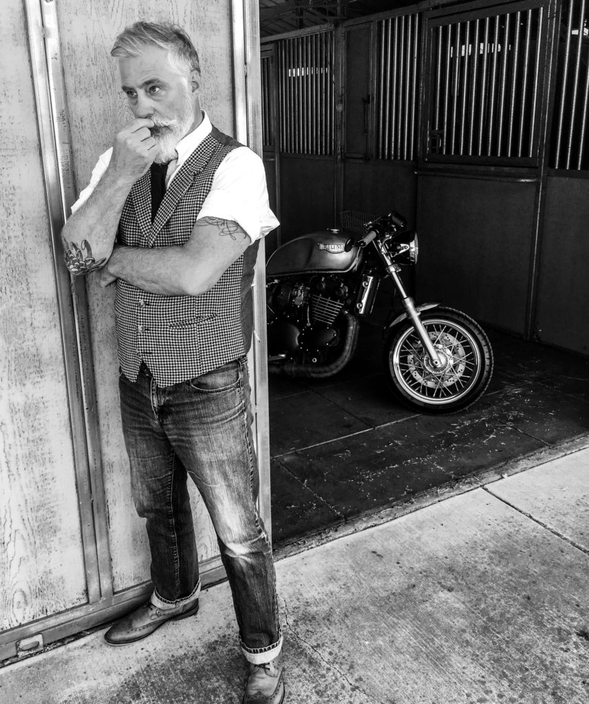
As a boy growing up in the 60’s, the vision of leather-clad bikers whose only nod to safety was an apparent paper machè helmet, pushing their bikes to seemingly interstellar limits filled me with intrigue and abject terror. I never found the grease and dirt of the ‘Rockers’ to be that appealing. In fact, I was more attracted to the clean-cut ‘Mods,’ but motorcycles in all of their stripped bare glory were the things of wonder. I marveled at the riders’ willingness to take a perfectly fine Triumph Trophy and pull bits off of it in a quest to drop weight. I was in awe of their nonchalant chopping, welding, and improvising to achieve that ‘ton-up’ machine.

However, I was too young, too broke, and too scared that I’d indelibly change the motorcycle to get beyond a dream.

The term “Ton-Up Boy” may have been lost to the ages. It defined a rank assigned to young men who straddled stripped down, borderline Burlesque British bikes and hurtled themselves towards (and often beyond) the magic 100 mph through the streets of London. Blurred streaks of black leather, dripping grease and belching smoke in a race from the Ace Cafe to the to Hanger Lane roundabout and back–to a plate of egg and chips.

Ride the Distinguished Gentleman's Ride and Raise Awareness for Men’s Health | Designing North Studios

The Project

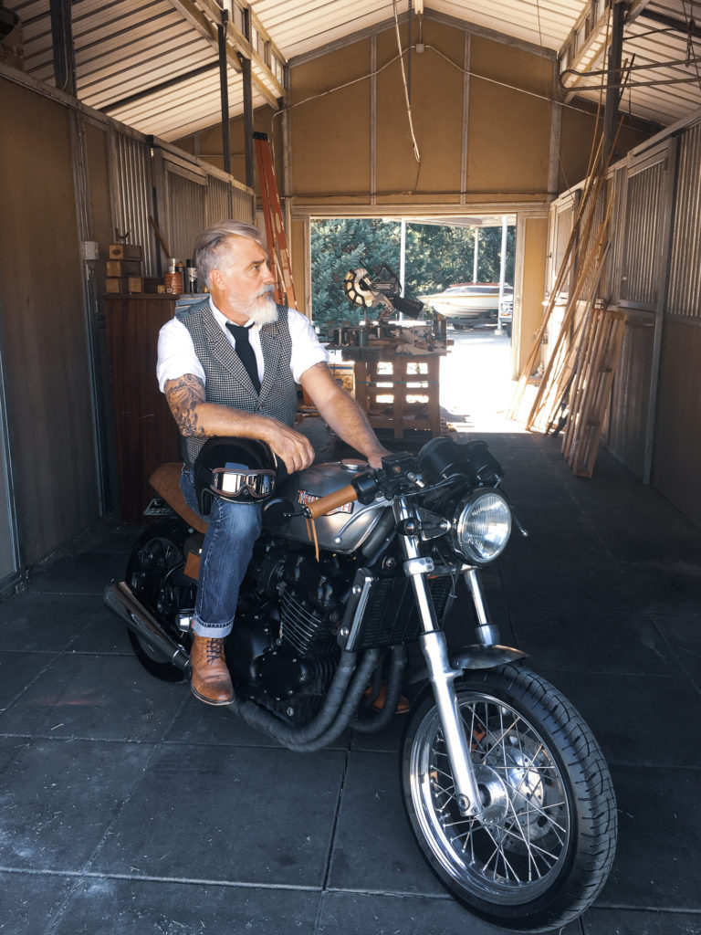
Skip forward many years of owning and riding motorcycles, acquiring mechanical and technical knowledge that could at least get me started from the side of the road (pending inevitable failure), and my thoughts returned to the ‘Ton-Up’ dream. Obviously achieving the magical “ton” nowadays is less of an accomplishment than putting your underwear on correctly, but locating a motorcycle that resembled the “ton up” machines of my youth provided a happy challenge. And building one was, to me at least, the final act after years spent gluing plastic model kits together.  

I spent some months scouring the internet for information on building a Cafe Racer. There’s a lot of info, I mean shit loads, and determining the best advice whether it was written by Jethro the hammer wielding yokel or Slick Jimmy’s Custom Foot Peg Emporium was a significant task. Companies like Ryca Motors sell awesome kits for you to quickly create your dream Cafe Racer but I wasn’t ready for anything remotely as professional just yet. I eventually pulled enough information together to create a vision of my project bike and how I might achieve it.

Fortune came my way via my good friend Rey Sotelo of Hollister Power Sports. I purchased an Indian Chief Vintage from Rey a few years back and never regretted the decision. Rey knew I was in the market for a donor bike and offered me a deal on older Triumph Legend TT, which had been received on a trade-in. A sit-up-and-beg cruiser wasn’t the most obvious donor choice for my cafe racer project but it was cheap so it meant that I didn’t care if my hammering, slashing and slobbering screwed the bike into oblivion. At a minimum I would gain some experience and most importantly, confidence.

So without a blueprint, clear project plan, or 50% of the tools I needed, I set about transforming a 1999 Triumph Cruiser into a rat-stripped Cafe Racer for my own sheer indulgence and pleasure.

Ride the Distinguished Gentleman's Ride and Raise Awareness for Men’s Health | Designing North Studios

The Build

Not only did the internet (kudos to Jethro) provide great project information, but without it I would never have been able to find the parts and equipment I needed for the build (what the hell did we do before Tim Berners Lee?). I am still blown away that I can lounge on the sofa and surf a catalog of parts from 2WheelPros.com or find assembly diagrams at Pandoras, hit a button and a friendly delivery service drops the bits at my door. Without companies like Texavina who not only hand made my new saddle but most importantly had the originally seat pan models to ensure a ‘true’ fit, I would have been screwed.

Skip forward again a few months and while I don’t think the bike will ever truly be finished, I do have a working manifestation of the vision I set out to achieve. It’s never going to be a concours d’elegance entry (even for my pre-industrial revolution eye it’s a bit rough around the edges), but it’s a rideable accomplishment that I would sooner massage my nether regions with a cheese grater than wind it up to the magic ton, but it runs and looks good enough and I did it on my own. Now what?

Ride the Distinguished Gentleman's Ride and Raise Awareness for Men’s Health | Designing North Studios

The Purpose: Prostate Cancer

Prostate cancer is the second most commonly diagnosed cancer in men. And The Movember Foundation is the largest funder of prostate cancer programs in the world. Additionally, prostate cancer only affects men, as women do not have a prostate gland. Risk factors in developing the disease include:

Age: The older a man, the more likely he is to be diagnosed with prostate cancer. If you’re 50 or over, chat with your doctor about PSA testing.

Family History : A man with a father or brother who developed prostate cancer is twice as likely to develop the disease. If you’re 45 or over and prostate cancer is in your family, you should strike up the conversation about PSA testing with your doctor.

Ethnicity: Prostate cancer has an increased occurrence in men of African and Afro-Caribbean descent.

For more information on prostate cancer including symptoms, testing, treatment options, and support resources, head over to the ‘men’s health’ section on Movember.com.

The Purpose: Suicide Prevention

3 out of 4 suicides are men. And 510,000 men die from suicide globally each year — That’s one every minute. This has to change.

The causes of suicide are complex. There’s no single reason why men take their own lives, but we do know that by improving overall mental health we can reduce the risk of suicide. We need to address untreated mental health conditions among men.

Too many men are toughing it out and struggling alone. There’s no shame in checking in your own mental wellbeing, and those close to around you. Our friends over at Movember have produced some handy guides that might help take the sting out of broaching the subject.

Ride the Distinguished Gentleman's Ride and Raise Awareness for Men’s Health | Designing North Studios

The Goal: Ride my Bike and Make a Difference

Early in 2018 I read about the Distinguished Gentleman’s Ride. A group of “…distinguished gentlefolk in over 650 cities worldwide will don their cravats, tustle their ties, press their tweed, and sit astride their classic and vintage styled motorcycles to raise funds and awareness for men’s health, specifically prostate cancer and men’s mental health.” To date, the Distinguished Gentlemen’s Ride has raised $4.85 million to support these causes while looking good at the same time.

Now I’ll admit that I’ve been a Mumford & Sons fan since first seeing them appear with Bob Dylan and the Avett Brothers at the 2011 Grammy’s, so the perhaps tenuous tie-in between the well-heeled motorcyclists of DGR, the Mumford-esque feel of the event and Marcus Mumford’s own passion for bikes prompted me to actually do something with my new creation (the Cafe Racer). I have almost convinced myself that I built the bike for such an event. It looks like it was made for it. This shabby, half-arsed project might just complete its life by actually doing some good. This wasn’t something I set out to do. Shit, my only intention was to build a rad bike. But in realizing a worthy end to the project it both closes the build and opens a door to give hope for someone, somewhere, to live longer. And I feel damn good about that. I know it’s not the intention, but it feels a little like I’ll be supporting this great cause and simultaneously fulfilling my Cafe-Racer dream while dressed up as Don Draper.

Pretentious? perhaps.

But if you want to show your support for a well intentioned Mumford-biker-wanna-be then please donate here: https://www.gentlemansride.com/rider/NigelPeacock

Story by: Nigel Peacock

Subscribing to the Agile Mindset: a Clear Opportunity for UX Designers and Developers to Make Great Products

A collaborative relationship using agile methodology among digital designers and developers can ultimately be the biggest factor separating a good final product from one that is great. Of course, this perspective assumes both teams are authentically agile, and embrace the Agile mindset using Agile strategies — yes, Agile is equal parts culture and lifestyle. All or nothing. Traditionally, using the same word four times in one sentence would be considered excessive; however, in the digital environment, designers and developers must be agile and do Agile, embracing the word as both an adjective and noun.

Adaptability, pace, and continuous improvement are often the words spoken when describing the advantages of using agile methodologies for development teams. And on a similar note, a UX practitioner might be heard describing their process as incremental and iterative with a focus on thoughtful features requiring sprints. In both instances, there’s an understanding that the customer must be heard and the end-user must be happy.

So, although differences between these two departments exist, each having slightly different needs (such as constant communication among developers versus time for research required by designers), a partnership with shared goals is most conducive to fostering the agile environment. Most important, we believe UX designers and developers can occupy the same sandbox in harmony, creating a much more productive environment than if they were separated. Reviewing the thoughts and advice presented by industry experts, we have identified the most important factors to consider when integrating design and development teams in an agile environment. This is how both teams can subscribe to Agile:

Co-design and Co-create

Participatory design, as it is referred to within the design community, describes the act of stakeholders designing with one another rather than in separate silos. An important detail for truly agile teams, this shared or co-design activity serves to meet the needs of end-users and most importantly, guarantees that solutions are usable and rewarding.

However, a nuance of co-design as it relates to cultivating an agile environment, practitioners should bring developers into the design process and developers return the favor for designers. Similar to making smart financial investments, designers can approach co-design (participatory design) with a give-a-little-get-a-lot mentality. By sharing important details, explaining their significance, and proving their value, designers can set the tone for inclusivity on most projects.

Co-creation on the other hand, the act of bringing people together for a mutually inclusive outcome, is critical to the modern agile team of designers and developers. In essence, this concept emphasizes that design and development should happen simultaneously, with both teams sharing responsibilities and working in unison for a more valuable outcome. A transformative experience for agile teams, co-creation motivates project members to be involved in each others work. And that’s the secret sauce. The more developers believe that designers are listening to capabilities of the technology, the more engaged they will be when receiving requirements — the fruit of user research and customer journeys.

As the agile development cycle illustrates, design and development shouldn’t happen in succession. These two teams of practitioners should place equal importance on planning, research, design and development, ultimately allowing them to successfully co-design and co-create — the embodiment of interaction over process.

Flexibility for All

A collaborative relationship between digital designers and developers, one that embraces agility, is dependent on everyone embracing the art of showing flexibility. Unlike waterfall methodology, agile values interaction over process, forgoing strict rules to allow for continuous iteration and change. Of course, some processes still exists in the form of research. Both designers and developers should “have the ability to respond gracefully to change,” says the Norman Nielsen Group.

The truth is, if just one person rejects this mindset the team and therefore company is not truly agile. This is often a common misconception made by both internal and external stakeholders; it’s either all in or not in at all. Therefore, for modern technology organizations or digital design firms where the design and development teams live under one roof or in close proximity, project success is largely determined on everyone’s ability to expect, anticipate, and invite change.

Through the lens of a UX professional designing in a healthy agile environment,

“Flexibility is dictated by how comfortable developers are with UX designers working ahead of sprints, especially on user-research and thoughtful design ideas,”

says Lisa Peacock, Executive Creative Director of Designing North Studios. “Being in-sync doesn’t necessarily mean working at the same pace; teams can still be on the same page when designers gather optimal information and data to effectively report back to DevOps.”

Similarly, flexibility also represents designers’ efforts to respect managed task lists and development timelines, as well as having mindfulness towards how many iterations are too many. Additionally, agile teams outperform the rest when they “win” at the game of trust. Of course, designers must understand that trust is earned not granted.

UX professionals are at the mercy of the user but wouldn’t have it any other way. The user-above-all-else mindset is one that values research, real-world testing, and solutions-crafting to make experiences pleasant and memorable, especially for digital products. Although this mindset is largely driven by creativity, important processes exist to uncover key requirements for the project, and designers should validate these requirements with developers using transparency. Supporting sentiments from the Nielsen Norman Group express that “UX professionals must rigorously validate design ideas, improve them, and communicate that rigor to the rest of the team in an honest and approachable way to gain developers’ trust.”     

The User is the ‘North Star’

Agile teams that seamlessly integrate both UX practitioners and developers wholeheartedly believe in the power of the user. In other words, their work evolves with the end-user at the center, from beginning to end. This inherently adds immense value to the groundwork a UX designer is accountable for: user-research and user-testing.

Many industry professionals fail to recognize that UX design is more scientific theory with well over 20 years of practice behind its title. In fact, the UX community should be looked at as a body of knowledge in its own right that is approached with well tested theory and dedicated practice. From a client’s perspective, it’s not easy to differentiate between all designers while identifying exactly what expertise they need for their project. And often, this is true for developers as well. This explains why a large number of predominantly visual designers (or UI designers) have filled the gap in supply and demand with a quick transition into the UX field. Unlike teams that “get UX,” teams that don’t do agile well will likely fall into this trap and ultimately serve up a biased solution to a real and complex user problem.

A team of UX designers and developers thriving in an agile environment views user behavior as a framework, mindset, and strategy. They measure their work in unison with data to ensure that final products are best for users rather than a reflection of what one person assumed to be the best solution. And like all good things in life, the balanced application of UX knowledge is viewed as a principle rather than input on thriving teams. Any potential gaps between design and development are quickly filled by finding common ground — understanding of the user’s needs. Specifically, the acceptance that thoughtful and considerate design details are paramount to a great final product, and the time it takes to craft these details respects the speed required to remain agile. As a good mother says often, “everything in moderation.” This couldn’t be more true when weighing time constraints versus the need for thoughtful details.

The simple truth is that digital products are most useful when UX and development teams effectively operate with each other, embracing the agile mindset. A key factor to all digital solutions: specialists are needed when building complicated things. More specific to our discussion on thriving agile teams, specialists should understand and embrace each other’s work and most importantly, want to work together for the greater good of the end-user. With the right people in place and the right leadership to guide these people, the critical factors of speed, efficiency, and detail can in fact exist harmoniously. So, as it stands today, agile environments most conducive to long-term success are defined by co-creation, flexibility, and a user-centric approach. If your team is currently in the process of applying agile or wants to understand what techniques should be used, these core factors offer a great starting point for integrating the complex roles among practitioners.


Life Design With a Trip to Big Sur

Fascinating. Soul-cleansing. Metaphorical. Big Sur is like nowhere else on this Earth. It’s a true playground for those seeking change and a training ground for designing your life.

Big Sur helped open our minds and our hearts to the world, starting with the natural world. It helped us become true listeners. It helped us design our lives. All of the problems that had been causing tension for the past year were being washed away like driftwood heading back to sea. It was this special place that taught us how to design solutions to the problems harassing us as humans. The ones our digital devices reminded us of daily. It shed new meaning on the phrase: “No service, no problem.” This trip was everything we needed to put us back on our tracks. Somehow, it was everything we needed and the only thing we needed all in one.

We are confident the Big-Sur experience is everything you need as well. To see how Big Sur can help you adopt this mindset, click on the image below (McWay Falls) and let the journey begin:

Life Design with a Trip to Big Sur

UX, Positive Change and Togetherness: Murals are Societies Best Tool for Expression

The events of 2017 have positioned 2018 to be a year for recovery, growth, and healing from recent events: political chaos, global humanitarian crises and environmental injustice to name a few. Feeling humanity’s readiness, Designing North Studios is on a mission to find and highlight the small details making a difference in society, starting with the collective effort witnessed from the creation of murals as a form of communication.

Cities across America are in desperate need of more public art — something thought provoking; emotional; relatable or just plain fun. Something to communicate positive vibes and inclusivity rather than negativity and fear. Could murals be the solution? A refreshing user experience for us all? We think so.

You see, murals are to the public as paintings are to gallery attendees: a visceral experience that requires little more than attention and interest, with the offering of pure enjoyment.

Deceivingly stationary, murals hold the power to larger movements, creating change and cultivating togetherness. Murals are the answer to designing more liveable communities for many important reasons: they are conducive to a person’s and group’s user experience (UX) within public spaces, they motivate positive change without name calling, and build community bonds through peaceful, artistic communication.

Murals Enhance User Experience

Murals of Venice, CA, Designing North Studios

As a member of your own community, you might ask yourself, “what is there to do/see around here.” As a UX designer however, the question might sound more like this: How can I interact with my community in a way that’s enjoyable?

And through the lens of a UX designer (using design thinking), answering this question with a solution that provides equitable impact for both a business and the surrounding public will generate the most impactful outcome. Murals are proving to be the ideal conduit, straddling the border between tangible satisfaction and intangible fulfillment.

Whether it’s measured by local foot traffic, tourism or social media insights, the impact murals have on the user experience (UX) recorded by a person in a public setting is felt throughout many large cities. From San Francisco to Manhattan, urban murals have become an embedded attraction, a reason for people to visit a specific area within a city to see with their own eyes what the hype is about — searching for a genuinely unique experience. From interviewing people on the streets of our local community, the most common reason for visiting a mural is to personally see what the artist has created, digest the artistic message being communicated and somehow capture the moment to share with others — both friends and family.

 The Audubon Mural Project

Most often, discussions around UX are directed towards a digital product, however, the physical world also benefits from good UX design — especially urban environments where many people are interacting with complex systems. Los Angeles is a proof of concept: from Venice to West Hollywood, the city is plastered with influential murals created by amature artists and historical muralists alike. If your asking why, you are thinking like a designer! A two-pronged answer, many of the murals were first painted in the mid 90s for various political, social and humanitarian causes — a way of communicating change at the time. But now, the city is again home to a “mural boom,” a strategic tactic to improve the experience visitors have within evolving neighborhoods.

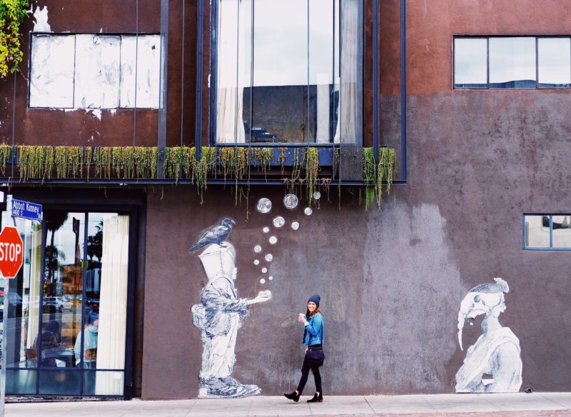
The city of Los Angeles, along with small business owners along Venice’s iconic Abbot Kinney Blvd have made mural viewing a visually rewarding activity, one that is user friendly to visitors on foot exploring the outdoor shopping hub. From corner to corner, local business owners have allowed their exterior walls to be used for large-scale murals, fueling the efficacy of this outdoor retail marketplace. At a time when the greater retail industry is synonymous with “retail-apocalypse,” components of user-centered design (UX in this case) are naturally adding value and reinventing the shopping experience — a concept we believe will define ‘modern retail.”

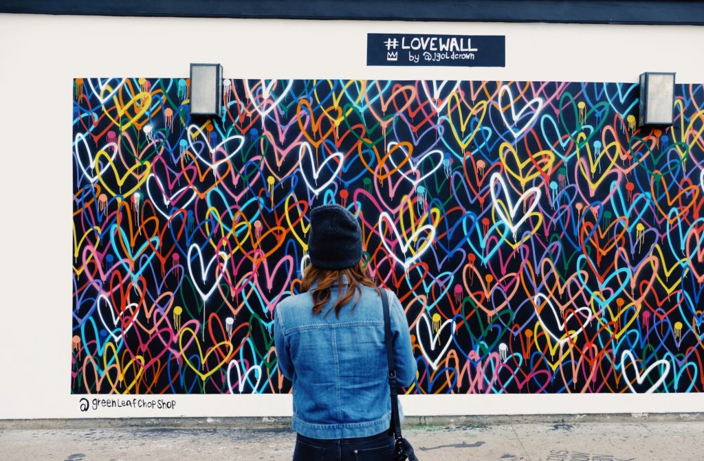
A recent visit to Abbot Kinney revealed a flow to it all. Almost all of the murals were on walls primed for photography — especially portraits, a.k.a., selfies. And they also ran perpendicular to the main street, giving visitors adequate opportunity to interact and hangout for a few minutes before their next stop. We also noticed that most murals seemed to be strategically located on the exterior walls of highly desirable restaurants, coffee cafes, and shops, a brilliant solution to reduce discomfort over wait times or purchase decisions (customers leave with a positive view of their overall experience). You may disagree, believing these factors to be too small and explained by coincidence, but we simply refer to that as good UX. (If it feels natural and compliments the overall environment, designers did their job.) And as Lisa Peacock, our Executive Creative Director, would say, “Small doesn’t even need to be recognizable to make an impact. That’s its beauty.” When all of the subtle, small details work together, like the murals within a vibrant community, a form of capital is created for that specific region; experiential capital as we call it. And it’s inclusive.

Murals of Venice, CA, Designing North Studios

Murals Facilitate Positive Change

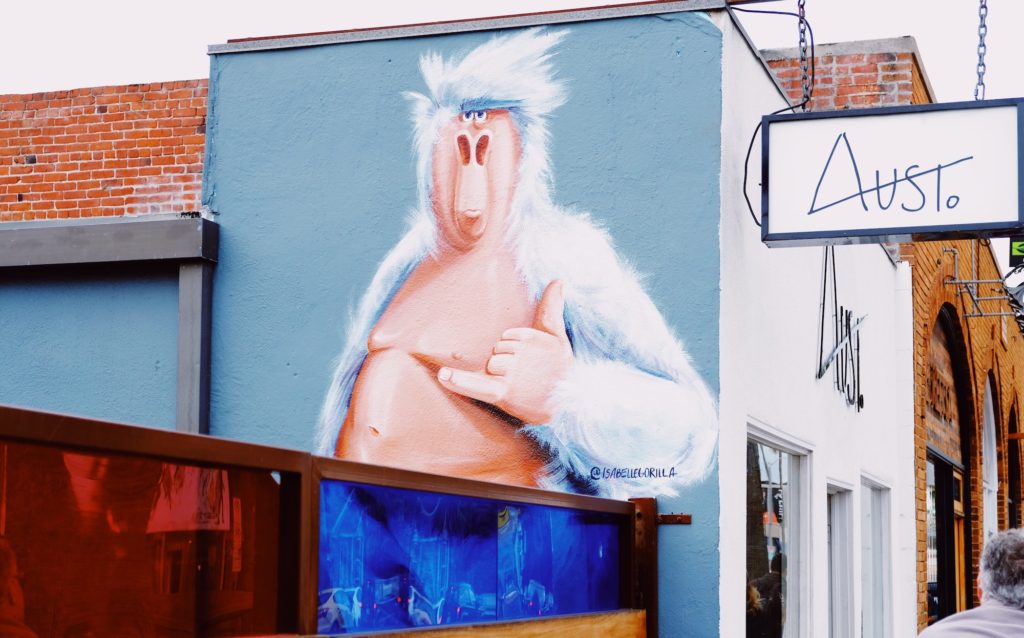
An extension of a good artist, a mural has the power to speak without ever saying a word–the popular “Isabelle Gorilla” murals found throughout Venice, CA, are a great example–one look and you’d swear the Gorilla was telling you to change your lifestyle, maybe even “slow down and chill.” Although they may speak differently to each individual, the unique interpretations often lead to inclusive discussions rather than divisive belief.

Of course, change can come from many sources, but very few of those create desired change purely from spoken words. Often, expression, action, or in the case of murals–artistry is needed. An important detail, murals speak to all humans; race, age and ethnicity are not a factor. This is something Stanford Medicine has been sharing with its community since 2015 when Fair Oaks Health Center (Redwood, CA) revealed a mural in the pediatrics waiting room. A volunteer for the project, Stanford art practice lecturer, Lauren Toomer, MFA, strategically incorporated letters, numbers, shapes, and images of the Redwood City community, as well as three interactive learning panels into the artwork. With the goal of supporting pre-kindergarten-aged children, this mural serves as a tool to educate young children during their visits to the pediatrician–often the only contact they have with professionals of any sort. Part of a larger effort, this mural now aids many children from low-income families who simply don’t have the means to pre-school, setting them up for greater economic potential from a very young age. Now, you don’t need us to remind you of the cumulative benefits on society when all members have access to more schooling and therefore professional development later on in life (higher education and job opportunities, to name a couple). And to think, all of this positive change from the use of a mural…

Just three years later, MayView community Health Center in Mountain View, CA, is also using a mural for positive change within its pediatric care division. Replacing a TV, clinic workers have identified the value murals bring to both the children and the community, addressing knowledge gaps in relationship to other children their age from families with greater means to education and learning. A key component of Stanford’s Pediatric Advocacy Program, murals are creating measurable change for many families in the community.

Similar to the walls of a pediatrician’s office, the urban landscape serves as an artist’s canvas, prime real estate for displaying visual art to convey important messages and change the status quo. A project accomplishing just this, Sea Walls by Pangeaseed Foundation uses public art to spread the message of ocean conservation into the streets. Since 2014, the group has created nearly 300 murals throughout 12 countries, including multiple pieces in San Diego, CA. And with over 200 artists on board, this community isn’t painting in the streets simply to display their talent, they are collaborating to change the way people see the ocean environment; murals are their medium. As Pangeaseed explains, these murals have a dedicated purpose:

While our oceans are the Earth’s life support system, providing 70% of the oxygen we breathe, a sixth of the animal protein people eat, medicines that keep us alive and healthy, and so much more, human impact in the form of overfishing, climate change, development, plastics, and other forms of pollution are taking a toll on the health of our seas. Unfortunately, these critical issues are often complex, multi-faceted and hard to understand for the average citizen. Through public art, Sea Walls has the opportunity to translate facts into visual stories that engage the public in a non-confrontational manner, and increase awareness.   

A lesson for all of humanity, why not let murals be our muse and allow them to communicate sensitive topics to a large audience without the anger-filled media battles? No matter what side of the fence you are on, art is always subjective–an effective method for communicating without insult or attack.

Murals of Venice, CA, Designing North Studios

Murals Create Community Bonds

From Harlem to Portland, murals are much more than artwork, actively driving collaboration and cultivating a narrative for the communities in which they are created. From facilitating coordination among the public, media, local leaders and the artists themselves, a simple creative idea can quickly transform into an organized public event, a process Forest For the Trees does exceptionally well. Curating both local and international artists, this nonprofit puts creators on the center stage. From sketch to unveiling, the entire project displays each artist as an individual but remains cohesive as a city-wide event. That’s the objective according to organizer, Gage Hamilton, “All the artists have their own themes and styles that they work within, and it was really up to each individual and pairing what direction they wanted to take. I just matched them up with property owners that liked their work, and all the property owners were cool enough to keep an open mind.”

Murals have significance in the Portland area, largely due to the bonding influence they provide. As this project displays, the local government doesn’t need to be relied upon for funding; by rallying local businesses and public supporters, community-wide mural events create more inclusiveness than a 4th of July block party. As the organizers had planned, Forest For the Trees wouldn’t have been possible without the help of many locals; because they had a hand in the facilitation, a sense of ownership was felt resulting in accessibility for everyone who wished to join the fun. For humanity, this is a rewarding experience, one that can be replicated from one community to another.    

Designed around a theme, The Audubon Mural Project is the perfect example of how murals can facilitate bonding within a community.

A city not often identified for wildlife viewing, Harlem, NY, now has some of the state’s best “bird watching,” with around 80 completed murals out of the 314 that the National Audubon Society and local gallery,  Gitler &_____ Gallery, wish to complete. Unique significance now resides on Harlem’s urban walls, covering the 314 species of birds labeled as threatened by climate change. You might ask, why Harlem of all places? Well, it happens to be the home of and final resting place of Mr. Audubon himself; a historical fact not recognized by many residents, that was until their home began receiving public art that made headlines across the country.

From Allen’s Hummingbird to a Swallow-Tailed Kite, avian masterpieces are splashed across Harlem neighborhoods, covering everything from aged brick high rises to the security gates of dental and vision offices. And this is all part of the design — when businesses close up, residents and passer-byers have something colorful and awe-inspiring to look at: birds!

Complementary to anyone wishing to view all eighty murals, a project map has been created for self-guided tours around Harlem neighborhoods. Communicating global challenges, this project is attracting accomplished artists from all over, further adding value to the experience of being a local resident, community leader or business owner. When people exit their apartments or visit the gas station they are greeted with lively artforms. It’s something different, something unexpected, yet so rewarding. This is the power of a mural.

Murals of Venice, CA, Designing North Studios

From feelings of unity and togetherness to cultivating thoughts for change, murals hold the power of influence. An answer to designing healthy communities, murals are conducive to a person’s and group’s user experience (UX) within public spaces, they motivate positive change without name calling, and build community bonds through peaceful, artistic communication. We say, let’s create more murals in 2018.

The Art Of Paying It Forward Without Spending A Dime

We’ve all been there before, caught up in the routine-of-things with little thought for what life has to offer outside of “the daily grind.” Rarely, do we take time to think about the others before us who “paid it forward” in one way or another, granting opportunities that would have otherwise never presented themselves.

When we pay it forward, we commit and act of selflessness that transcends our connection to other humans on the planet, elevating the human experience in a positive way. Whether it’s an act of kindness, faith, or even compassion, it all makes a difference and can potentially set off a chain reaction of reciprocated behavior.

Just imagine a world where a simple gesture could snowball into a global movement; wouldn’t that be something to witness?

Life presents many opportunities to pay it forward, often when you least expect it. But you don’t always have to wait for someone else to initiate a good deed. The truth is, you can be the catalyst to set things in motion, with any person you interact with.

Here are 10 fulfilling ways to pay it forward without spending a dime:

1. Substitute reimbursement with a request to “pay it forward”

You’ve just helped a fellow driver install a spare tire on the side of the road. He/she kindly offers a twenty dollar bill for your time and efforts. The temptation for “cold cash” may be strong, but chances are good you didn’t pull over to make a quick buck. Instead, ask the driver to return the favor for someone else who experiences a similar situation, in the future.

2. Offer mentorship

Regardless of age, profession, or relationship, everyone can benefit from a mentor in some aspect of their life. But finding one can be tricky. Sharing your time, knowledge, and experiences with others following in your footsteps, creates a feedback loop for personal development that strengthens the human experience. As the saying goes, “Be the mentor you wish you had.”  

3. Call a friend, family member, or acquaintance to see how they are doing, and listen

Life is busy. We get it. But everyone can make time for family and friends, right? The funny thing about life, it has a way of coming between you and the people you most want to spend your time with. Again, you’re not alone.

Those who most love you likely thought about you at least once, this very day. So why not give them a call and ask how they are? A simple gesture, it affirms that they are in fact important and top-of-mind, even during life’s busiest moments. Be an ear to talk to; pay it forward without speaking more than a few words.

4. Write positive reviews for small business that you support

These days, reviews are everything. They can make or break even the most successful business. Just look at social media’s impact on the boom of new products and services; it’s all about how many people “like” your business. When you have a stellar experience at a store or service provider, let others know how good it felt while also helping the business serve more people, and do good work in the process.

5. Offer your seat/place in line

As simple as it seems, why is it so rare, to see people give up their place in line… time and competition possibly? Lines are a daily routine, and yet they never get any easier to stand in. Even so, there are those who struggle both physically and emotionally, to stand in lines, to access needed services. Offering up your place in line to someone who could use it, goes a long way in paying it forward. Simple and selfless, it’s sure to brighten someone’s day.

6. Teach someone else a skill you have mastered

Mastering a new skill is a highly rewarding experience for most people, and often motivates continued education. In a world with so many like-minded individuals, there’s always another person trying to pick up the skills that you already have. Why not help others along, saving time and money with their efforts — chances are they will feel inspired to do the same. Think of it as a power to teach and influence through generosity. Now that will put a smile on your face.

7. Spend a day complementing those around you

Could you be positive for an entire a day? What about offering up nothing but compliments to everyone you speak to? Not an easy task! But when you see the good in others you are seeing the good in the world, and helping others do the same. Not to mention, it feels pretty good when you can be the root of someone’s happiness.

8. Donate blood at a local drive

Paying it forward with the “gift of life.” When you are healthy, you have the remarkable power to help someone who is not. Local blood drives make the process as convenient as possible and add immediate aid to the healthcare community. By sharing your experience with your network of friends, you can be a difference maker for someone in need while influencing your peers to get out and donate.

9. Spend some time picking up trash in a public area

Paying it forward has never been easier. Trash is everywhere, and always needs a trashcan to call home. Most people understand that we share this responsibility yet it’s more appealing when they see someone else initiating the action. Next time, try becoming the leader of a cleanup movement in your local community.

10. Facilitate progress in helping someone realize their dreams

“Keep dreaming,” a phrase that we toss around regularly to ease the letdown of reality. But what impact could we make if we all helped one another inch closer to our dreams? Yeah, it could be HUGE. Often, we hold the “golden ticket” to another person’s progress, and with a little generosity, can facilitate the realization of another person’s dreams. Whether it’s providing an invaluable contact or something larger, think about offering it up next time someone shares their dreams with you.

Think of paying it forward as an art form — the art of harnessing compassion, kindness, or faith in society. The more of this art you practice, the more beautiful the world can be. These forms of selflessness are far more impactful on society than we often give credit, and inherently provide food for the soul, long into the future. Even more exciting about “paying it forward,” it doesn’t have to cost a dime. And why not get creative in the process. Here at Designing North, it’s our mission to design a community that lives north of expectation, in the name of elevating the human experience. Be the global count.  

California’s ‘Super-Bloom’ 2017: User Experience Design Madness

California’s ‘super-bloom’ leads to a ‘super-boom’ of tourism, traffic, and confusion.

Wildflowers are popping up all over the map in Southern California — a place largely known for mars-like droughts — is turning once desolate landscapes into a colorful array of white, yellow, orange, and purple — the ideal contrast for your Instagram feed or Facebook wall. And as we have learned time and time again, when all media streams descend on a single subject, reality is quickly distorted; reflecting individual imagination and creativity in a method that portrays a universal reality.

We all want to experience the same feeling of excitement as the next person — missing out might trigger anxiety. It’s commonly referred to as FOMO (fear of missing out), and represents the California wildflower ‘super-bloom’ very well. In order to keep our dreams in sight we latch onto pictures, videos, and written words from strangers who have been where we have not. Sounds harmless, right? Unfortunately, it’s quite the opposite; something the town of Anza Borrego recently learned.

The LA Times reported: JoAnn Maiter, a part-time employee of the Borrego Springs Chamber of Commerce, said she couldn’t remember how many phone calls she’d answered. Dozens and dozens.

“We’re swamped. You can’t even get into our visitor’s center right now,” she said, adding that nearly 300 people had already signed into the visitor’s log by noon on Friday. “They’re coming from everywhere — absolutely everywhere: Canada, Minnesota, Chicago.”

From a user experience perspective, you can’t design a guaranteed outcome, you can only design for an experience — which may or may not lead to the desired outcome. Even with all of the user research in the world there will always be situational factors that a designer simply can’t control — unless artificial intelligence has something up it’s sleeve.

External forces such as social media, rarely follow this thought process and often distort reality to a level that we can’t recover from — the ‘Super-Bloom’ is a prime example.

Impact of Media on Perception

A well respected photographer uses his highly trained eye, creative vision, and advanced equipment to capture a brilliant image of the desert bloom. As most experienced photographers do, he then uses post-processing skills to perfect the image and shares it with her thousands of eager followers; with a well written message of inspiration and eternal wanderlust. It’s a dream-worthy scenario and nearly every human on the planet wants to experience this feeling personally. And this is the expectation they have, all the way up to the moment they finally do — “the moment of truth.”

As was the case for many visitors, the ‘super-bloom’ introduced a reality that wasn’t entirely true to the stunning imagery and influential media viewed online — an all-too-common scenario in this “digital age”. Just like a moment in time, every human can’t experience the exact same event the way another person did previously. 

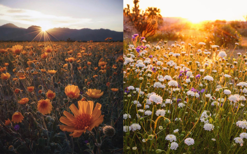
Anza Borrego Wildflowers

Instagram photos by professional photographer Scott Kranz

From a user experience perspective, I am able to understand why a highly anticipated natural phenomenon has turned into a complete headache for thousands of people. A quick comparison of expectation versus reality reveals two different scenarios; we all want the one that aligns with our media viewing experience. But not everyone will experience the event in the same manner; under the same conditions.

The first 500 visitors to the region likely had a great time; roads were clear, the sun was still rising, services were accessible, and fellow adventure seekers weren’t breathing down their throats. By the time ten thousand people flooded the park, reality took a turn for the worst.

Importance of Understanding User Behavior

When talking about the field of UX, understanding ‘user’ behavior through and through is a fundamental rule. Unfortunately, most professional industries — outside of the digital design or human factors realm — forget to rehearse their use cases, often leading to more harm than good.

Read more on the differences between UX, XD and other practices around UCD.

In predictable fashion, the governing bodies that control this impacted region, have been promoting the “super-bloom” for months — picking up the intensity over the past few weeks — as they prepared for this abundance of excitement in their own backyard. Shortly after, the media took hold and the conversation snowballed from there — fake news!

Because our studio practices the user-centered approach, I quickly recognized a parallel between the work of a UX designer and the experience that these state parks and media outlets were hoping to deliver. More importantly, I concluded that the managing bodies of these parks didn’t do their research on the possible user groups that might ascend and make up most of their visitors. As you might expect, the resulting experience was best described with frustration and disappointment — and that’s putting it politely.

Whether they were in communication or not, the media and state park services did a fantastic job promoting this natural phenomenon; you might even believe that it was a planned event from the look of coordinated PR efforts. In this case, it’s not what they did, but rather what they didn’t do that made the experience memorable.

Whether it was the severe underestimation of potential attendance or lack of education leading up to the event, the disconnect between visitors (users for all intended purpose) and the parks themselves was too great to recover from. From a user’s perspective, this is where the disconnect made the most impact:

I was promised once-in-a-decade-flowers yet I was never educated on what a super-bloom entails; how it looks and how it’s different from my garden at home — a bed of roses is far more spectacular than a patch of dandelion. Given the rarity of this phenomenon, it’s safe to assume that the majority of visitors didn’t have detailed knowledge on what exactly they were going to see; Leaving this experience up to my imagination was a risky approach to rely on.

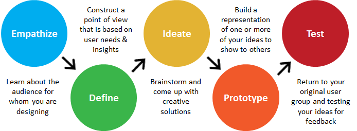
Apply Design Thinking

Prior to the weekend, visitor estimates were casually tossed around. Whether a backup plan was strategized or not, it was evident that the actual attendance to the region was far greater than expected. The lack of parking — yet alone physical space — direction, and transportation resources caused a once relaxing environment to quickly become stressful and borderline dangerous.

Design thinking example

Hosting a large number of visitors — similar to a sporting event — called for an increase in staff or personnel to at least assist visitors during their travel, yet alone manage their experiences while visiting. This region in particular required off-road access to view some of the most appealing landscape. With no prior education or experience in off-roading, hordes of visitors took to the trails without proper equipment or professional direction; conflict ensued for many, positioning select groups against each other. Have you ever seen a Hyundai Sonata attempt a water crossing? We hadn’t either until this trip.

With consideration for the needs, wants, and limitations of visitors, the ‘Super-Bloom’ experience could have been something special. And had I not been working shoulder-to-shoulder with a team of UCD practitioners, reminding me daily how design should solve problems, I’d still be confused and frustrated from the tension felt during the experience. Understanding the gaps, missed communication, and lack of research helps to alleviate the disappointment I felt (kinda). Who knows, in the next decade we might just see designers in charge of the solutions to the problems we identified — wouldn’t that be smart. The events of the 2017 California ‘Super-Bloom’ are a reminder that design thinkers are needed everywhere; in every company and perhaps most especially when it comes to serving the people experiencing government services.

Design thinking can transform. Let us show you how that paired with a UCD approach can open the door to new possibilities.

Digital Designers and Drug Dealers: We All Need The User

Nobody wants to be called a user. In grade school, that meant you only pretended to be friends with Tina because you really liked Amy. User. In high school, when your mom found Jack’s badly rolled joint in your jeans pocket on a pre-wash inspection, she freaked. Oh my gosh honey, are you a user!? But once you found yourself in the digital design world, the seemingly unsophisticated and often maligned moniker ‘user’ took on a more positive mantle. In fact, it opened the door to thought-provoking conversations about design, experience, and the joy that is felt as people interact with something that is well-designed. More recently, it’s being treated as an undesirable label again, attributed to a form of rather careless behavior on the part of the digital labeler: Oh no, we shan’t call them ‘users’.

Sigh. I think we’re going to have to toughen up. The practice of UX (User Experience) in its classical sense, demands a conceptual context with a blend of human factors and ergonomics that without a doubt, needs a user. Co-founder of the UK-based agency Clearleft, Andy Budd, recently participated in a lengthy and enlightening interview with Digital Arts that thoroughly covered his take on the biggest morphisms in UX; much of which relates back to the term ‘user’ and its unique meaning for the niche specialists who use it as a part of their profession. Andy illuminates the classic UX designer role while educating his audience on the murky waters surrounding title confusion within the field of digital design.

Watch the full interview here: Digital Arts UK | UX in 2016: An in-depth discussion of today’s big issues with Clearleft’s Andy Budd

We can’t all possibly be UX designers can we?

Over the past five or six years an interesting shift has taken place within the digital design market that has resulted in mass confusion among the greater industry. This includes clients of design firms, employees within these firms, as well as new professionals who are seeking to join the industry in their career search. As Andy points out in the interview, this shift in professional title and qualification is simply a result of supply and demand. As demand grew rapidly for classic UX designers, supply couldn’t keep up, leaving prime opportunities on the table for other designers who have similar skill sets. In theory, a niche group suddenly opened its door for others to join the cool kids.

Before we share any further insight from Andy Buddy, let’s quickly cover the core competencies that make a UX designer such a commodity in the first place:

  • Interaction Design
  • Design Research
  • Information Architecture
  • UX Strategy

Many industry professionals fail to recognize that UX design is more scientific theory with well over 20 years of practice behind its title. In fact, the UX community should be looked at as a body of knowledge in its own right that is approached with well tested theory and dedicated practice.

If we go back to Andy’s point on not seeing enough initial supply in order to fulfill the demand for classic UX designers, we can understand why it was fairly easy for other skilled designers from slightly different disciplines to fill the void. From a client’s perspective, it’s not easy to differentiate between all high level designers while identifying exactly what expertise they need for their project. This explains why a large number of predominately visual designers (or UI designers) have filled the gap in supply and demand with a quick transition into the UX field. They may be talented within their area of expertise, but that’s simply not an automatic qualifier for the UX title, and the same goes for all speciality design fields.

UI designers are often experts in:

  • Visual Design
  • Interaction Design
  • Experience Design

In addition they commonly follow the mindset of:

I designed an experience, I then designed a thing, so I must be a UX designer. Andy understands this reasoning but proves that it’s a bit misleading as he explains, “I believe you can’t design an experience. You can only try, and that it is much more of “a layered practice” with lots of practitioners adding to that experience.” We believe the same. You can’t design an experience, but you can design strategic paths for it to unfold. We can see first-hand that this idea of everyone being able to call themselves a UX designer is causing the strategic approach of design to be overlooked and possibly even archived for some unknowing clients. For a large pool of clients who understandably don’t know exactly what kind of ‘U’ or ‘X’ or ‘D’ they should be looking for, they may be finding talented individuals, but might not be finding the best tool for the task at hand.

The simple truth is that you need specialists when you are building complicated things. Andy Buddy said it best, “If everyone is responsible for everything, nobody is responsible for anything.” So lets keep it straight, UX design is not experience design (XD). A classic UX designer taps into the human factors discipline to understand interaction, can analyze your business problem, employs research-based design practices, knows how to structure content, and will strategize your customer journey before any visual designer should even hit the sketch pad. Experience design is broader. It’s what designers want users to feel when they interact with a brand across all its various touch points, beyond digital. It’s the layer of intuition and visualization atop a solid foundation that gets uncovered as the entire design team does its strategic thinking (or discovery). A design team will all be solving the same client problem, but will be doing so from different perspectives and much different lenses. Super key! You wouldn’t use a telephoto zoom lens for a portrait photo shoot unless of course you found out your client was selling the next great acne cream. Then, only your visual designer might insist on real proof and switch up the lens.

No one tool will ever do everything that you need, and the more often companies chase this dream of the multi-acronym designer saving the day, the further down the rabbit hole they will fall. Moving into the future, Andy expresses that designers need to consider themselves as a toolbox. A toolbox full of skills clearly knows what it can do best, but also knows that it may need to collaborate and learn before embarking on complex digital projects.

Designing-North-UX-User-Example

It’s quite interesting to watch the digital design industry burst at the seams with professionals, cringe as the acronyms morph, and sigh as the term ‘user’ gets dropped from many UX conversations. We get it. The subject of UX is a confusing topic and it doesn’t show signs of simplifying anytime soon. Whether the term ‘user’ is considered impersonal, not representative of a project’s defined persona, or even feels a little drug-den-ish or mean, it’s still an integral front-end component to the Experience Designer title if that’s what one is really practicing. In some disciplines, redefining titles to better align with a more familiar subject is appropriate (like, vice-president of people vs. vice president of human resources) but that’s not the case in this design realm. In a way, removing the U from UX would be comparable to asking a chef to make your favorite meal without him inquiring as to the name of your dish, or at least some hints on a food group. Or better yet, it’s like Jack’s joint getting that whirl in the washing machine: Mom didn’t do her usual ‘research‘ and just wanted your jeans to ‘look and feel‘ pretty.

As the industry moves forward, it’s vital that rising design leaders receive broad exposure to all the various lenses and mindsets of UI, UX, XD, IxD, et al. In doing so, they will be better suited to bring the right mix of design minds to the table while trying to create a collaborative environment and strategic approach for client projects. With so many X’s in our world it’s not shocking that the classic discipline of UX has been misrepresented through title confusion and task semantics. Regardless, the interesting evidence in throwing around the UX term so liberally is somewhat indicative that more and more clients and designers are recognizing that digital projects are indeed complex and strategic exercises: touching all aspects of a client’s business ( marketing, sales, customer service, IT, HR, etc.) Digital agencies like us understand that no longer are we in the website design business. We are in the crafting customer journeys business. And like so many of us operating in our own dark den somewhere: we all need the user.


Do you subscribe to Designing North Stories yet?


5 Tips for Managing the Digital Product Design and Development Process

Everybody knows that the three most important words in real estate are location, location, location. But did you know that the three most important words in managing digital product design & development are communication, communication, communication?

No, this is not a new Geico ad. We recently interviewed Designing North Studios’ Managing Director and Executive Creative Director Lisa Peacock  and Head of Technology Nigel Peacock about how best to navigate the sometimes stormy seas of digital design and development. The interview was timely, as we just completed a retrospective on a major digital product design (yet to be unveiled to the public) – a process we undertake religiously after every big digital endeavor.

What tools or processes are most critical to the successful execution of a digital development project?

Nigel:

If the decision is solely ours, then we employ the Agile development methodology, which has consistently worked well for us. Depending on the Nigel_Peacock-colorclient’s preference, we can employ offshoots of Agile such as Scrum, Kanban or even Extreme programming.  That doesn’t mean that we can’t adapt to other more traditional processes, however, such as Waterfall or Critical Path Method (there’s one for the teenagers). That said, we often find ourselves working in a hybrid environment to accommodate a particular client’s internal processes. Whatever the preferred methodology, we do insist that a decision is made early on in the engagement usually during the discovery process which ensures that we get everyone on the same page thus completing stage one of “communication, communication, communication.”

Lisa:

Yes, and I think that the daily stand-ups are probably the most beneficial or critical element of that process. Every team member who is deployed on the project is part of the daily stand-up, and is expected to report on what they’re working on that day, what’s next on their task list, and any blockers or impediments that might cause them to not complete their task.

Nigel:

I would add  that it’s imperative that those meetings are kept to the brief three-point agenda that Lisa mentioned. In fact the meeting leader, the “Scrum master,” has a responsibility to keep the stand-ups organized to the point of being regimented and steer each contribution to a 5-10 minute slot at the same time every day.  Longer discussions can be saved for the “Meet After” or “Huddle.”  Working with a virtual team means that we don’t have the luxury of “water cooler” discussions, so tools like Slack and Basecamp are vital additions to our project arsenal, and allow us to continue conversations outside of the stand ups. Or we can just say “Hi’ to make sure we keep the team socialized and the energy levels up.

You’ve both managed countless digital projects over the course of your collective careers. What are the biggest potential pitfalls to be wary of – the perennial hang-ups?

Lisa:

designing-north-studios-lisa-peacock-pointingTwo Things: Business Requirements and Business Rules. Not keeping requirements top of mind throughout the project, and not documenting the product’s business rules effectively so that they are not lost in the hand-off between Design and Tech is critical. Establishing requirements up front, which is part of an Agile process or any project process for that matter, is the easy part. But it takes strong leadership to continuously circle back and hold both the requirements and subsequent business rules up against decisions points as the team progresses through a project.

Nigel:

Yes, and steady tracking of the requirements and designs makes it easier to eliminate disagreements as they arise. When you encounter a conflict between a proposed UX solution from the designers and a technical solution from the developers, we’ll grab the applicable business set to help inform a direction. I would also add that guiding the customer toward defining the MVP (Minimum Viable Product) is paramount to any product launch success. It’s super easy to get excited as the product begins to take shape and keep adding more and more bells and whistles until you eventually have a difficult time reaching the finish line. Keeping a backlog of great ideas, with a quick prioritization indicator for add ons later is critical to keeping the creative thinking logged. It also helps to remind clients that you can eventually get everything you want, but not all at once. This is where Agile, used properly, can be a real asset.

Speaking of settling conflicts, how do you solve conflicts that aren’t necessarily settled by a review of the business rules?

Nigel:

branding-design-gallery01Even the most well documented, evolved business rules can still be open to interpretation when the development rubber meets the road. It’s really important to have members of the design, development, and analysis teams joined at the hip from the project inception to deployment.  Rather than constrain enthusiasm or creativity, we tend to let ideas flow freely, then before committing to them, we’ll have the Tech team make sure that designers aren’t writing checks that can’t be cashed.

Lisa:

Hey now, expertise comes at a cost my friend. Ha! No, this is true. Creativity can jeopardize scope. A good creative director will spot it when its happening. I would also add that the designers can often help to rein-in the tech team too when their solution is more elegant than might be needed for a particular requirement or business rule. Again, daily stand-ups can give tech a better understanding from the design and business teams as to what the customer not only wants but really needs. Then assumptions aren’t made along the way that can cost everybody extra time and money.

You touched on time and money and that translates to budget. What tools do you use for scheduling and for tracking budget?

Nigel:

Typically we use Microsoft Project for the project schedule and Google Docs to communicate high level planning.  Depending on the customer preference we will use a variety of development planning tools, but most often focus on Microsoft Team Foundation Server (TFS) or JIRA for sprint planning.

Lisa:

In terms of tracking project budget, we’re a Harvest shop. Everyone works to a detailed time sheet that’s approved every week. Harvest reports make it easy to see exactly where you are, and forecast burn rate which is especially helpful when talent is working on more than one project at a time. Specifically, for tracking design deliverables, we like Trello, and find it to be an effective way to assign tasks, see what’s coming up next, what’s in-review with the client, and finally fill-up the complete column once a deliverable has been handed-off to tech.

What happens when a designer or a developer just isn’t getting it?

Nigel:

You know, that’s honestly one of the best parts of our business model. We’re a blend of freelancers who have worked together on a variety of projects. When we select our team, it’s after Lisa and I have a good feel for the type of client we’re dealing with, the type of project we’re tackling, and the methodology that’s going to work best for the client. We handpick the team from there. We’re not saddled with having to use anyone “on the bench” just because they’re filling seats at an office.

Lisa:

And look, despite that flexibility, we still need to have the fortitude to acknowledge when we’ve got the wrong person for a particular task. We recently had a very talented designer who came out of the chute with the client’s favorite overall design for a digital product, but whose follow-up design comps kept missing the mark. Rather than beating our head against the wall, we just made the change; swapped out one talent for another talent more suited to the pace and ‘feel’ for the product brand direction. It worked out great, in no time, we were back on track. It was the right move.

Nigel:

Again, our business model gives us a lot of flexibility. We usually shoot for the Extreme Programming model in that we assemble a team dynamic which comprises a mix of business experience, technical talent, innovators, and leaders but most importantly a team that works together, understands each other, and just gets off on producing quality products.

Any final thoughts or advice?

Nigel:

No process is perfect. We see digital product design & development as an iterative process always. We’re continually improving and refining how we tackle new projects. But without question, effective communication between team members and between DN and the client, is paramount. And actually, a true strategy we believe in.

Lisa:

I agree with Nigel, and would add that having people who are generally happy, energetic, and who come to the table with the DN mindset we’re always looking for in our stars, is what I strive for. We put together teams filled with people who enjoy what they do. It makes life much easier during crunch time. You can have the best full stack developer on the planet, but if everyone hates working with him, it can make for a rough project. Respect for one another and collaboration are key.

Nigel:

And I think that when team members have a common goal and a mutual respect for one another, it also eases the process. When everyone has a solid understanding of the scope of the project and has respect for each other’s abilities, it goes a long way. 

Top 5 tips for effectively managing a digital product design & development project:

_______________

1. Communicate, Communicate, Communicate.

Conduct daily stand-ups. Every team member knows what he or she is working on that day and that week. Blockers are addressed and mitigated.

_______________

2. Revisit requirements & business rules.

They’re established during discovery with the client and are revisited frequently – Scope creep kills the project, erodes motivation, and makes planning a pain in the ass.

_______________

3. Establish an MVP.

Make sure the project plan has a clear definition of the MVP and successfully execute that first. Refer to the “wouldn’t it be great” list later, and don’t let that distract anyone.

_______________

4. Assemble the right team.

And don’t be afraid to make changes when needed. One wrong apple makes the whole tree look like it needs water.

_______________

5. Iterate.

No process is perfect, so keep striving to refine your processes with each new project. Wisdom comes by learning something every single day.

_______________

Ready to get started on a new digital product or redesign?

GIVE US A HOLLER

_______________


Subscribing to all our storytelling yet?


Bootstrap/Material Design vs. Custom: When a Designer Goes Rogue

We periodically receive requests for advice from friends and colleagues. If you’re not knee-deep in design mud on a daily basis, it’s easy to wonder if things are going along the way they ought to be. And it’s equally common to wonder if you’re spending your design dollars wisely. You want to be fair, but not taken advantage of. You want to make sure that nobody is blowing smoke…

Here’s a recent one that we thought might be useful to more than just our friend:

I contracted out a designer for our company to help us design our new Web app experience. We had wireframes in place so I needed someone to bring them to life.  One of the requirements I gave him upfront is that we have a very weak front-end development team and my preference was we built the design off a Bootstrap/Material Design theme.  He didn’t show any resistance to this early on.

As the project progressed, I noticed that he wasn’t using any themes and, instead, was creating his own design.  I called him out on it and he went back and swapped some of the visual components with ones from Bootstrap (e.g., paging control).  I, then, did a full assessment on his comp and found that almost all of it was custom.

I brought this up to him and he started getting defensive saying that I shouldn’t have hired him if I just wanted him to a apply a theme.  So, I’m in a bit of a bind.

What’s your perspective on Bootstrap/Material Design vs custom?  For our company, it’s most important that we move fast (even with weak front-end development) and provide our end users a super simple experience.

Hmm. A few things come to mind here:

The planning, the agreement, the approach.

There are a bunch of Material Design framework themes based on Bootstrap that already exist – did you guys start there? “…build the design off a Bootstrap/Material Design theme.” If you purchased an existing framework, then I don’t know why the designer didn’t follow and work with the purchased theme – seems odd if that was the plan. If you did not purchase a theme, was the agreement clear as to what you meant by “…build the design off a Bootstrap/Material Design theme?” Because Material Design is more than just color and visuals, it also offers tested layout principles to follow (particularly with regard to the interactions around the Android OS) – but the approach to working with Material Design can and should be interpreted/considered/potentially mixed if designing for both Android and iOS.

As for getting defensive around working with a theme, it still takes design talent to work with a theme // but you need some code chops or a good developer partner to actually execute against a canned theme well – it’s not an out-of-the-box exercise.

As for my opinion – both options can be expensive and turn out badly without a good upfront plan. If you get a rock star designer that understands how to design for a developer – then custom is best. If you get an all-in-one designer/developer that finds it easy to work and pull apart a purchased theme, great – but that’s likely a designer-focused person who can hack at the code vs. a developer who can follow a design aesthetic  (good developers hate purchased themes, faster to do stuff from scratch). But if you were just trying to follow the principles of Material Design so as to execute good UX – then the designer and developer should have been working closely from the beginning. And they both should have known to ask for that up-front.

fast=crap // slow=crap // appropriately steady=quality.

Got a question? Shoot us an email.
Northern California
studio@designingnorth.com
© 2018 Designing North Studios. The Creative Division of The Carrera Agency. All rights reserved. Privacy | Terms