Sometimes it’s difficult to know whether or not it’s time for a website redesign. Then again, sometimes it’s obvious. For example, when you’ve decided to take your brick-and-mortar business online and need to launch an eCommerce website – that’s obvious. Let’s face it, it’s a big investment to redesign your website – both internally and externally, and nobody wants to deploy precious marketing budget dollars needlessly. So here is our advice to help you in your decision-making process. If you answer yes to one or more of the items below, it’s probably time to talk to a trusted digital design agency.
You might be a webneck, if:
#1
Your website doesn’t pass Google’s Mobile Friendly test.
This is a very simple concept. It’s pass/fail. As of April 21, 2015, Google began degrading organic search results for non-mobile-friendly websites. If you’re still enjoying strong search results, you’re lucky. Here’s the link to test your website: http://bit.ly/MobileFriendlyTestForGoogle.
#2
Your website is not responsive.
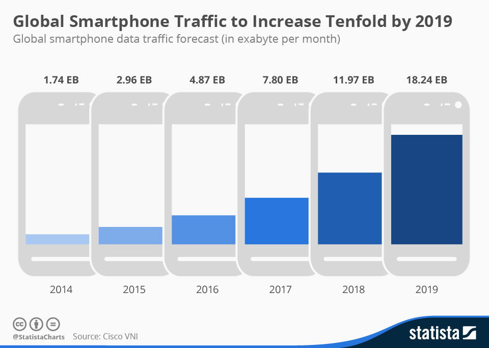
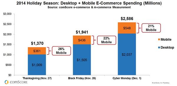
No, that sentence doesn’t mean your website has no pulse and you should rush it to the ER. Although, figuratively, it kind of does. A responsive website is essentially one that can be experienced and look great on whichever platform it is being viewed. That means it looks good and is useable on smartphones and tablets, as well as desktops and laptops. If it’s not responsive, you didn’t pass #1 above either, but we need to underscore this point. Nearly a quarter of all 2014 online sales Black Friday / Cyber Monday weekend were completed on MOBILE. Check out the charts below. Let’s face it, the world is going mobile.
#3
Your website still has Flash.
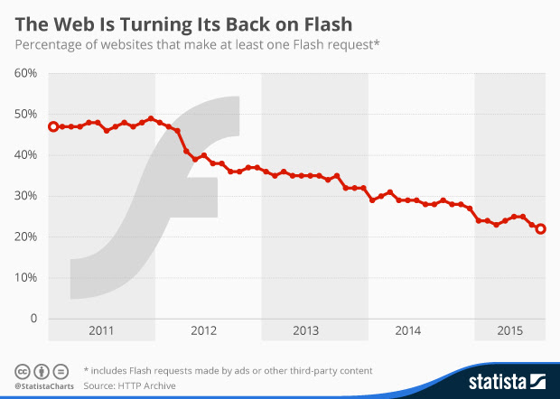
Seriously? Sorry, we don’t mean to be offensive, but have you been living under a rock? If your website utilizes Flash, pick up your phone now. You need a redesign. You are broadcasting to the world that your business does indeed drag its knuckles on the ground. Apple’s Steve Jobs forcefully stated his reasons for not supporting Flash on iPhone and iPads back in April 2010, yet incredibly, over 20% of websites still make a Flash request.
#4
Your website takes too long to load.
Sure, those graphics and that video were spectacular when you launched your new site just four years ago, but now no one is waiting around to see them. 47% of users expect a web page to load in two seconds or less, and 40% of users will leave a website if it takes more than three seconds to load {source: Econsultancy}. You work so hard to get eyes to your website, don’t make them leave because you haven’t upgraded it.
#5
Your website’s lost that lovin’ feeling.
And it’s gone, gone, gone. Once your page finally loads (see #4. above), users form an opinion in 0.05 seconds {source: Kinesis Inc.}. According to the NN Group, you have 10 seconds to leave an impression and tell them what they’ll get out of your website and company before they leave. So ask yourself, Does your website’s homepage pack a punch with a sharp, concise message that’s well supported by its graphical design?
#6
Your website is text heavy.
Like it or not (and we at Designing North Studios are book lovers, so…), people don’t take the time to read much text online. If your website has page after page of paragraph after paragraph of text, nobody is reading it. That doesn’t mean you can’t have downloadable white papers or product descriptions, but it probably does mean that it’s time for a website overhaul.
#7
The carpet doesn’t match the drapes.
Regardless of your interpretation of that metaphor, it drives the point home. In this globally competitive landscape, your prospective clients and customers don’t need any surprises. At least not negative surprises. If you fancy your legal practice as the go-to tech law firm, but your website looks like your nerdy nephew pasted it together in 2007, you better believe that when the innovator with the IPO of the decade checks out your site, he’s going to question your tech bona fides.
#8
You’ve expanded globally, but your website is English – only.
If you expect to be a serious global contender, whether in eCommerce or as a service provider or thought-leader, you should consider offering your website in the language of the target home country. This is a big decision by the way. While digital translators have come a long way in the past decade, they are still imperfect. We know. We’ve tested them. Capiche? You’ll need to employ native speakers to assist in the translations, and you’ll need to be committed to translating future updates as well.
#9
Your website hasn’t kept up with your competitors.
If you go online to check out a restaurant, you expect to be able to review its menu. So if you’re running a string of restaurants, and don’t display online menus, don’t expect to accumulate new customers via the Internet. Similarly, if you’re part of the premier orthopedic group in your town, but that practice across the tracks has a website that allows patients to cancel or modify appointments online rather than sitting on hold, as long as they’re not bolting patellae to scapulae, you might get lapped.
#10
Your website adds no value to your customer/clients.
Over two decades ago when I started in this business, it was the Wild West. Nobody was quite sure what worked best. Many businesses just slapped something up on the web to ensure they had a Yellow Pages style presence. Every now and then that still works, but those instances are declining precipitously – think sliding down Everest on a bobsled precipitous. Equally, the websites that are sell, sell, sell are much like watching those insipid infomercials – you want to change the channel as soon as possible. If you’re selling jeans online, are you showing them paired with cute tops and shoes for outfit ideas? Do you have an FAQ section or a blog post about the various denim textures that you sell or a calculator that allows the customer to input their measurements, then spits out a recommended size? If you’re a law firm, does your home page cite a couple of recent cases to illustrate how you would approach a prospective client’s case? Do you offer periodic free tips to your corporate clients that might keep them out of court? Take a good hard look at your website with fresh eyes. Are you helping or just spamming and prattling?
Conclusion
Look, despite the fact that we are embedded in this business, the pace of change is annoying to us too. Just when we can operate a software platform in our sleep, the provider releases an upgrade. We’re not always a first-adopter; sometimes playing a little wait-and-see can be valuable – but eventually we have to bite the proverbial bullet. Plus, all of these upgrades (software, websites, computers, smartphones, etc.) and the concomitant re-training associated with them are expensive. Double sting. That said, what we’ve presented here are not the latest innovations or ephemeral trends. Our Top 10 Reasons You Need a Website Redesign are, in our professional opinion, clearly established indicators that if ignored, may profoundly impact your business in the near future.
Questions? Did we miss one? We would love to hear your thoughts –


Comments ( 0 )