Discovery
First Orion was building products with passion. They were on a mission to tackle the large-scale epidemic of scam and robocalls to consumer mobile phones. But you wouldn’t know it from their website or their messaging.
During the discovery process, as we learned more about First Orion, we realized that all of their differentiators were not coming through in their online presence.
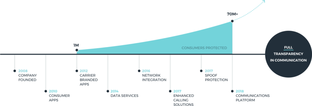
First, they are filled with real data scientists creating the algorithms that allow their specialists to analyze the data around the scam and epidemic of robocalls. Which, let’s face it, is real superhero stuff. And like any good superhero, being authentic about their mission, especially for a company like First Orion, is truly about ‘sharing what’s “under the cape.” And what’s under there is not just the data and the knowledge, it’s a palpable drive coming from their team to protect people. We felt it during discovery; the people at First Orion displayed a sense of passion for protecting us. Just as we communicated a passion to craft a solution for their current problem: an outdated digital presence, lacking a story, lacking a customer journey with these superheroes.
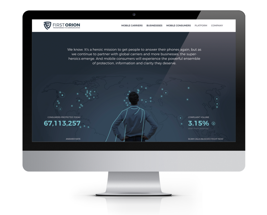
There wasn’t a person at FO that didn’t express a true desire to do the right thing. It was refreshing to see such autonomy around ethical decision making. They could see all the data, all the bad actors trying every second to get through to our phones, unrelenting, and it was so inspiring to unearth this amazing commitment to be part of the change, part of this kind of ‘protection team.’
The Design Challenge
Content is the biggest challenge for every project. But we have techniques to organize process. We introduced something new to our process this time called ‘priority guides’ that allowed the client team to not get distracted with visuals and really focus on the content and message. The design team was then able to mock-up wires with real content vs. your standard latin placeholder. It’s a hard technique, because most people can be very visual — but it forces everyone to read.
In terms of the First Orion voice, it flowed well for us after our interviews in discovery. There is quiet confidence, a humble pride, and a heartfelt knowledge that comes across from everyone. It was important for people to know that First Orion knows their stuff, they are careful with data, but that it’s all wrapped in a good sense of polite Arkansas humor. It makes you what you are: approachable. And this is what the new content communicates.
The ‘Aha! Moment’ — Yes, we had it
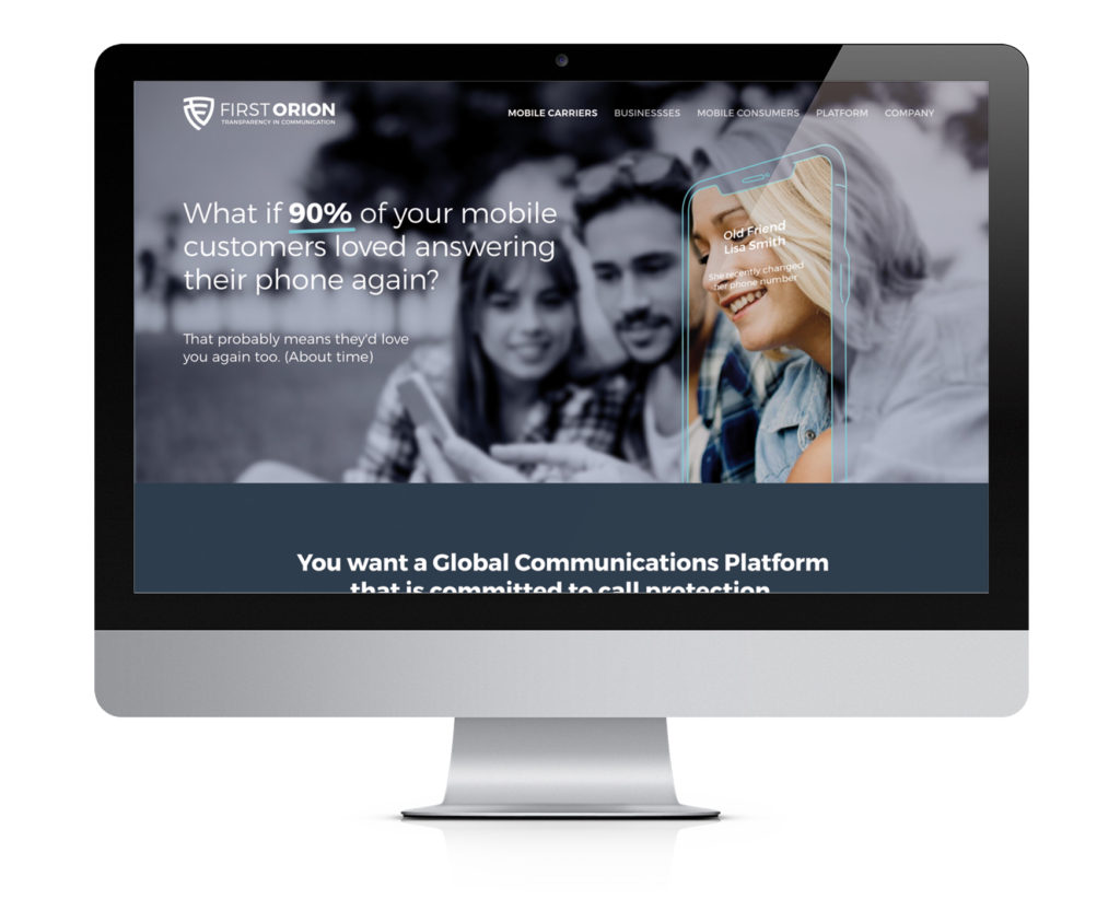
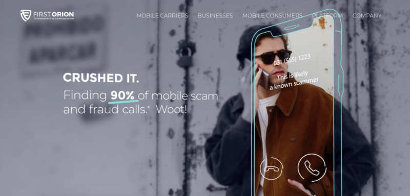
The Aha moment was the combination of our initial ‘superhero’ idea for website launch 1.0 combined with the transparency visualization. That everything coming through the phone would be in full color (or transparent) if your mobile carrier chose FO as their protection partner. Hence all the main areas of the website showing full color via the phone, black and white/blue-tint everywhere else. Illustrated well with the home video where a phone is being waved over a crowd of people seeing only color via the phone screen — and every other customer being protected with the FO logo on their phone.
Soon after we felt the superhero emerge for us as a creative team. We drew a cape on one of the data scientists, because we had written that heroics were emerging from their product line. From there, we were inspired to move away from showing real devices with real product shots, and we just sketched. The telecom space is crowded; everyone looked the same. We wanted to introduce simplicity but ensure that FO stood out from the crowd… We were moved by the First Orion mission statement and subsequent tagline (Transparency in Communication) to illustrate transparency and what that really meant. This led to our idea of the phone becoming a trusted source again, where in full color, you could see who is calling and why.
A unique truth to this project: it was the client that inspired us most. They are superheroes, but not in a goofy way. Their “powers for good” are understated and authentic — like a sketch or doodle you make on a piece of paper. Because when you’re sketching or doodling, truth emerges. And we think the truth is pretty hip. So ‘hip’ just came naturally — feedback we received directly from First Orion upon launch: “The new website feels decidedly more hip than a traditional corporate website.”
Favorite Design Element
We love the subtlety of the cape. You find it in a few places; it covers (no pun intended) a few themes. It symbolizes that First Orion, carriers, businesses, consumers: we are all superheroes in this fight against mobile scam, robo, and spoof calls. Coming together is what makes us stronger. But it also illustrates that unlike many data companies who may have something to hide. First Orion wants you to see what’s under the cape. This aligns with their mission of Transparency In Communication — so the cape does its job in many aspects.
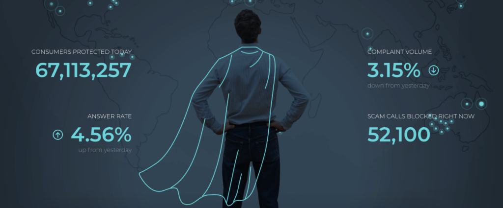
“We’re a hip, progressive, start-up company with a flair for creativity, said Traci Campbell, Corporate Marketing Manager for First Orion. “We’re packed full of professional and smart people, but we don’t need our voice to be overtly corporate.” The friendly style, tone and language begins to create a cohesive “First Orion persona” across all our digital marketing efforts, including social.” The cape is the perfect symbol for this message. But this benevolent character is non-fictional, and their powers help create super consumers.
The Final Product
It speaks to each audience uniquely now. What First Orion is to a mobile carrier is different for a mobile consumer. We crafted numerous journeys to the right message, the right product, the right information on how to be a part of this ‘superhero league’ in support of First Orion’s quest for complete transparency.
We met them and considered them true heroes in this battle. And believed they were truly fighting for us. So we positioned them as the heroes we knew them to be, succinctly explained why to each of their very important audiences, and hit the launch button so they could share their story everywhere.
Of course, the client always gets the last word: “FirstOrion.com has undergone a complete makeover, thanks to our own Corporate Product Marketing Team and the brilliant folks at Designing North Studios. They have worked countless hours to give a new look and feel to the website, designed in mind to speak to each of our unique audiences. The combined team put together a concept that paints our employees as the superheroes of call transparency, tirelessly crusading for justice against spam, scam, and robocalls and battling for people to trust their phones again.”
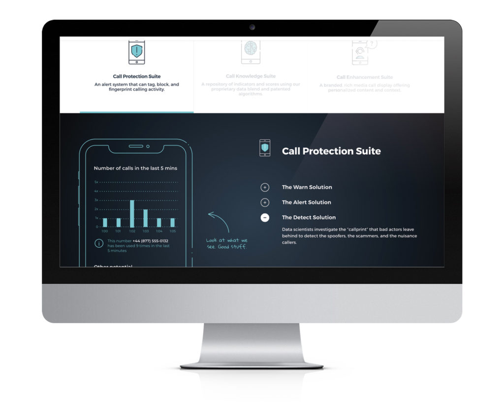
Sharing her feedback on the redesign, Traci Campbell said, “The new site gives First Orion a fresh persona in the marketing world. It also got into the nitty-gritty of what First Orion provides to carriers, businesses, and consumers. This new space will allow us to provide more information to each of our customers in a way that speaks directly to them and lets us showcase our products in a new and exciting way.”
About Designing North Studios:
Designing North Studios is an interactive design studio focused on digital solutions for web, mobile, and branding initiatives. Our mindset: attention to small UX extras makes for big UX impact. A bit different than your average agency, we were started by UX designers and can engage in a project as a team (Hire-A-Team) — or you can rent one of ‘ours’ (Rent-A-Star) for yours. If you have a project you’d like to discuss or are in need of a *designing north star* for your existing team, give us a buzz or shoot us an email.

Comments ( 0 )